internal product · pitch first, credits after

the pitch that got fundedconcepts, shown under nda

Agent
Assist.

The screen between fourteen thousand agents and every customer call. An AI copilot built inside ’s value division — eleven prepaid brands, care centers and retail floors. The client stays redacted. The work doesn’t.

Role — sole designer to design manager, still on it Span — 22 months and counting Status — live, in production

01 the problem

A support call is a fight with tabs.

The agent answering a prepaid-carrier call works across a CRM, a billing tool, a knowledge base, an ordering system and a notes doc — while a customer waits on the line. Summaries are typed up by hand after every call. Follow-ups live in memory. And nobody knows how the customer feels until the survey, when it’s too late.

So we pitched one screen that follows the call — before it, through it, and after it.

02 between calls

Idle isn’t idle.

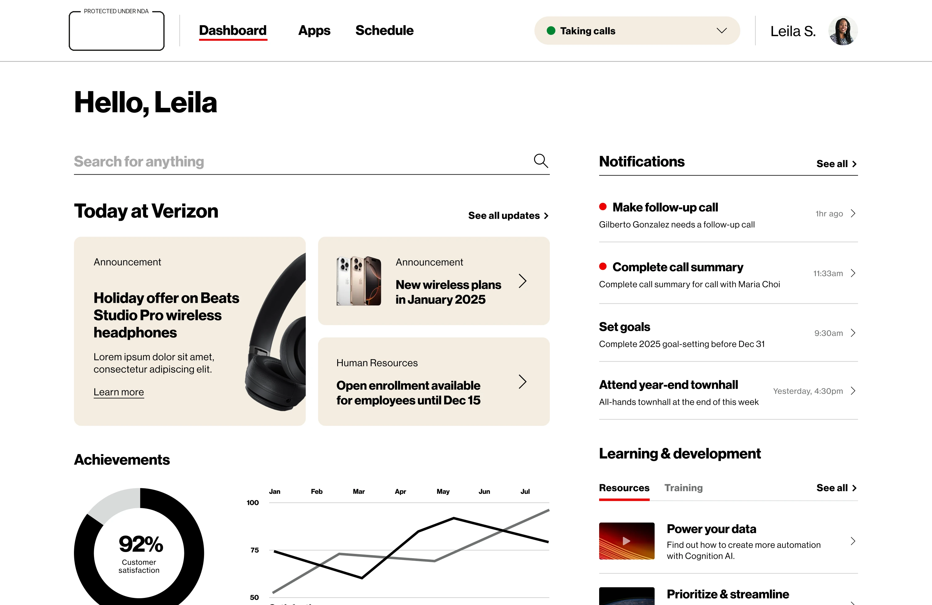
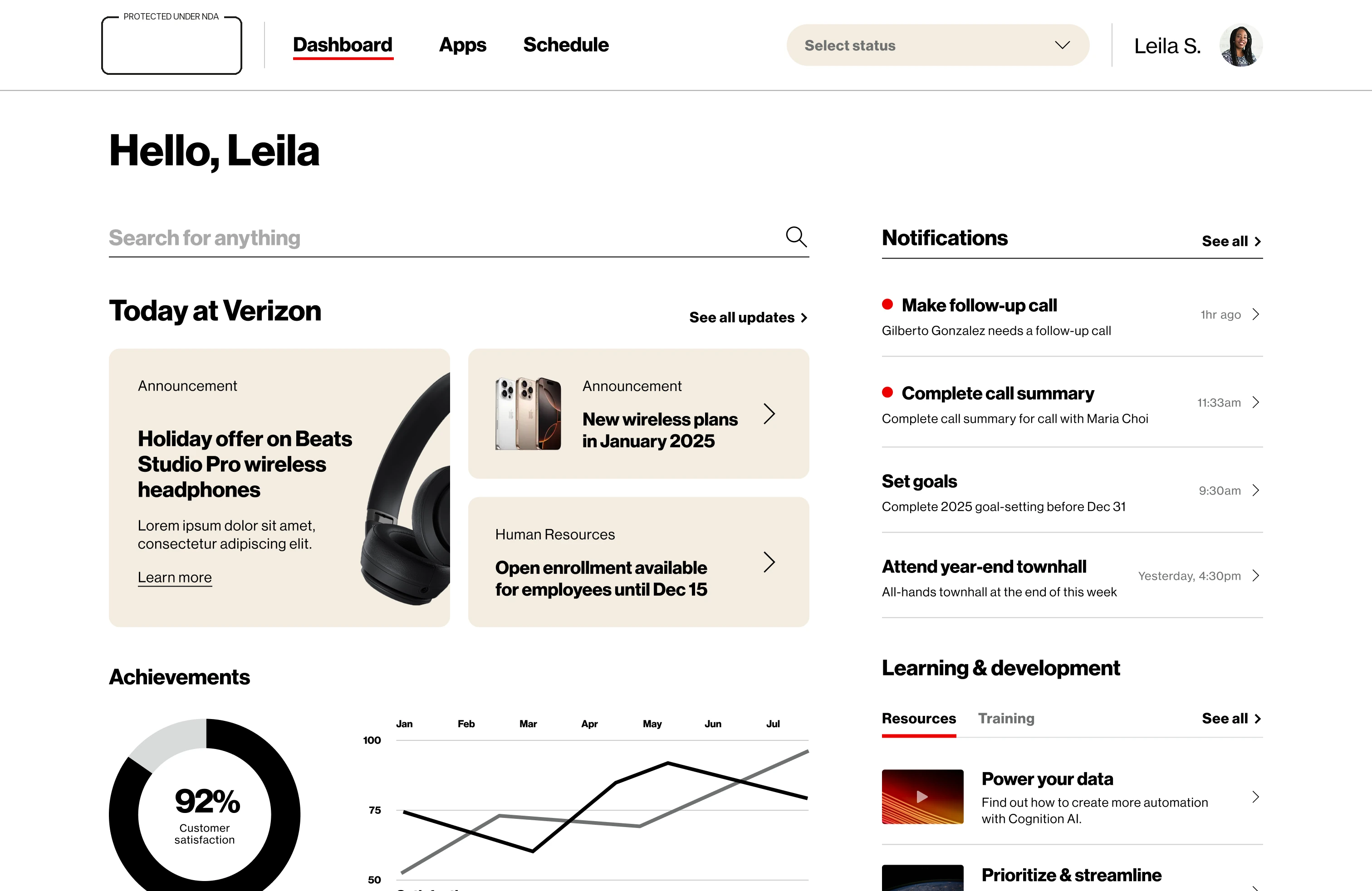
The dashboard is where the shift lives: announcements from the brand, learning modules, follow-up notifications, satisfaction and conversation graphs. Availability is a persistent header control — the agent’s state is always one glance away, never buried in a modal.

Agent Assist dashboard between calls
Between calls — announcements, learning & development, achievements, and the agent’s own numbers. The status dropdown lives in the header, top right.

03 the handoff

A call doesn’t ring. It arrives.

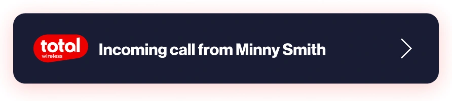
Behind the screen sits CTI — the telephony layer that hands a live call off from the IVR into the tool. The moment it does, and only while the agent is set to taking calls, the notification slides in from the right. Nothing is dialled, nothing is picked up. The call simply appears, already carrying who it is.

Dashboard with the agent set to taking calls
Live — the notification entering as CTI delivers the call. Visible, not disruptive: the dashboard stays usable, and clicking the alert is what opens the pre-call briefing.

04 before hello

Read the room before you answer.

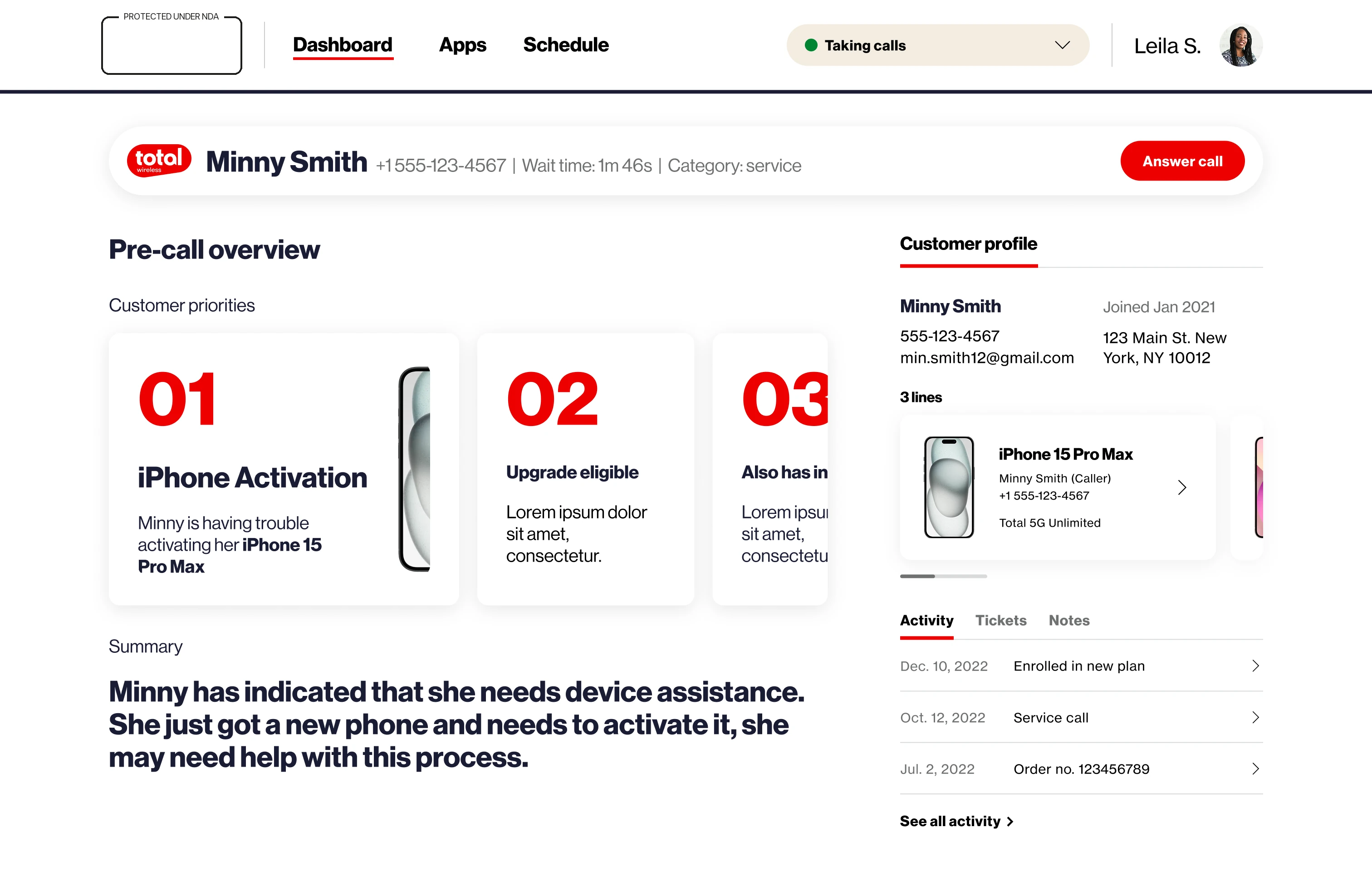
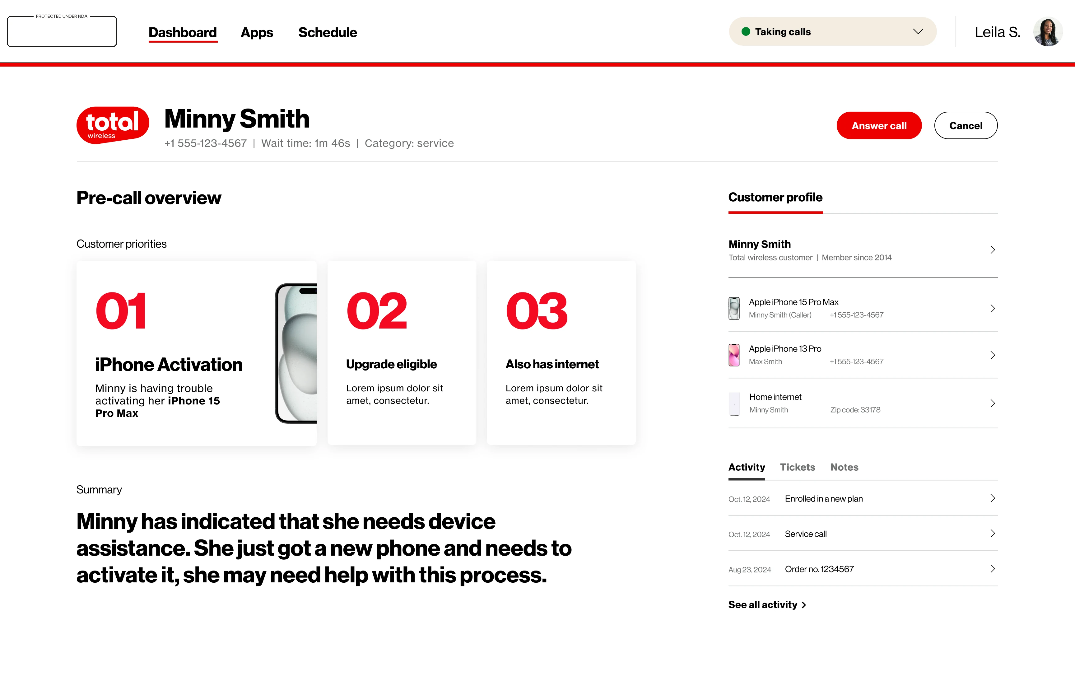
The pre-call briefing loads while the customer is still in the queue: an AI summary of why they’re probably calling, their top three priorities ranked, the line they’re calling from, and their whole relationship — lines, activity, history — one glance deep.

Pre-call briefing screen
Pre-call — “Minny has indicated that she needs device assistance…” Priorities 01–03 (activation, upgrade-eligible, also-has-internet), wait time, and Answer call where the call controls will land.

05 during the call

Guidance that keeps pace with talking.

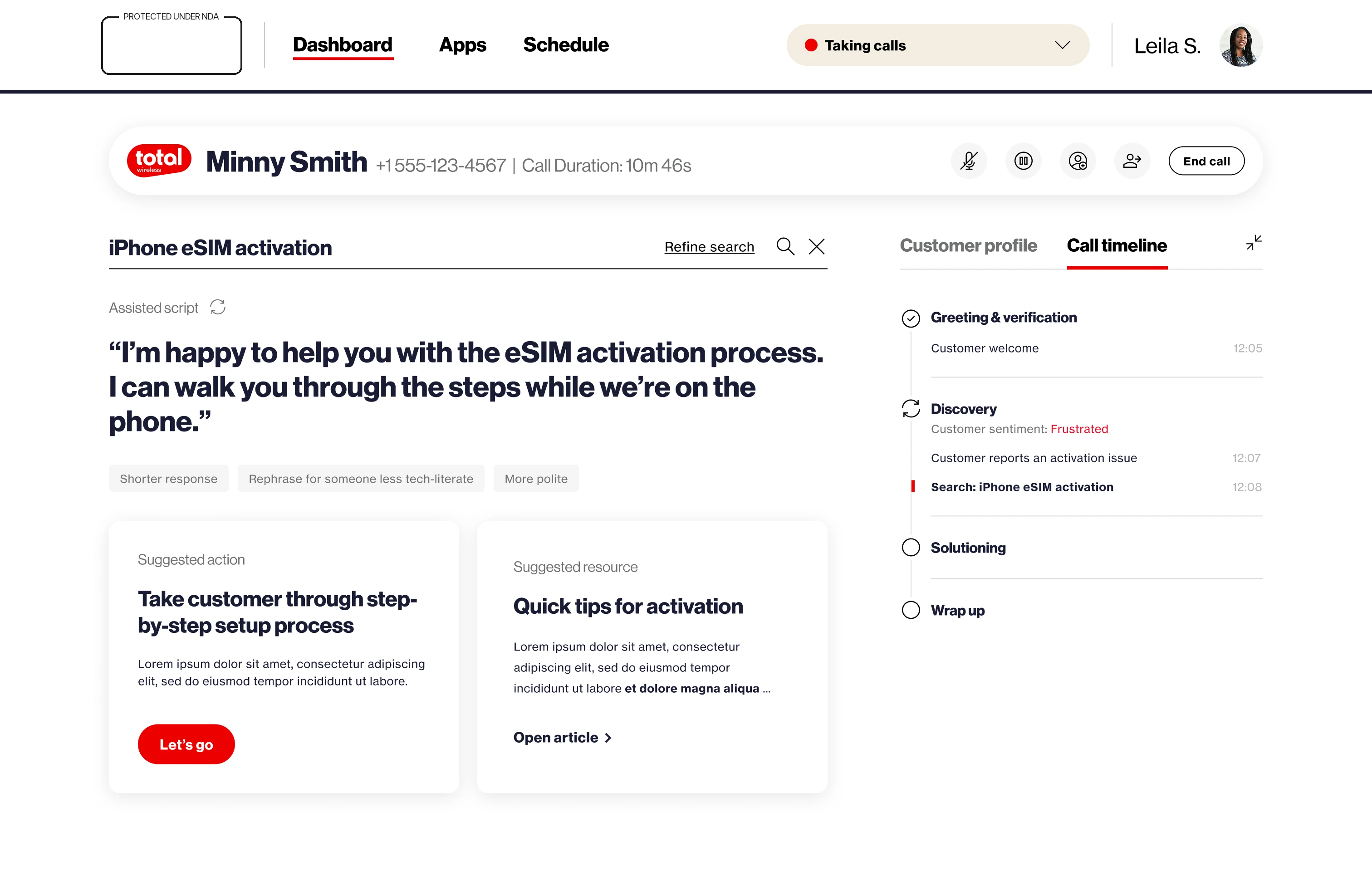
The conversation pane drafts the agent’s next line, suggests the next action, and pulls the right article — while the timeline on the right writes the call down as it happens. Search refines inside its own context: breadcrumbs, not dead ends.

During-call guidance with assisted script
Assisted script — a draft answer with one-tap rewrites: Shorter response, Rephrase for someone less tech-literate, More polite. Beside it, a suggested action and the matching article.
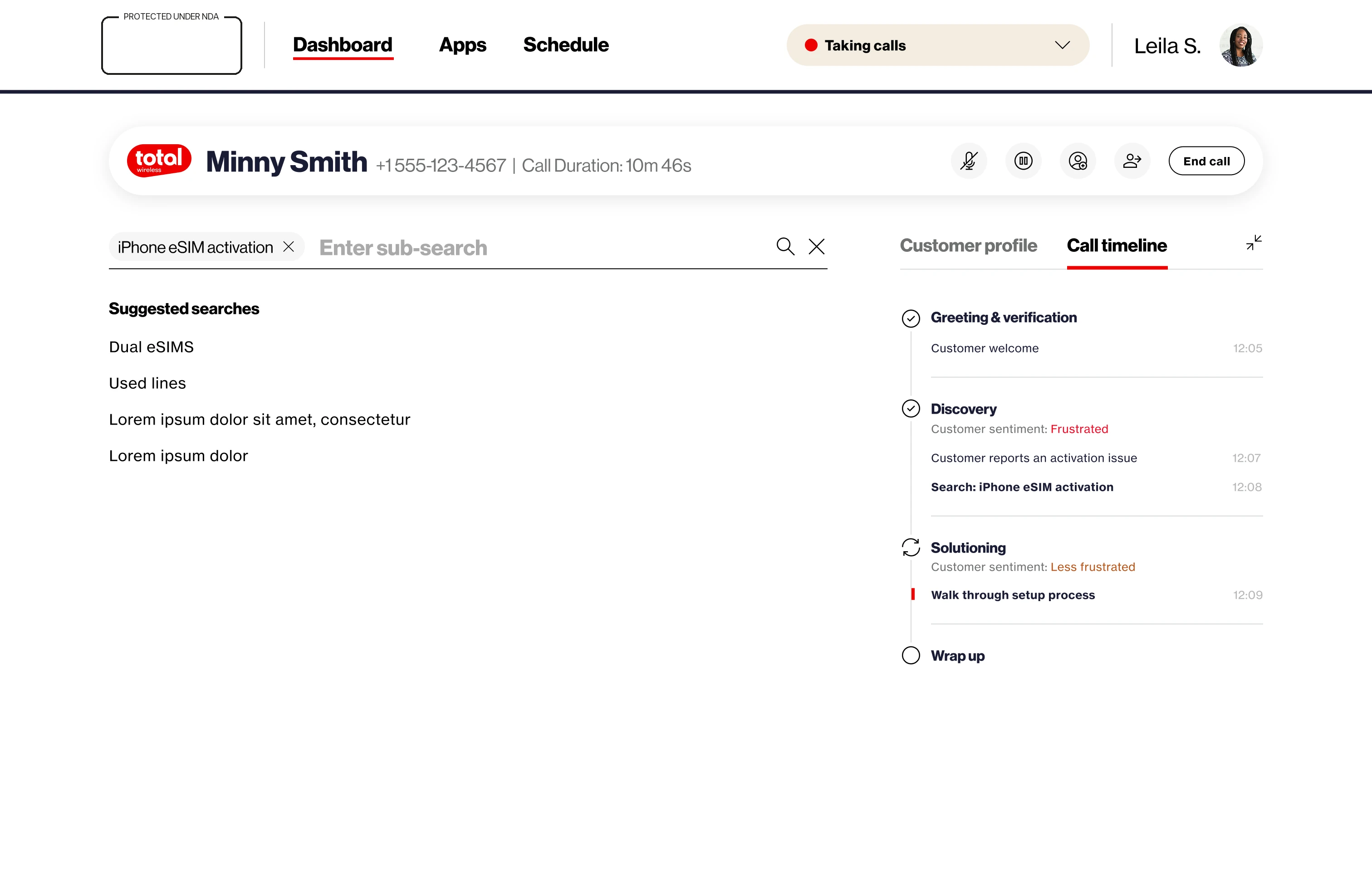
Sub-search inside an existing search context
Refine, don’t restart — a sub-search opens inside “iPhone eSIM activation.”
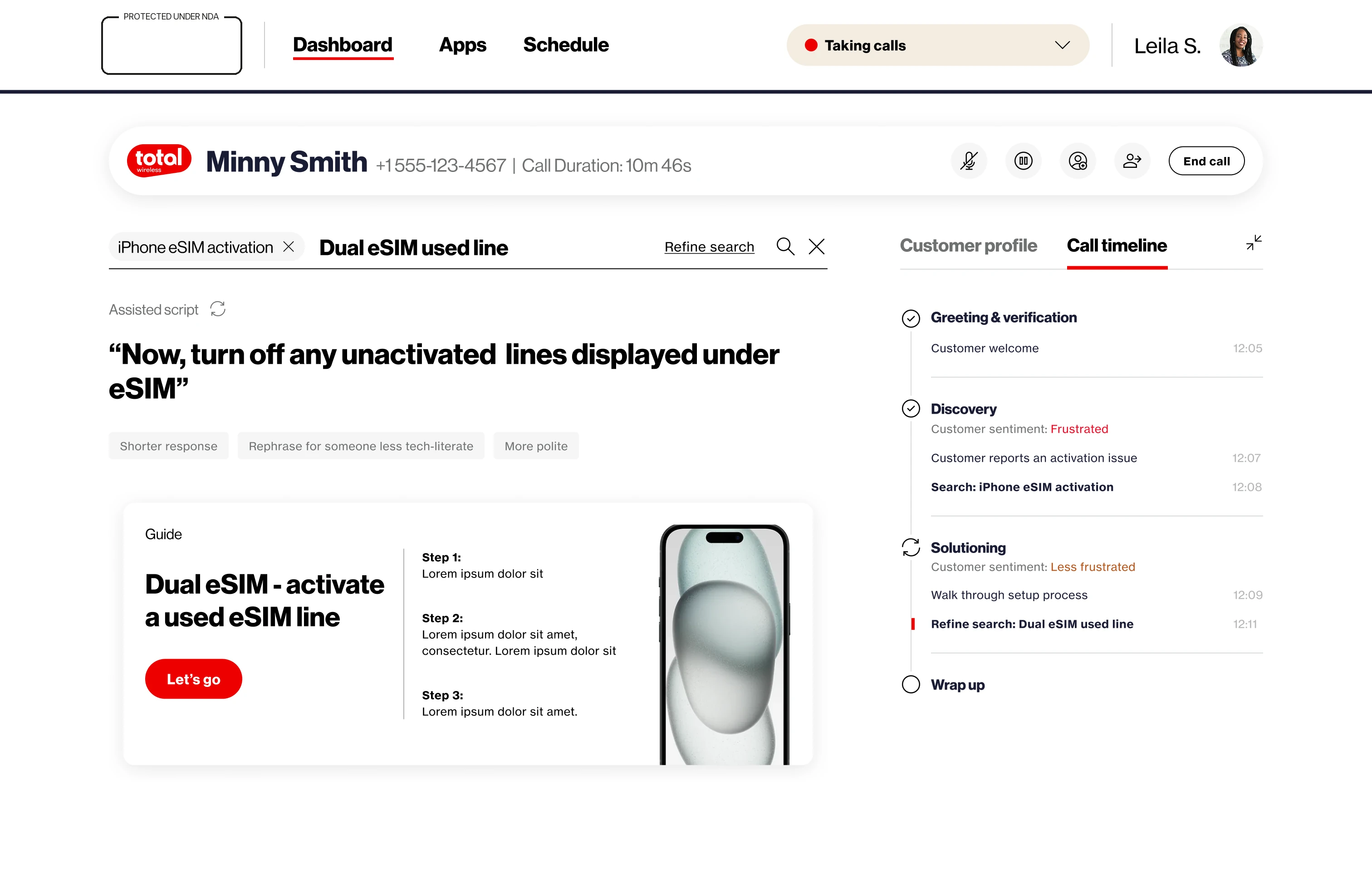
Refined search result with breadcrumb chips
The refined result — a step-by-step guide card, with the search trail held as removable chips.

06 the part that made the room lean in

It reads the room.

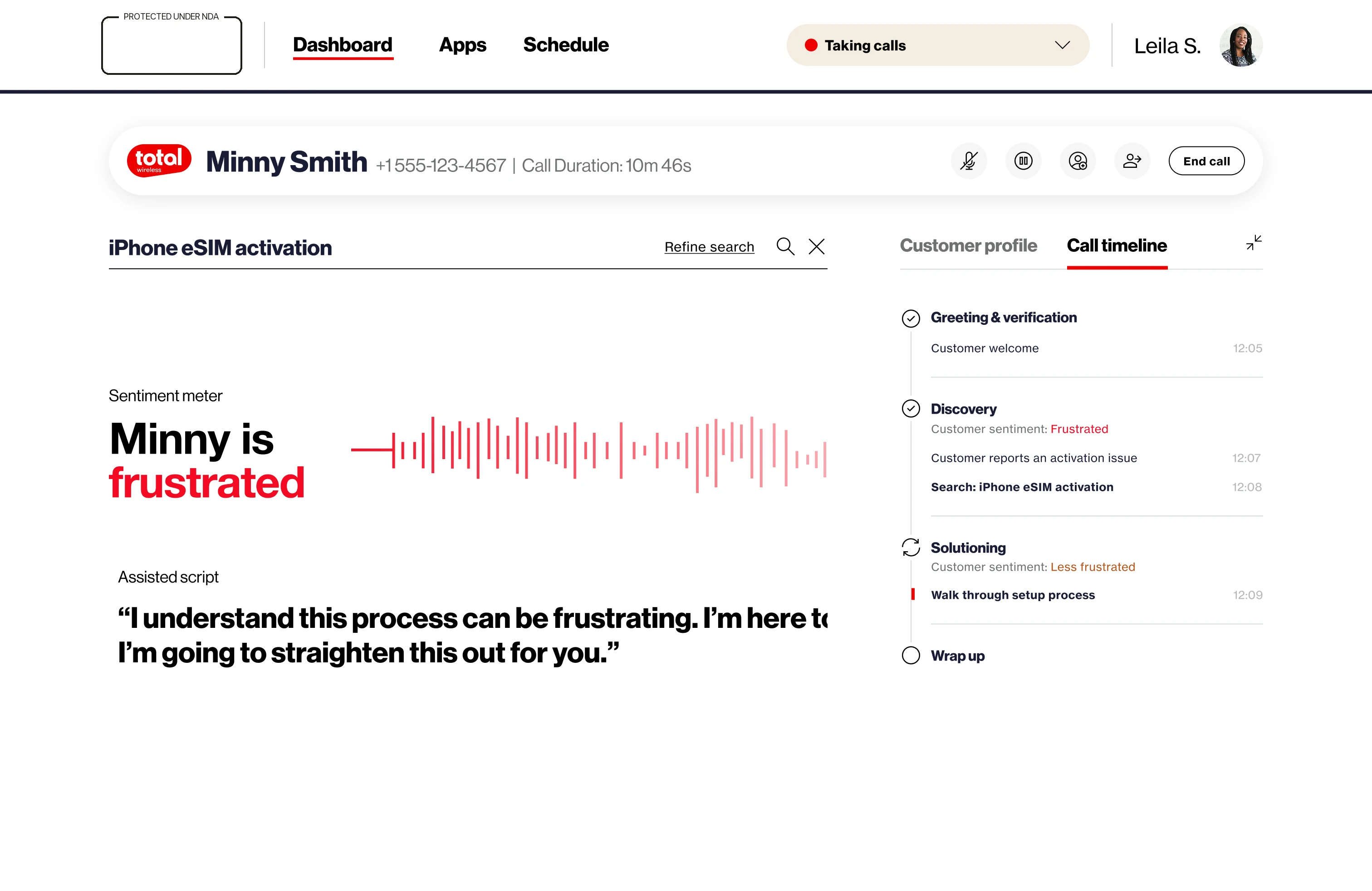
Sentiment isn’t a post-call statistic here. The meter listens live, names the feeling, and changes what the machine suggests — the script turns to empathy, and resolve-or-escalate moves within reach.

Sentiment meter reading: Minny is frustrated
The meter — it names the feeling in words, not a score out of ten, because the next thing the agent reads is written to match it.
Full during-call screen with sentiment meter
The full screen — empathy script drafted, Resolve ticket and Escalate ticket at hand, and the call timeline on the right already marking the low point.

The timeline doesn’t just log events. It logs feelings — frustrated, less frustrated, content — and hands the agent a receipt for the repair.

07 the second engine

Before this, agents could only fix things.

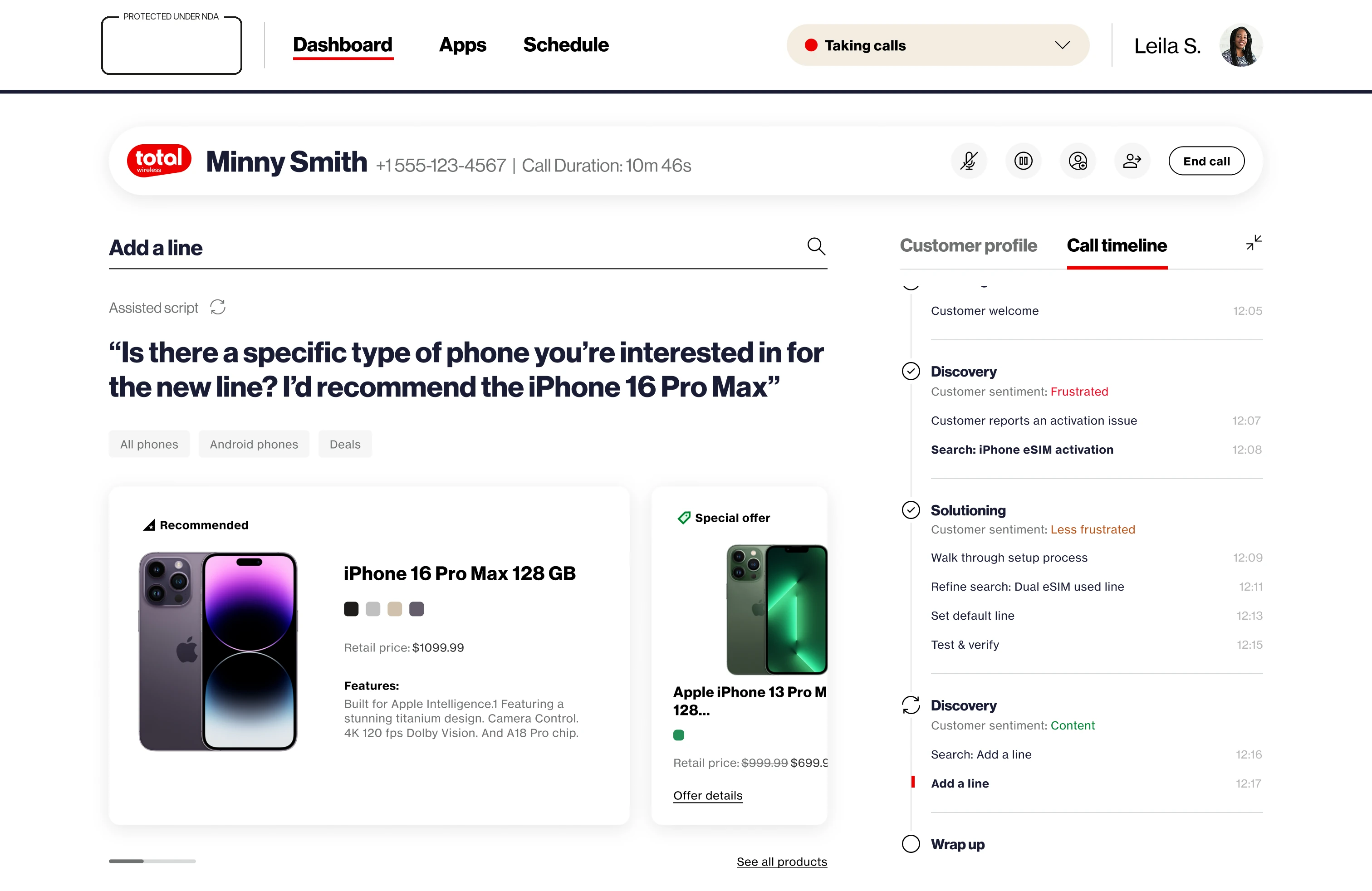
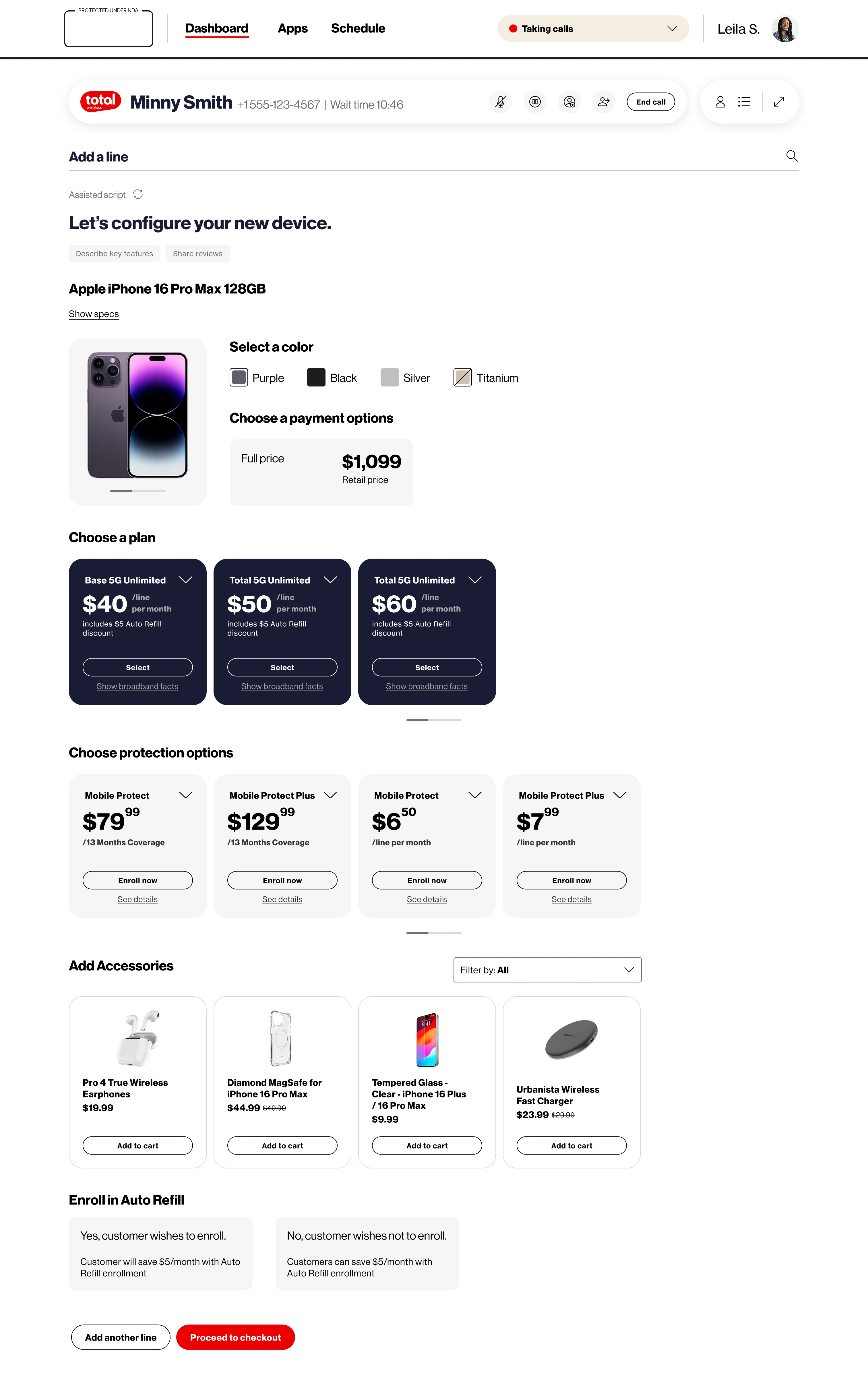
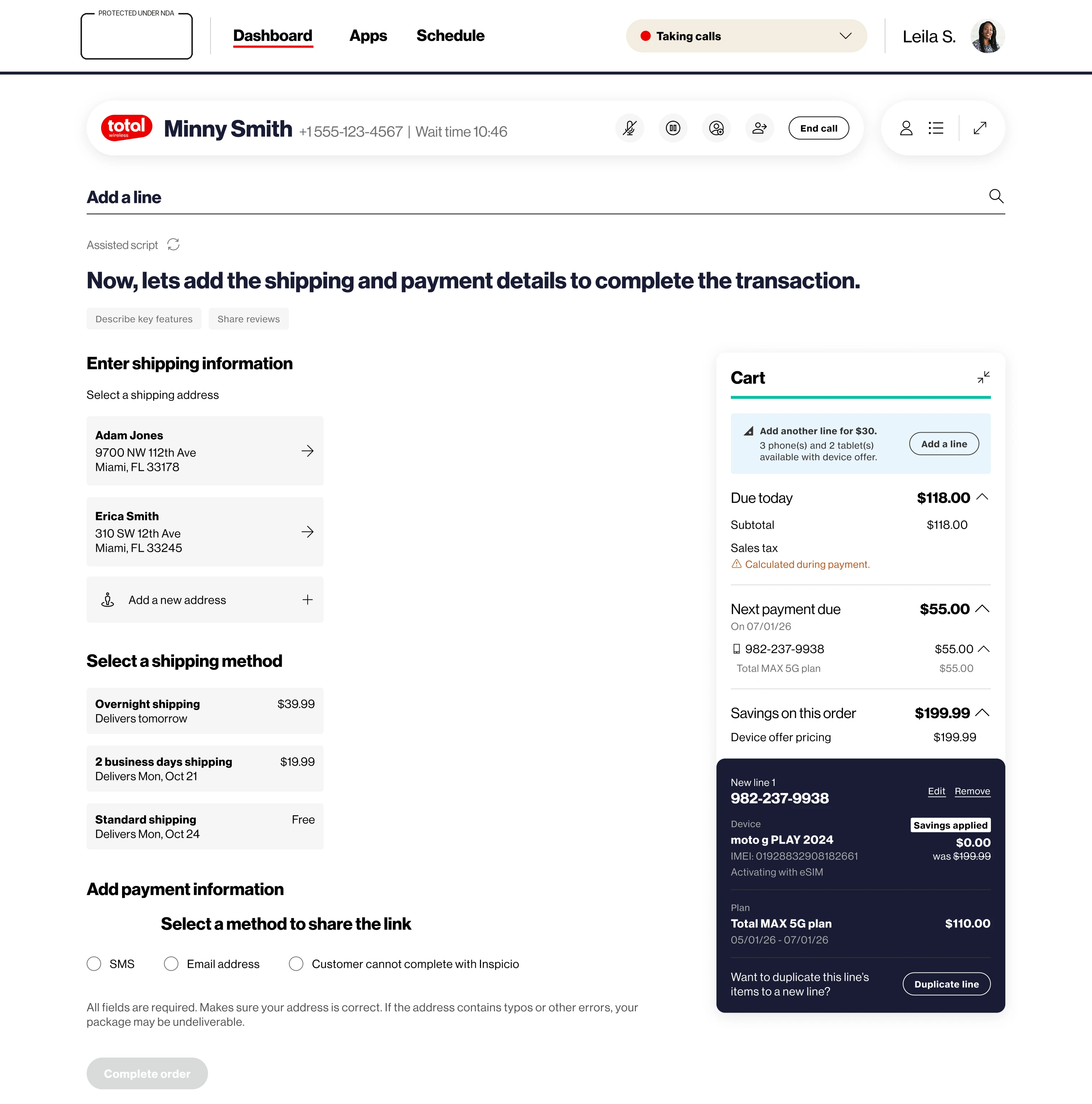
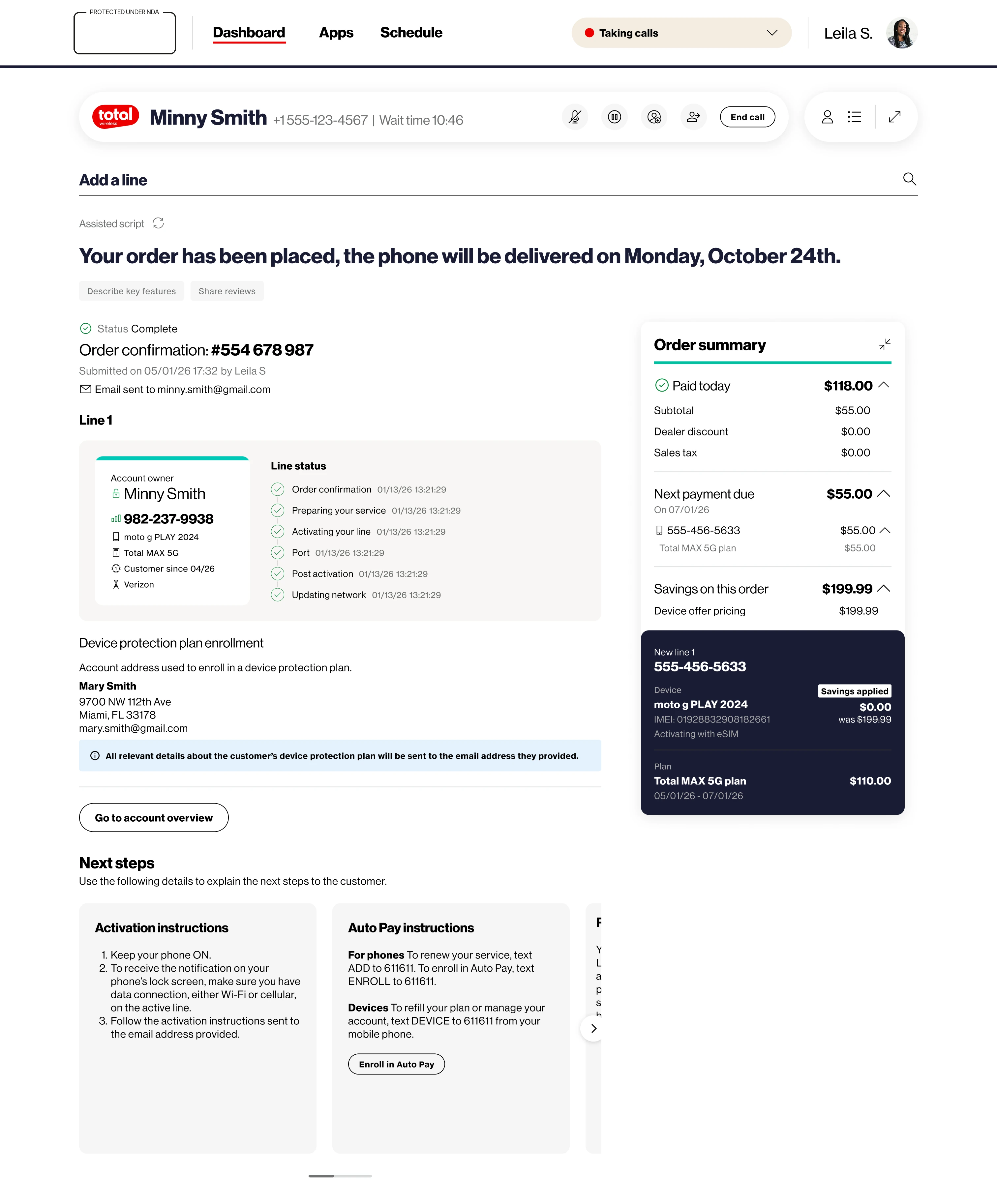
The old floor ran service and nothing else — a customer who wanted to add a line got handed to someone else, or to a website, or to nobody. Sales arrived with this tool. The same portal that resolves an activation can now quote a device, configure a plan and take the payment, which turned a cost centre into a channel.

In-call device recommendations
A second transaction type — “Add a line” opens as its own context, recommendations first. The timeline that just closed a service issue opens a new discovery beneath it: one interaction, two kinds of work.
Device configuration: color, payment, plan

Configure — color, payment, plan tiers, protection.

Checkout: shipping, payment, cart

Check out — shipping, payment, running cart. Or share a link the customer completes herself.

Order placed: confirmation and line status

Placed — confirmation, line status, delivery date. Still on the same call.

08 after the call

Every call ends as a record.

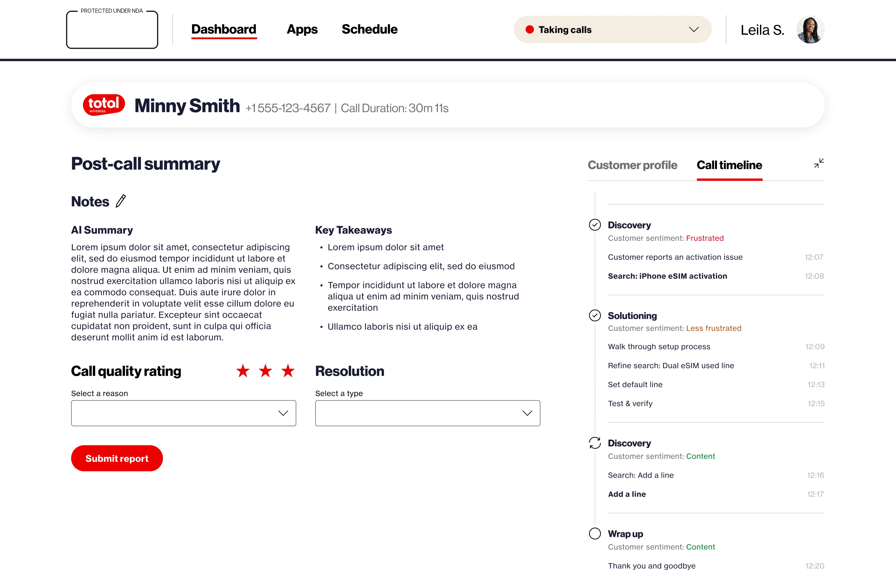
The summary drafts itself — takeaways, notes, quality rating, resolution — so the agent edits instead of authors. It isn’t a loose note either: this screen belongs to Case Management, a micro-frontend that files every call as an interaction ticket on the customer’s profile. The next agent to pick up this customer inherits the whole history, not a blank page.

Post-call summary screen
Post-call — AI summary and key takeaways ready to edit, filed as an interaction ticket. The timeline on the right holds the whole arc: frustrated → less frustrated → content → “thank you and goodbye.”
Report submitted modal with gross adds progress
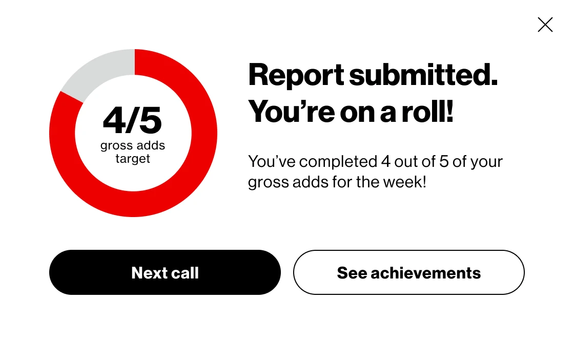
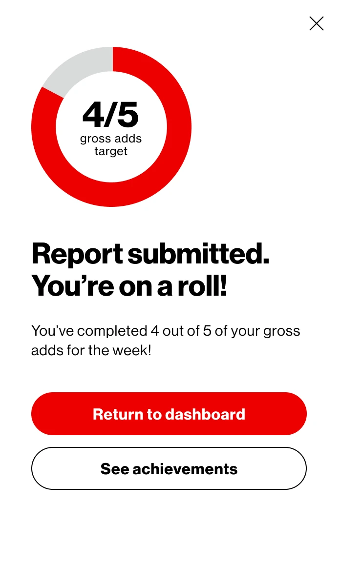
And a little dopamine — report submitted, 4 of 5 weekly gross adds, next call. Agent motivation is a designed surface, not a poster in the break room.

09 the system underneath

One product. Eleven brands.

Every value brand keeps its own color and its own logo on the same bones: a brand bar under the nav, primary CTAs and highlights in the sub-brand’s color, and action cards floated to white so no accent can break them.

Three were themed at concept stage — the three you can switch between here. The other eight were the argument: build it so a brand is a token set, and the ninth costs a palette rather than a redesign.

Pre-call screen, brand themed
Same screen, three brands — the accent moves through the bar under the nav, the primary CTA, the priority numerals and the selected tab. Layout, components and copy do not move at all.

10 same brain, different floor

It walks the store, too.

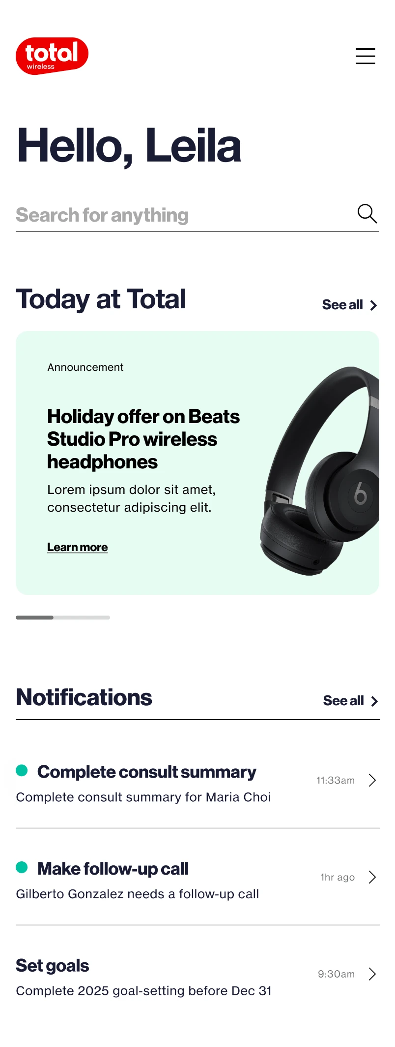
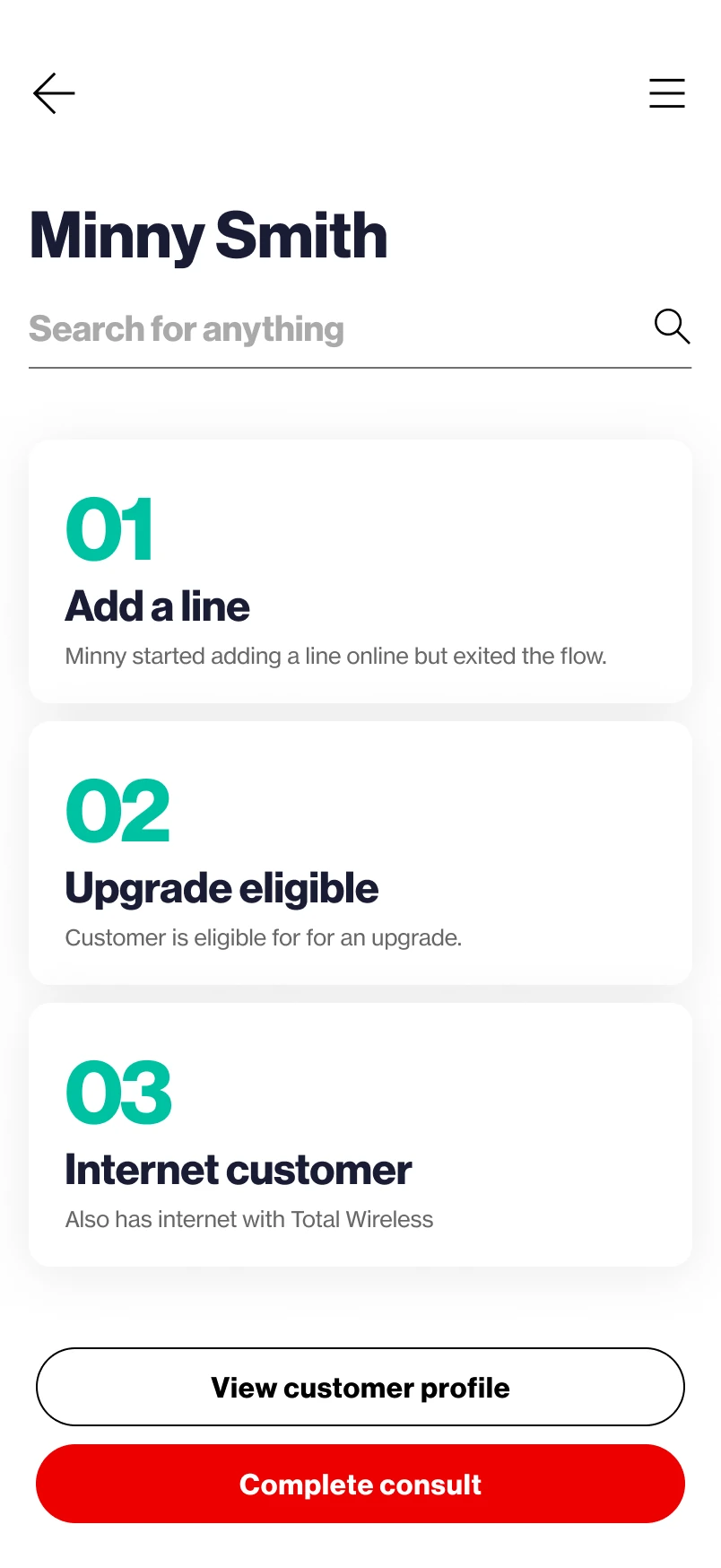
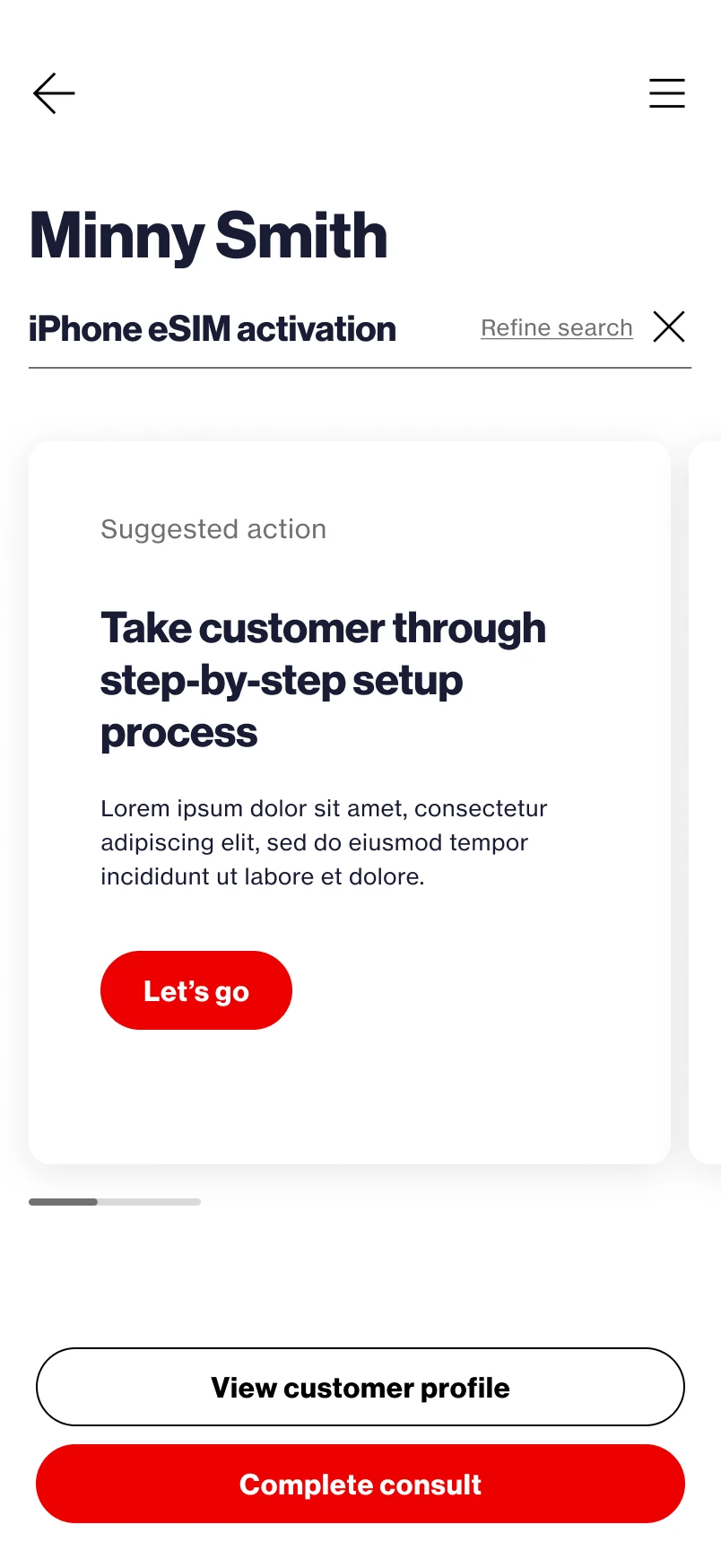
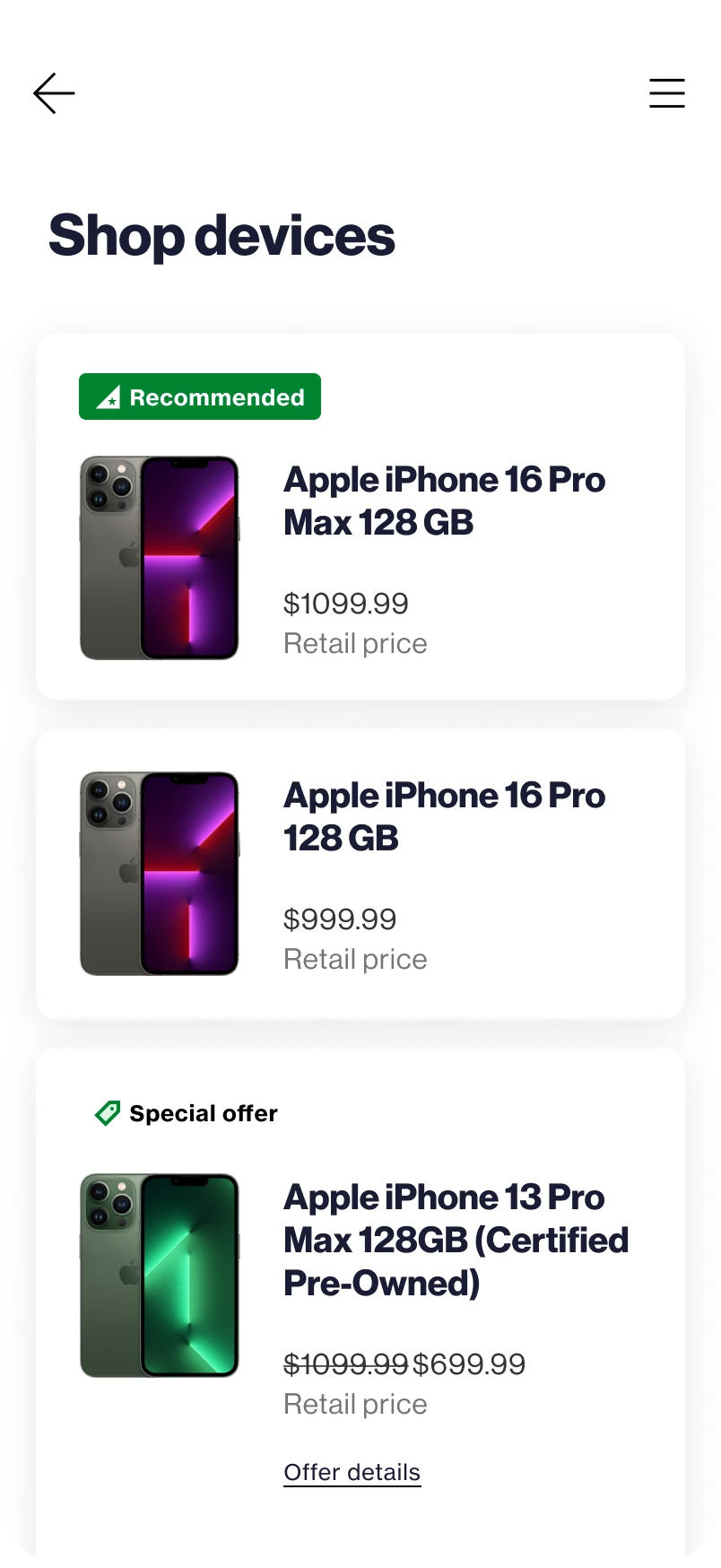
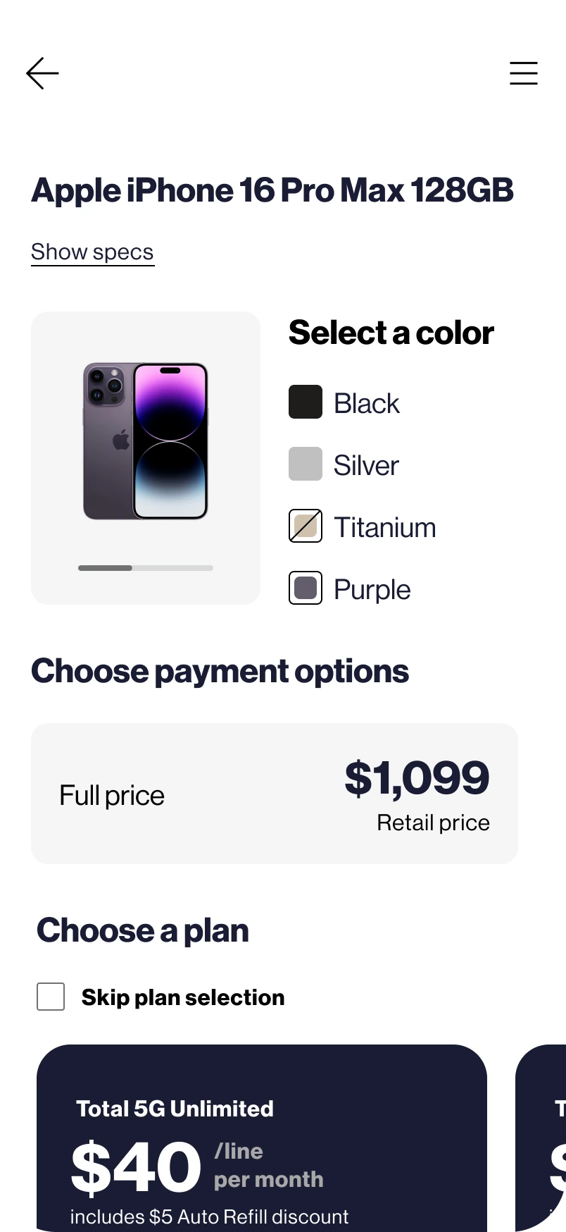
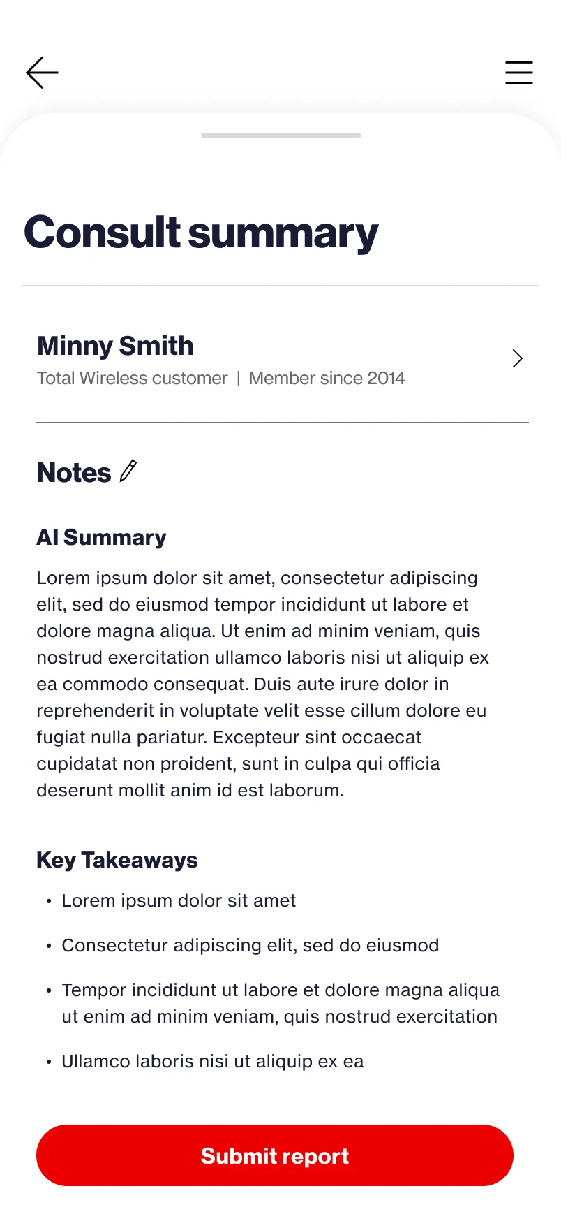
Retail associates carry the same intelligence on a phone. No headset, no queue — the customer is standing in front of you. Look the member up by number, get the same ranked priorities, guide the same setup, sell the same line, and close the consult with the same AI summary.

eleven screensthe whole companion

Announcements and follow-ups, same as the desk.

01 · the shift — Announcements and follow-ups, same as the desk.

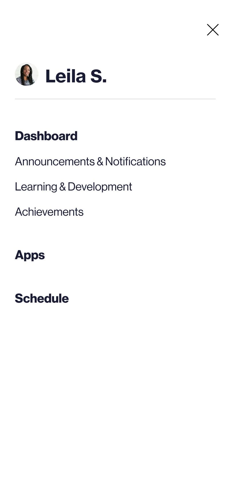
Everything behind a drawer, thumb-first.

02 · navigate — Everything behind a drawer, thumb-first.

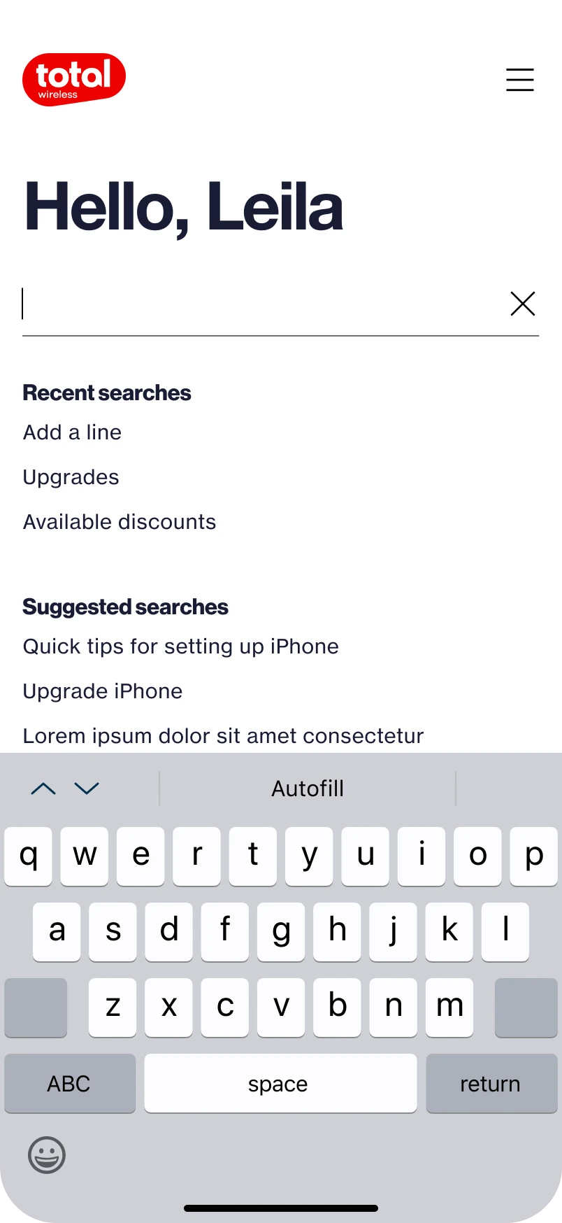
Recents and suggestions before typing.

03 · search — Recents and suggestions before typing.

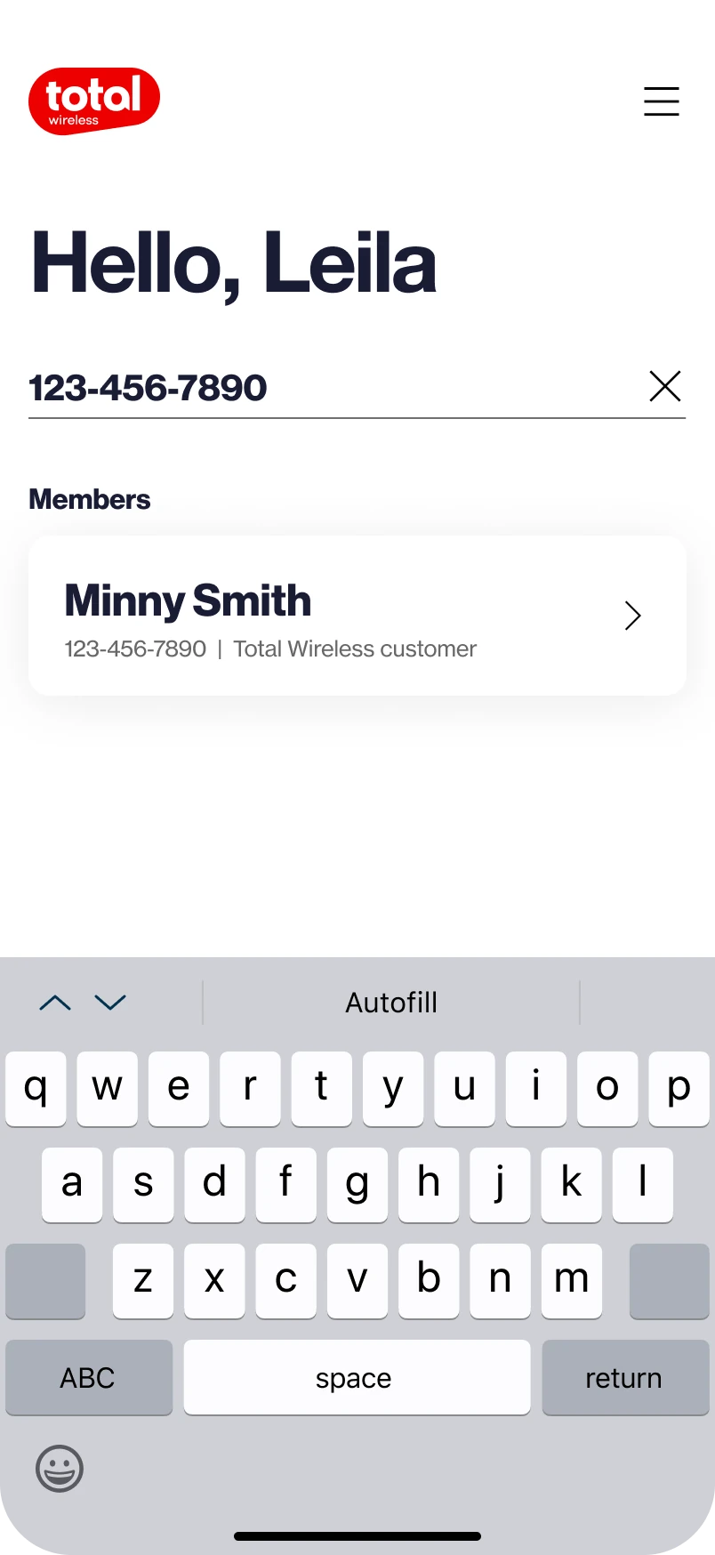
The member, by number — no call to receive.

04 · look up — The member, by number — no call to receive.

The same ranked priorities, before hello.

05 · brief — The same ranked priorities, before hello.

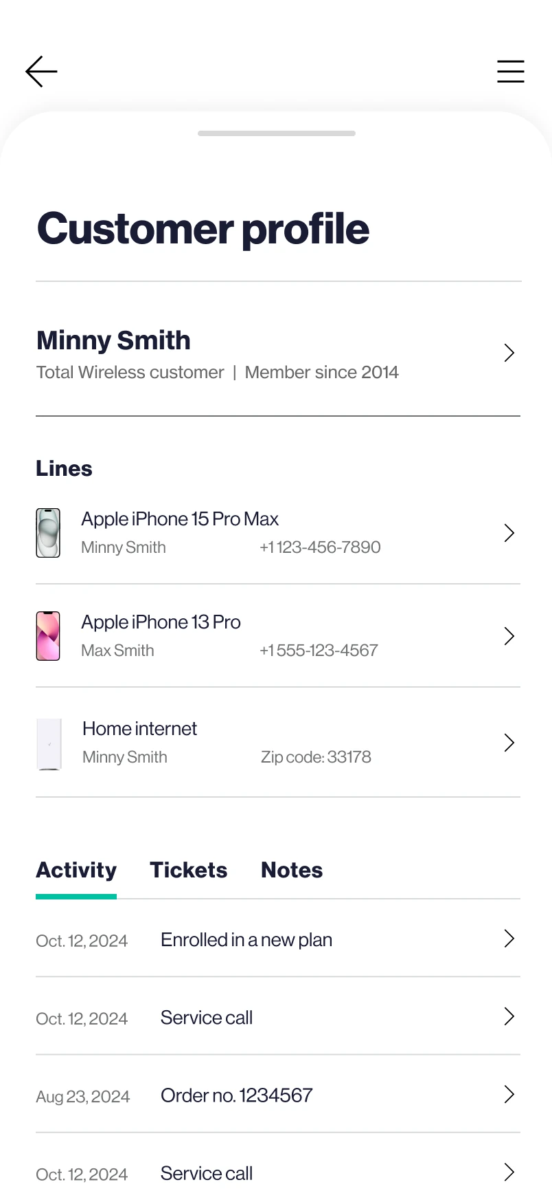
Lines, activity, history — one tap deep.

06 · profile — Lines, activity, history — one tap deep.

Assisted steps, pocket-size.

07 · guide — Assisted steps, pocket-size.

The gridwall, in hand.

08 · sell — The gridwall, in hand.

Colour, payment, plan.

09 · configure — Colour, payment, plan.

Consult summary, filed like any call.

10 · close — Consult summary, filed like any call.

Same wrap-up, same weekly target.

11 · logged — Same wrap-up, same weekly target.

11 traction

The numbers a deck would end on.

14,000+agents and associates using it in production
11prepaid brands on one design system
$700k+invested in the build to date
2channels live — care centers, then retail stores

Most pitches end with an ask. This one ended with a build — funded, shipped, and in fourteen thousand hands.

part two what i did

A spreadsheet of asks became a funded platform. Then it needed a team.

The pitch above is the product talking. This part is mine, and it has two movements — earning the mandate, then building the practice that could deliver it. I joined as the only designer on this and I’m still on it twenty-two months later, three titles later, twelve people later.

movement one

Earning the mandate

What I inherited was a dated interface and an Excel file of requirements. What it had to become was a business case — because nothing here was funded on the strength of a screen.

inheritedAn outdated tool and a list of asks No product thesis, no system, no argument for why any of it mattered. The first job was deciding what this was, not what it looked like.
argued forSales, on a floor that only did service The tool’s biggest idea wasn’t an interface. It was that the same portal resolving an activation could also quote a device and take a payment — which is how a cost centre becomes a channel.
argued forOne system, eleven brands Eleven prepaid brands could have meant eleven builds. Making the brand a theme — accent, bar, logo — over one skeleton is what made the scope affordable enough to say yes to.
result$700k+ committed to the build Not a redesign that got approved — a capability that got bought. Everything after this row exists because that argument landed.
movement two

Building the practice

A funded platform is a delivery problem. Going from drawing every screen to being accountable for screens I don’t draw is the actual change in the job — and the part I’d want to be judged on.

team of oneSenior Product Designer Wires, client reviews, redlines, solo. Every screen in Part One started at this desk.
thenDesign Lead The point where the bottleneck stopped being the work and started being me.
nowDesign Manager — a team of 12 Across two channels, eleven brands and a micro-frontend architecture, delivering continuously. Still in the file every week; managing is easier when you remember what it costs to make something good.
scope movedCare centers → + Retail stores The desktop copilot earned a second life on the store floor — associates carry the mobile companion, and stores run the desktop app at the counter for the division’s flagship brand.
statusLive · 14,000+ users · still evolving $700k+ invested and running strong. The version in production today is generations past these frames.
the multiplier

The system had to do the managing

Eleven accents and zero layout forks isn’t a visual decision, it’s a staffing one. Every rule that holds — cards float white, the brand is a theme, components don’t branch — is a decision twelve people don’t have to relitigate.

the seams

Designing against other people’s systems

CTI owns the call. Case Management owns the ticket. Neither is mine, and the product only feels like one thing if design is fluent at the seams — which meant learning enough of the architecture to be useful in the room where it gets decided.

the bar

Consistency is the manager’s output

One designer holds a standard by doing the work. Twelve hold it by agreeing what the standard is — so most of the craft conversation moved upstream, into what we decide once and never argue about again.

still open

The part that isn’t finished

Two channels are live and the surface keeps widening. The question I’m working now is how far this can go before one product becomes several — and what has to be true for it not to.
the pitch that got fundedthe rest is under nda

What you just saw is the oldest thing about this product. These are the concepts that secured the funding — the live platform has evolved far beyond them, and that evolution is the twenty-two months. The current interface, its metrics and its roadmap stay behind the NDA, where they belong.