Tanmay made you a case study

The unwrapping is the gift.

Dearly is a free, no-login way to send someone a wrapped moment instead of a text — live at fromdearly.com, built solo, end to end. So this case study arrives the way the product arrives. Untie it.

Drag the tab • or tap to untie — the product's own words Opened. Drag it back to wrap it up again.

RoleProduct design & frontend build, solo TypeSelf-initiated · shipped ScopeProduct · UX · Visual system · Build PostedAug 9, 2026 — live
Why this exists

I went looking for this, and every version of it was a chore.

This didn't start as a product idea. It started as a failed errand: I wanted to send someone something that felt like more than a text, went looking for a way to do it, and gave up. Three things were wrong with everything I tried — and each one turned into a decision.

01

It only went one way.

You send a thing into the void. The person receives it and there's nowhere to put what they felt about it — no reply, no acknowledgement, nothing back. For something whose entire purpose is connection, the connection was one-directional.

Became the hardest problem in the build. See Afterglow.
02

Too many choices, or none at all.

Either a catalogue of hundreds of templates to scroll before you can start, or a single fixed card with your name dropped into it. Both fail the same way: the effort goes into picking instead of into what you actually wanted to say.

Three wraps. Not one, not a hundred.
03

The whole thing felt like admin.

Make an account. Confirm an email. Now make them make an account. A gesture that should take two minutes turned into a form-filling session, and the feeling drained out somewhere around the password field.

No account, either side. One screen, one link.
Packed · the wrapping room, step by step

Six decisions, one screen.

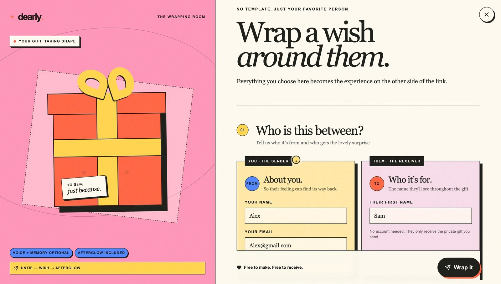
The sender never navigates anywhere. A live preview holds the left half the whole way down, and every choice on the right repaints it before they've finished making it — so “what will they actually see” is never a guess.

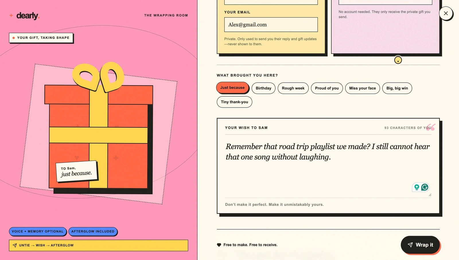
Step 01, Who is this between: sender and receiver cards side by side, an occasion picker, and the wish textarea with a character counter reading 93 characters of you.
01

Who it's between. Two named cards, not one form: the sender leaves an email purely so a reply can find its way back, and it is never shown to the receiver. Naming the occasion relabels the sticky note on the box immediately. The wish counts up in “characters of you” rather than characters remaining.
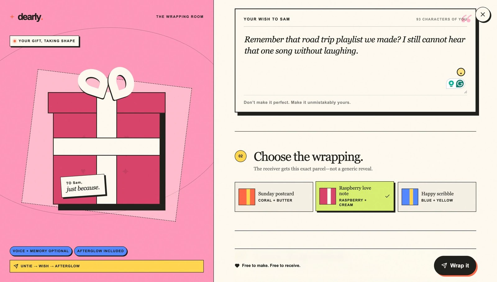
Step 02, Choose the wrapping: three named wrap styles, with Raspberry love note selected and the live preview re-themed to raspberry and cream.
02

The wrapping. Three, not one and not a hundred. Each is a full re-theme rather than a tint — picking Raspberry love note repaints the box, ribbon and bow on the left mid-thought. “The receiver gets this exact parcel, not a generic reveal.”

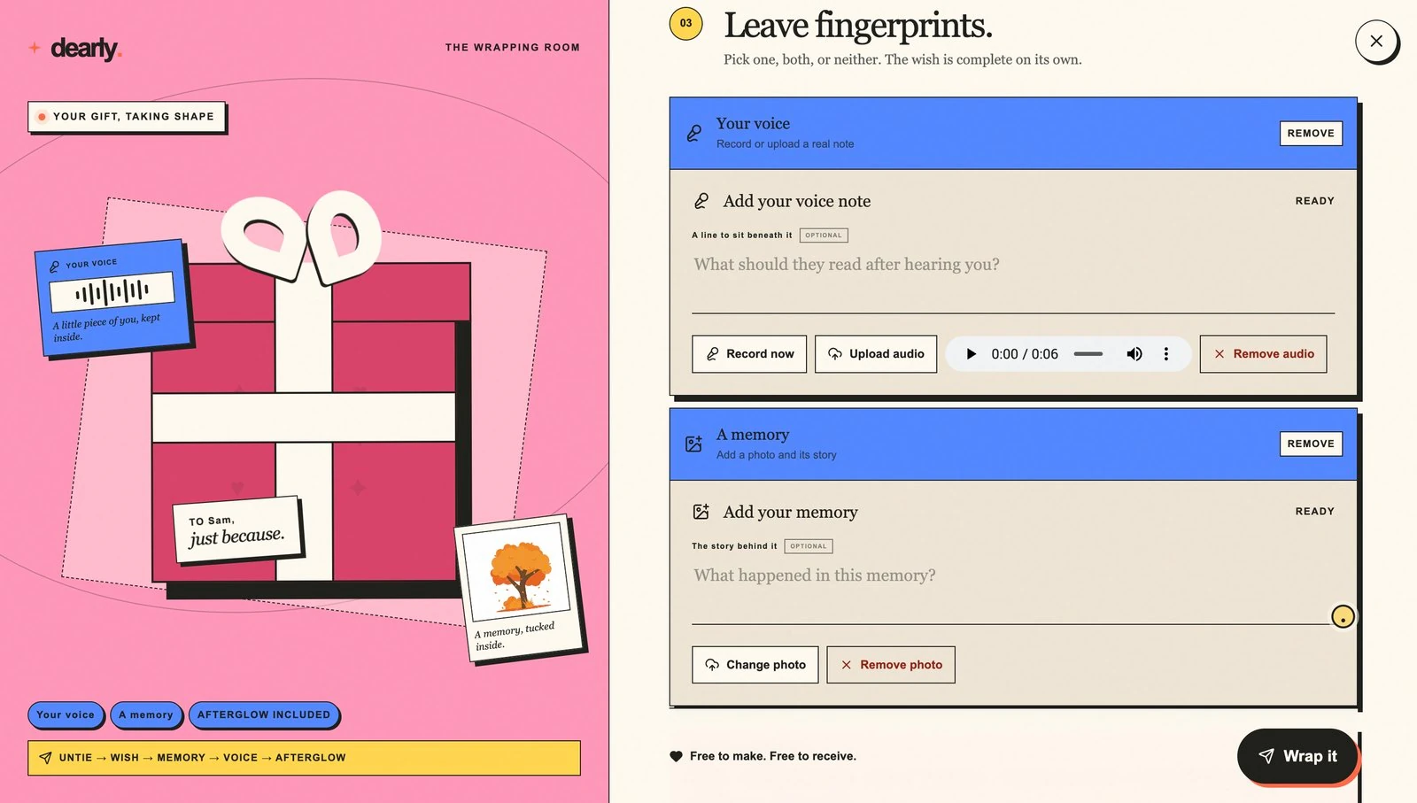
Step 03, Leave fingerprints: optional voice note and photo memory, above a pink panel describing the receiver's experience.
03

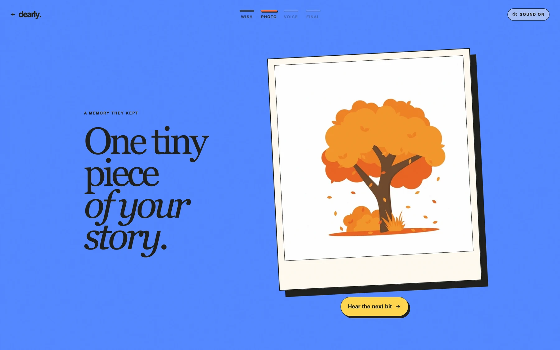
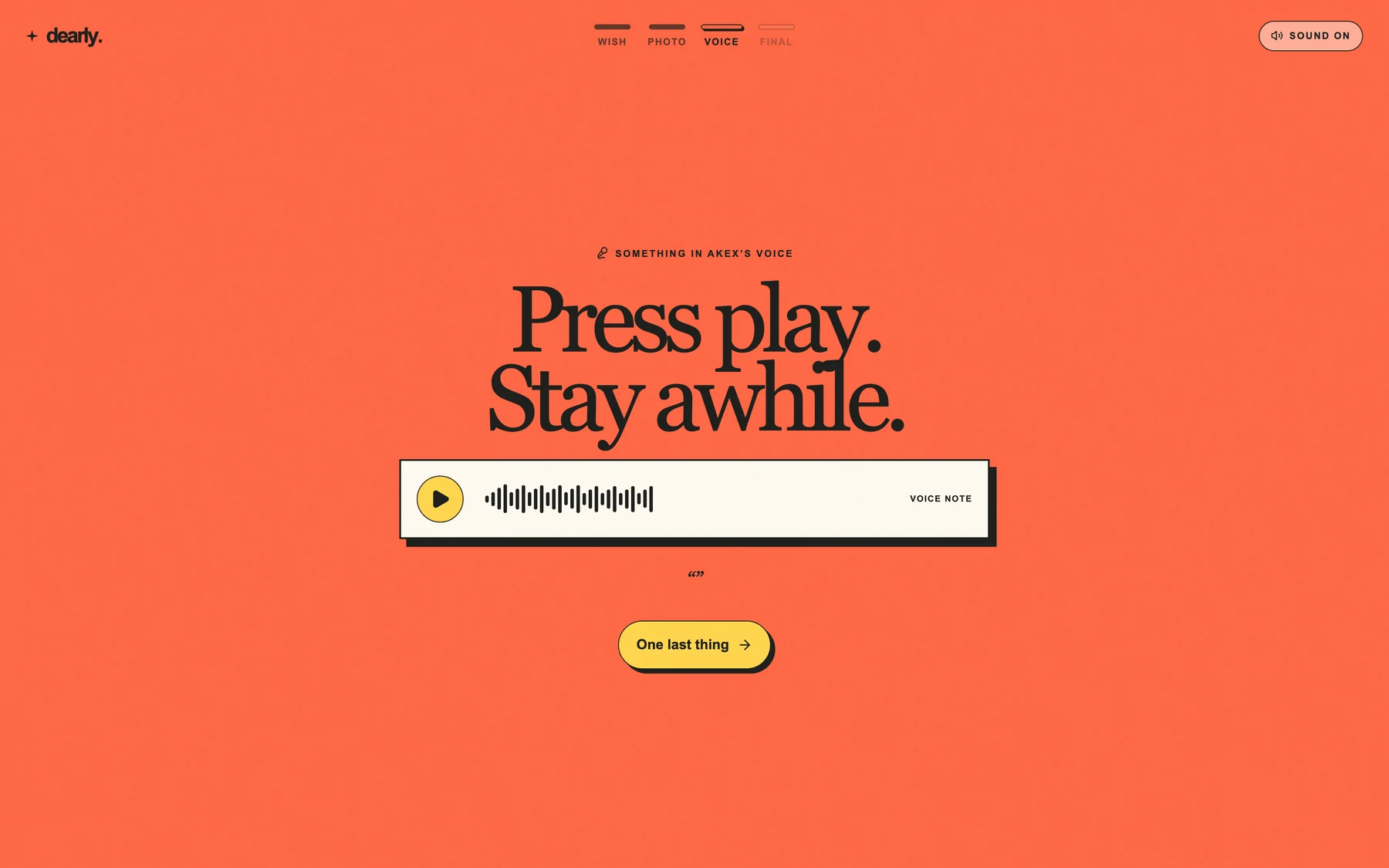
Fingerprints, optional. A voice note and a photo-with-its-story, both opt-in: “pick one, both, or neither — the wish is complete on its own.” The panel underneath spells out what the other side will get, so the sender is never guessing at the experience they're buying into.
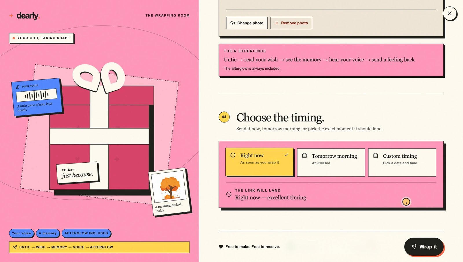
Step 04, Choose the timing: right now, tomorrow morning, or a custom moment, with Wrap it waiting at the bottom.
04

The timing, then wrap. Now, tomorrow at 9am, or an exact moment. That last option is the one that forces real infrastructure — a promise the backend has to keep long after the tab is closed. Only then does Wrap it come alive.

05 & 06 · not pictured

Then: how to send it, and sending it.

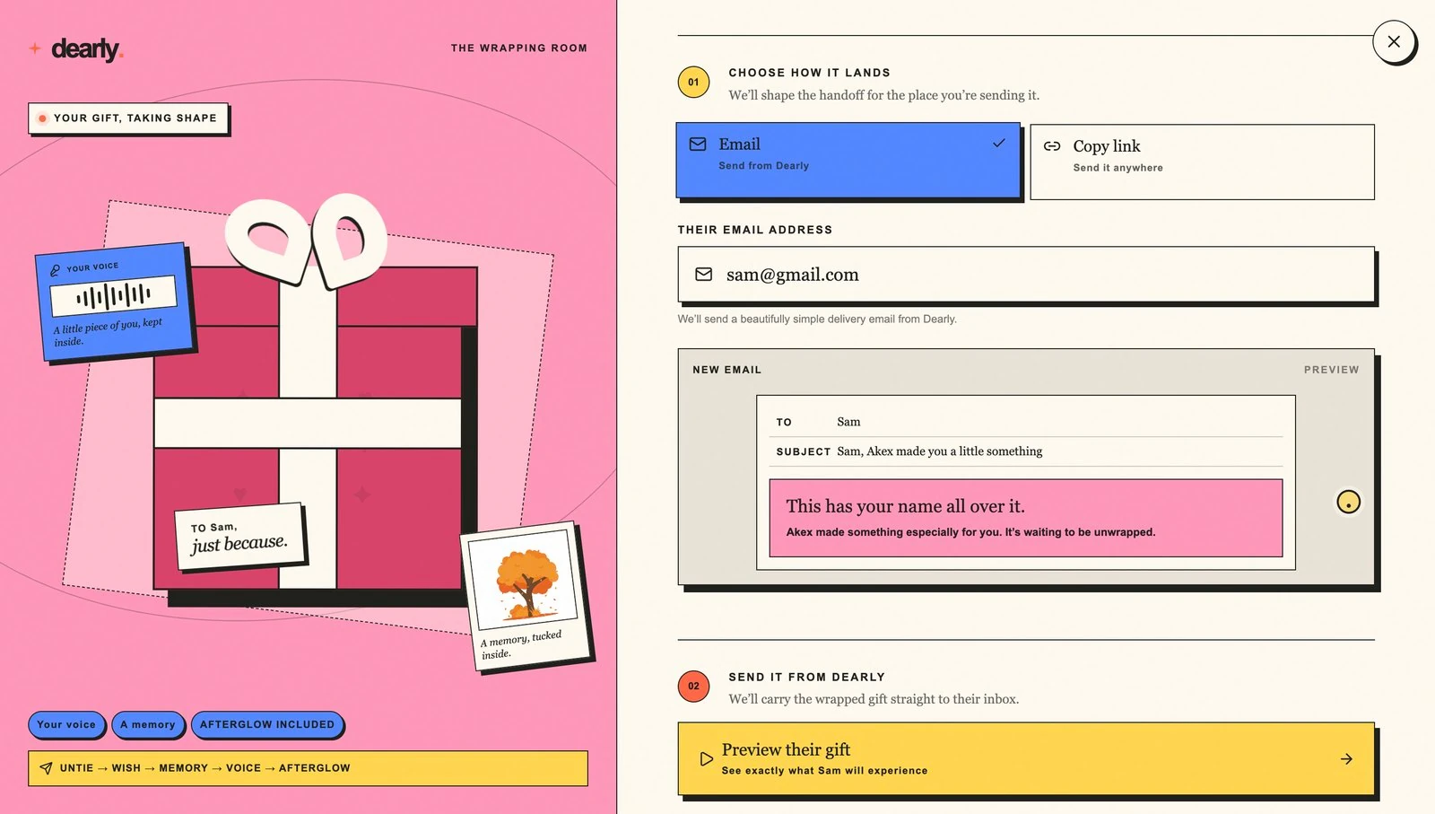
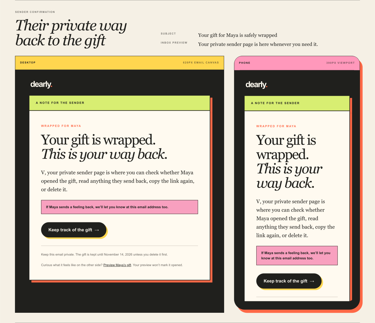
Wrapping mints the gift and hands back two private links — one to send, one the sender keeps. Choosing a channel and sending are the last two steps. They aren't shown because reaching them means creating a real gift in the live product, and this case study doesn't put test rows in someone's production database to get a screenshot.

05

Send, or hand it over. Email is one channel; copy the link and send it myself is an equal one. What happens to it next is the subject of the following section.

Keep scrolling 01 / 05
In transit · the part that took longest

Knowing whether it actually arrived.

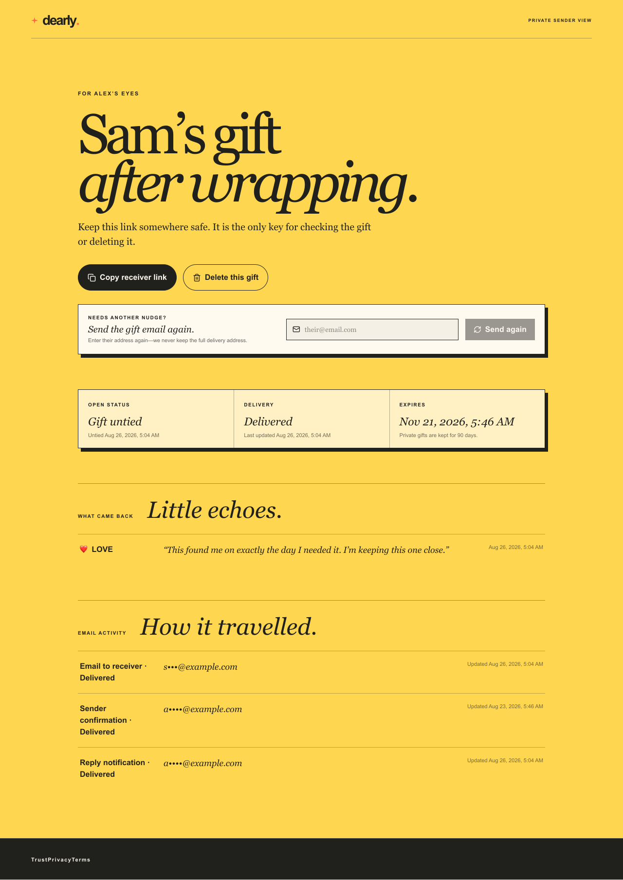
This was the hardest thing in the project, and it's invisible. Writing and wrapping a gift is a screen problem. Getting it to land — and knowing when it didn't, and why, and where it stopped — is a different kind of problem, and it took the longest to get right.

A gift is not a page view. If it silently fails to arrive, the sender doesn't just lose a feature — they think their person got something and was unmoved enough not to mention it. Silent failure is the worst possible bug in a product like this.

How a gift actually travelsthe shape that made tracking possible
1 · WrapThe gift is created first, as its own step, and comes back with a permanent home. It exists before anyone has tried to send it anywhere.
2 · DeliverSending is a separate operation against that gift, not part of making it. Splitting the two is what makes the rest of this possible.
Because of thatScheduling is real: “tomorrow at 9am” is a delivery booked against a gift that already exists, not a request held open in a browser tab.
And because of thatA failed send is recoverable instead of fatal. The gift didn't evaporate — delivery just hasn't happened yet, and can be retried or rerouted.
Handing it overEmail is one channel; “copy the link and send it myself” is an equal one, not a consolation prize. Some gifts are better handed over in person.
When it failsThe failure has a written script, not a red triangle: “Delivery could not be completed. Copy the private link instead.” The moment survives the outage.

The bot problem, without a puzzle.

Anything that sends email on a stranger's behalf gets abused within days of going live. The standard fix is a CAPTCHA — which would mean asking someone to identify traffic lights in the middle of the most sincere thing they'll do all week. Screening runs invisibly instead, on both doors: sending a gift, and sending a feeling back.

Delivered · the ten seconds that matter

The other side of one link.

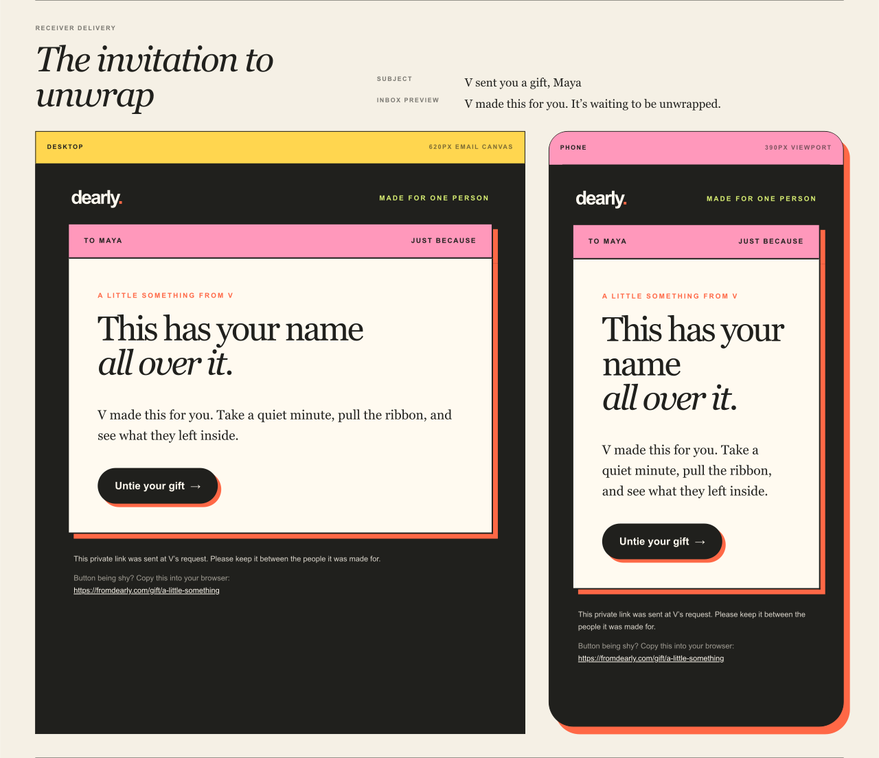
The receiver never sees a form, an account wall, or an install. They land on a page built only for them and open it with their hands — the same gesture you used at the top of this page.

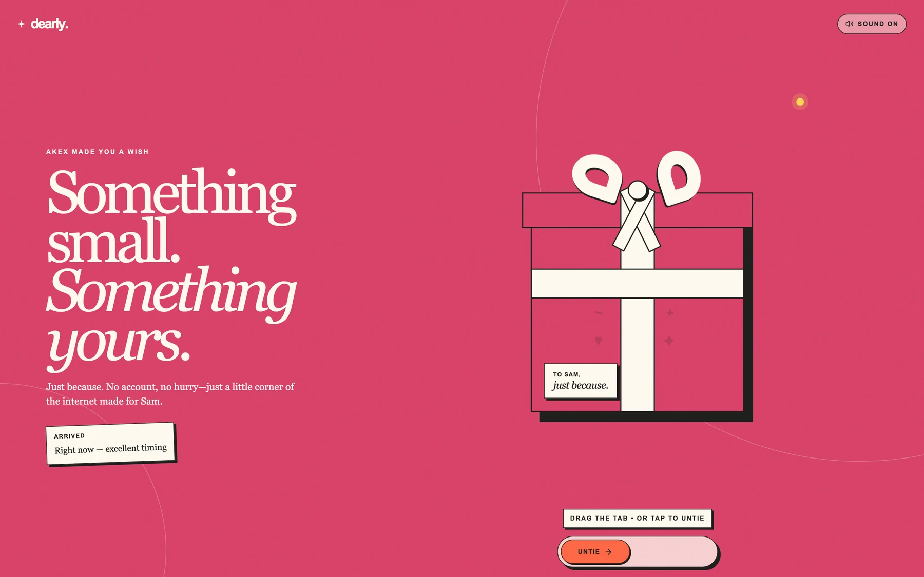
The receiver's landing page: a personalised headline, an arrived timestamp, the wrapped parcel and a drag-to-untie tab.
01

Arrived. Personalised before they've done anything — their name, the occasion, an “arrived” stamp reading “right now — excellent timing.” The parcel rendering here is the exact wrap the sender chose four steps ago, not a house default.

Mid-reveal: the ribbon released and the note card sliding out of the parcel.
02

Untied. Not a state change — a sequence. The ribbon lets go, the card slides part-way out on its own, and only then is the wish readable. A few hundred milliseconds of held attention: long enough to register as a moment, short enough to never read as waiting.

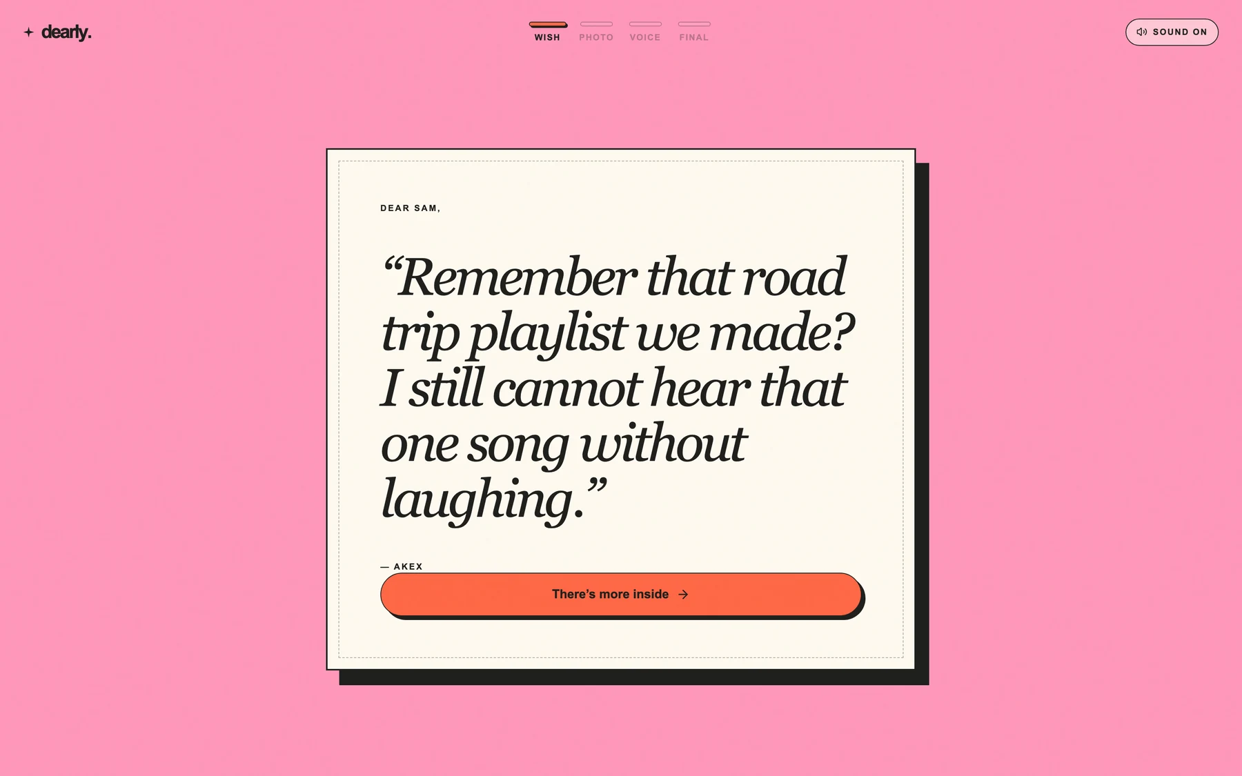
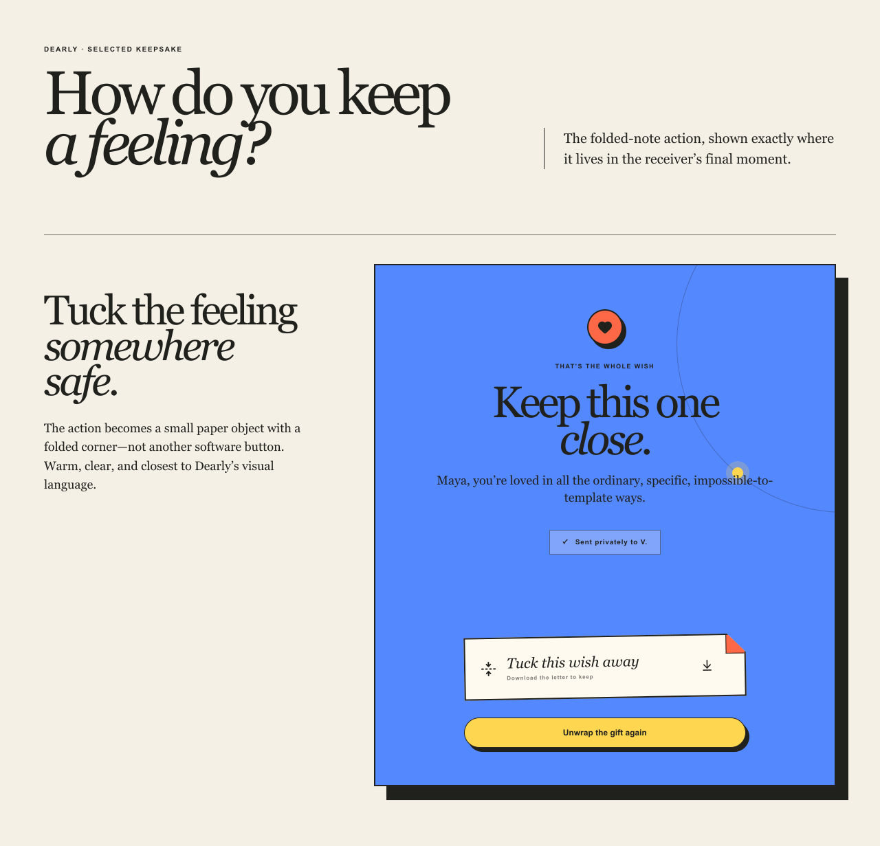
The revealed wish alone on its own card, with a Keep this close button.
03

The wish, alone. Everything else goes quiet. No nav, no branding competing for the read, no next-step nagging at the edge of the frame — just the thing somebody wrote, at the size it deserves. This is the whole product, and it is one screen with almost nothing on it.

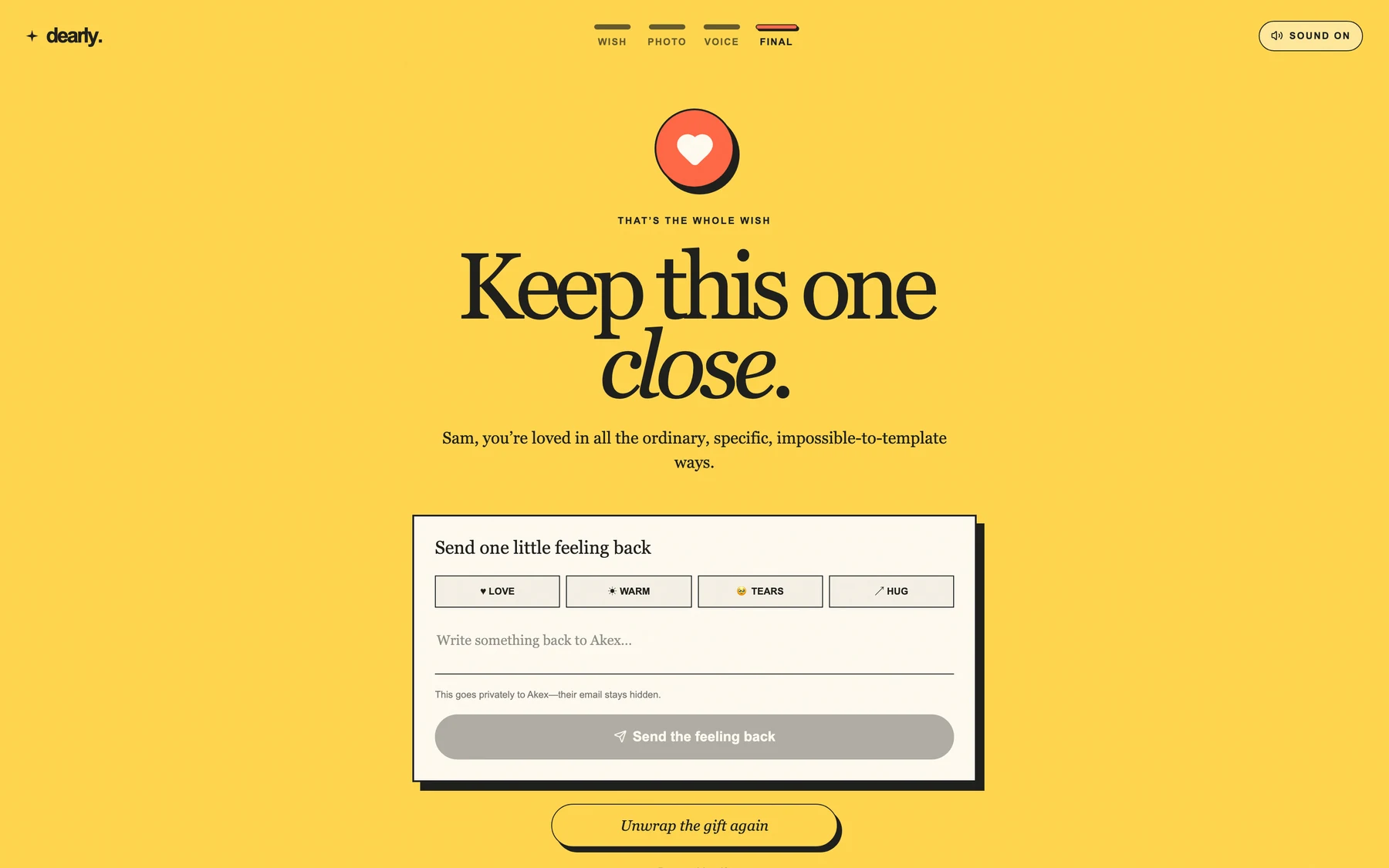
The closing yellow screen: send one feeling back with Love, Warm, Tears or Hug, plus a private note field.
04

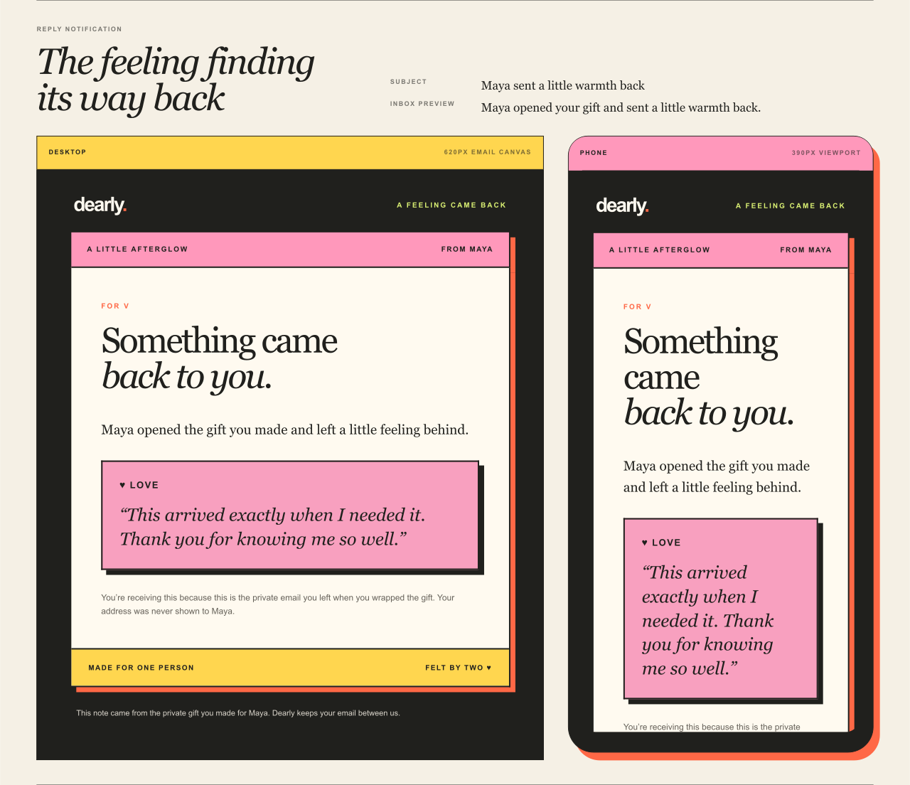
And then it asks. The ground turns yellow and the page requests one thing back — a feeling, or a few words, routed privately to a sender whose address was never revealed. The loop closes here, which is the entire reason the product exists.

Keep scrolling 01 / 04
Left out · on purpose and otherwise

What didn't go in the box.

One person, about a month, start to live. Scope was the whole game — three things came out along the way, for two different reasons, and both reasons are worth being straight about.

Cut listand where each one went
Money, in any formGift cards, chipping in, tipping the sender — the obvious next dimension for a gifting product. The payment rails didn't come together for a solo build, and rather than hold the launch hostage to that, the entire money dimension came out. Cut for a real-world constraint, not a design one.
Text messagesSMS delivery would beat email for something this personal — most of these gifts get handed over in a text anyway. It's carrier setup and per-message cost on a free product, so it waited. The copy-the-link channel exists partly to cover this gap by hand.
Accounts · history · a dashboardThis one was cut on purpose and stayed cut. Every one of them would have solved the reply problem the easy way, and every one would have reintroduced the exact friction that made the category feel like a chore. The harder path was the point.

What's next.

Money goes back on the table first — it's the one cut that was forced rather than chosen, and it's the difference between a thing people love and a thing that can sustain itself. SMS follows. Both are additive: neither requires an account, so neither breaks the one rule the product is actually built on.

Afterglow · complaint 01, answered

Where do you anchor a reply between two strangers?

Every messaging product solves replies with identity — two accounts and a thread between them. Take accounts away and there is nothing left to hang a conversation on. The answer was to make the links themselves the identities: wrapping mints two private URLs at once, one the receiver opens and one the sender keeps, so a feeling can travel back between two people who never signed up for anything.

Which is also why the page you just scrolled ran pink, then paper, then yellow. It's your turn.

Open the real thing

fromdearly.com · free · no account for either of you