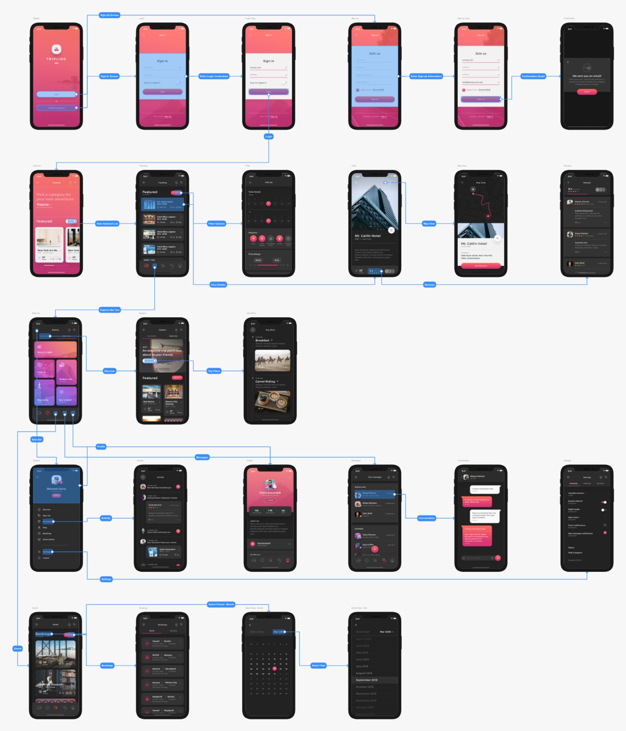
Five stops, one flow.
Sign in & sign up
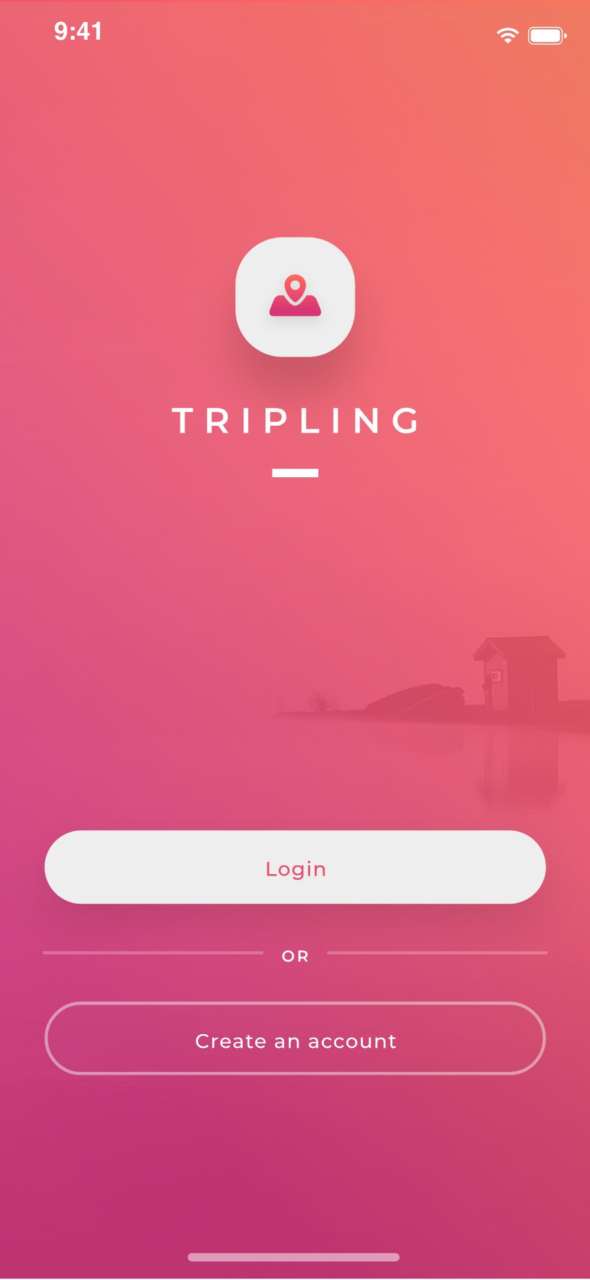
The first thing the app asks of you is nothing at all. A wordmark, a lake fading into the gradient, and two ways in — the five seconds of calm before any form appears.
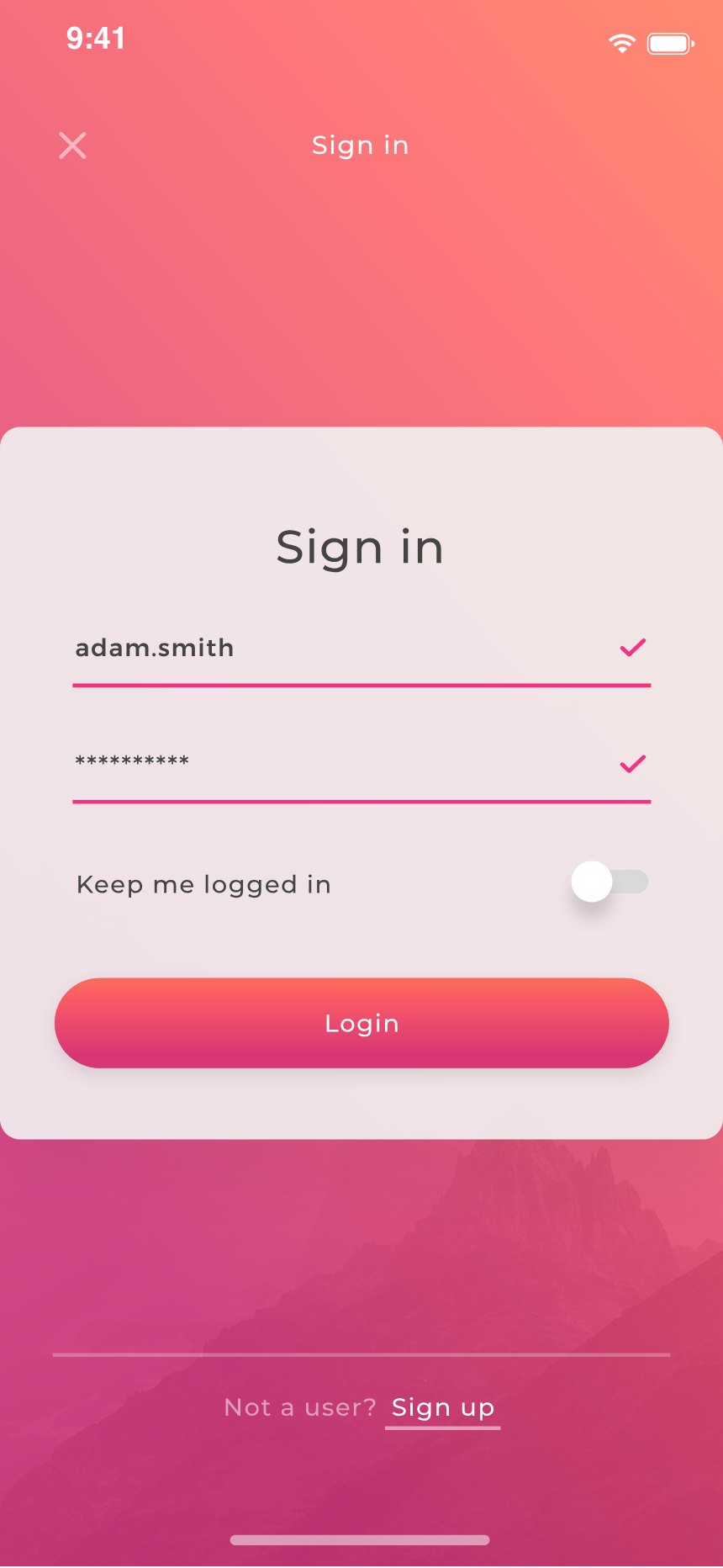
Sign-in was designed twice: once empty, once mid-entry. This is the second one — a checkmark has already confirmed the username before the password field is even reached.
Every field in the sign-up flow carries the same inline check, with the terms checkbox gating the button. Nothing surprises you after the tap.
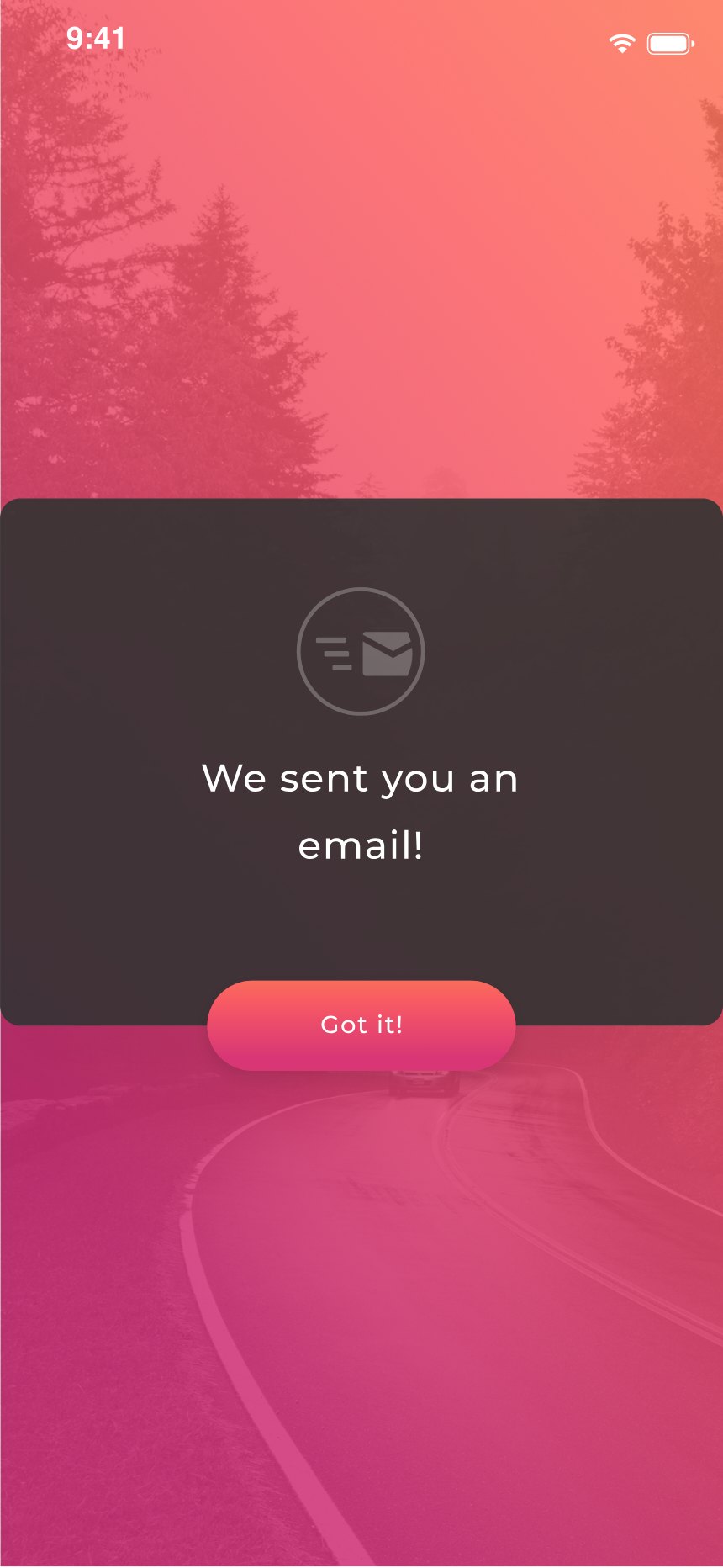
“We sent you an email!” A closed loop with one clear next step — not a silent redirect that leaves you wondering whether anything happened.
Discover & filter
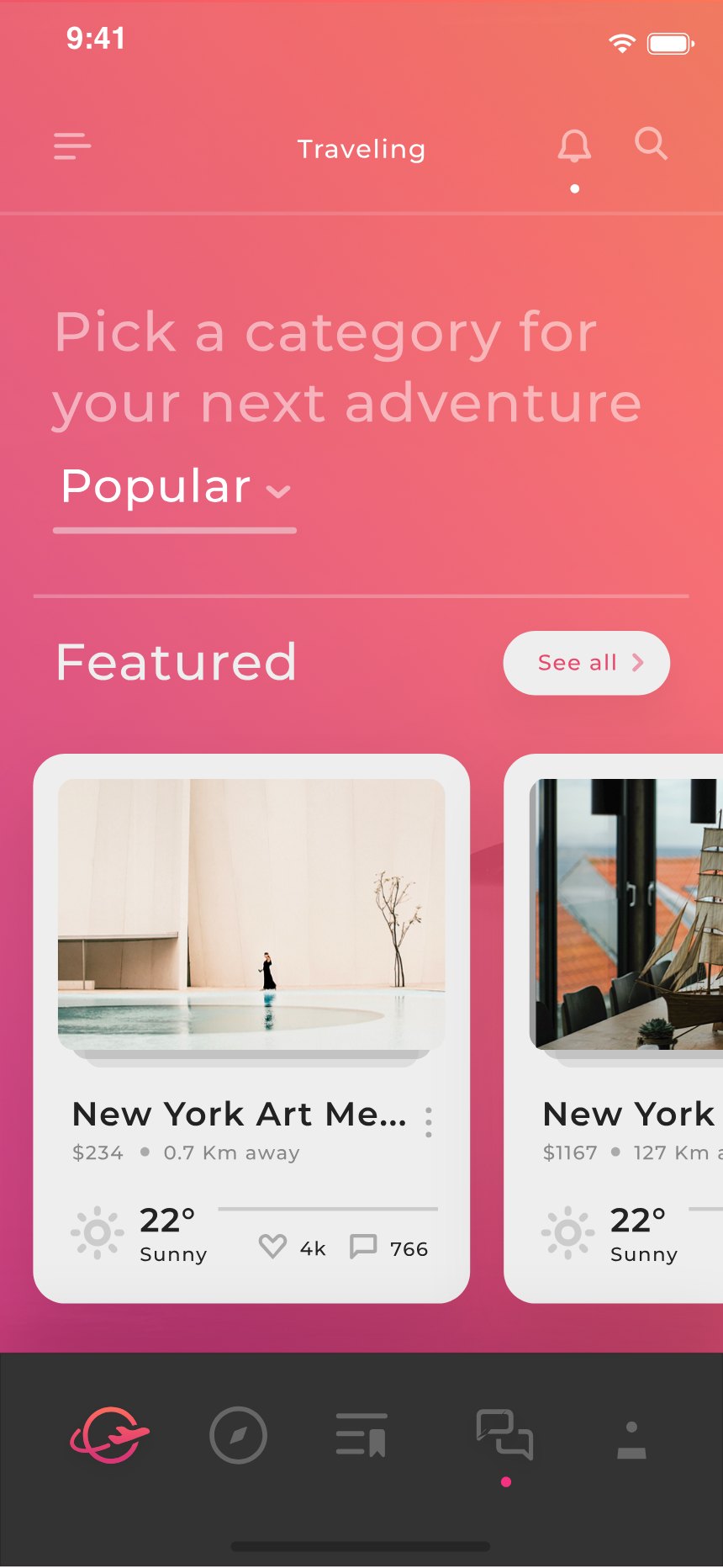
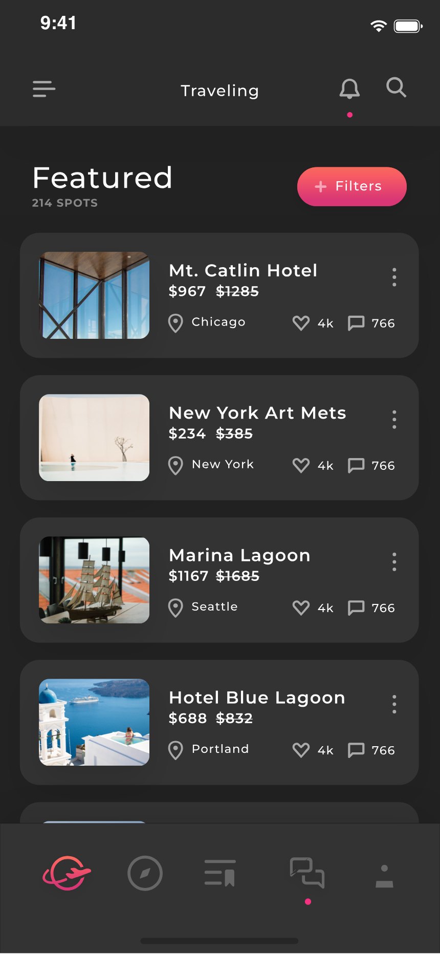
Browsing opens on a question, not a wall of listings: pick a category for your next adventure. A Popular sort up top, a featured strip below, two cards showing.
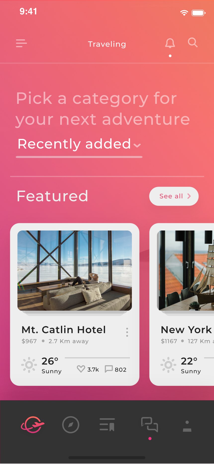
The sort dropdown is the control most apps fake. This one works: switch to Recently added and Mt. Catlin Hotel jumps to the front of the strip, live, on screen.
Three separate states were designed to prove it — closed, open, and applied — because an interaction isn’t designed until its middle frame is.
The full list runs 214 spots deep. Deals wear strike-through pricing, and every card carries distance, weather, and a review count — enough to judge without opening it.
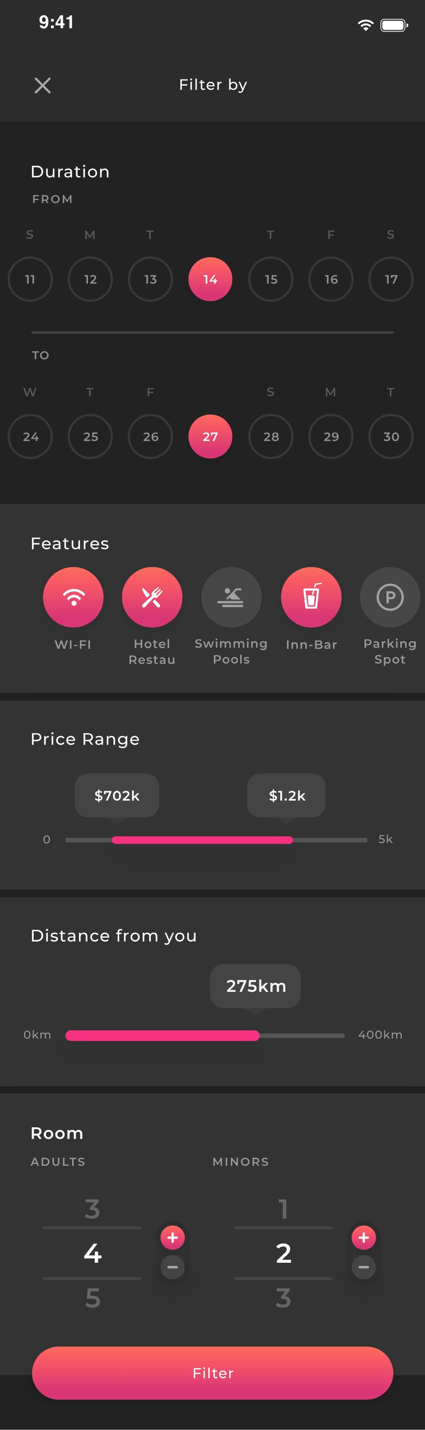
Dates, amenities, price range, distance, room count — one tall sheet instead of a chain of pages, so narrowing the list never loses your place in it.
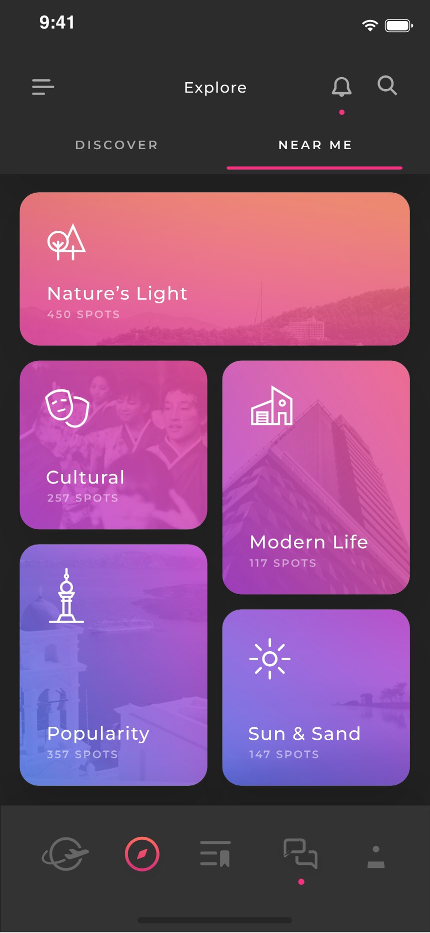
And when you don’t know what you’re looking for, the app stops asking: Nature’s Light, Cultural, Modern Life, Sun & Sand — moods with spot counts, not another sorted list.
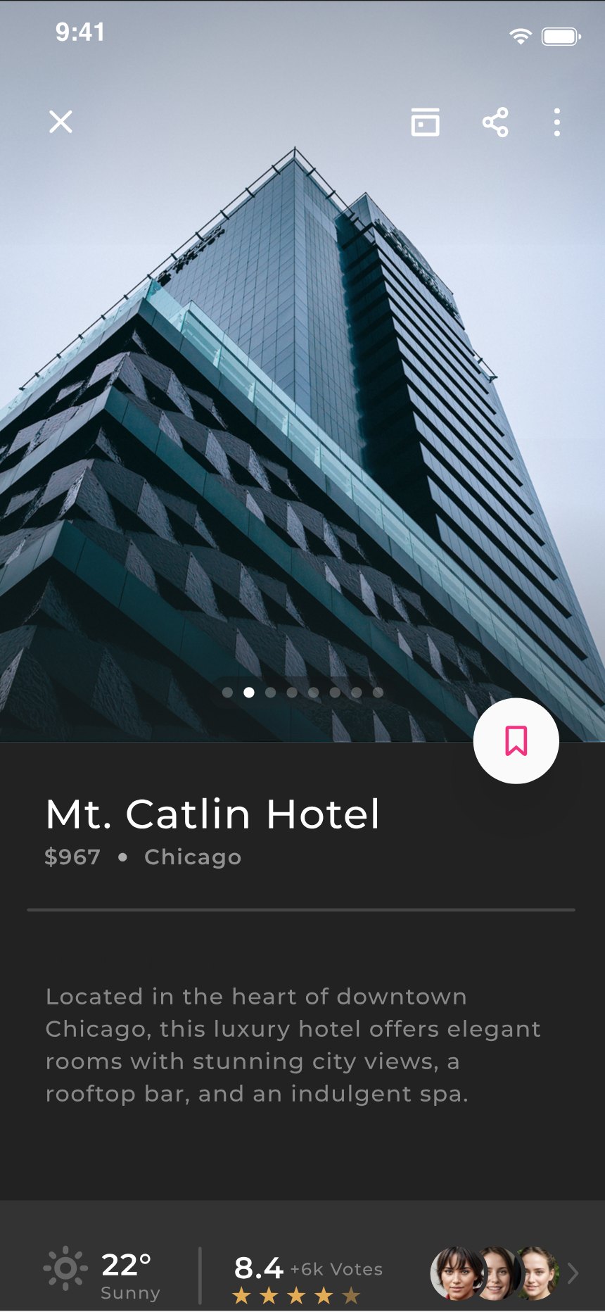
The hotel, considered
Mt. Catlin Hotel, $967, Chicago. A photo carousel eight frames deep, live weather, and a rating that arrives with faces attached — 8.4 from six thousand votes, three of whom you can see.
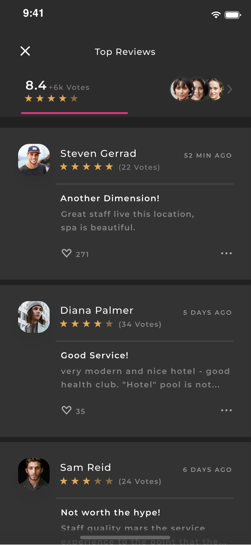
The votes break open into reviews you can actually read — praise, complaints, a three-star “Not worth the hype!” left in — because a trustworthy average is one you can argue with.
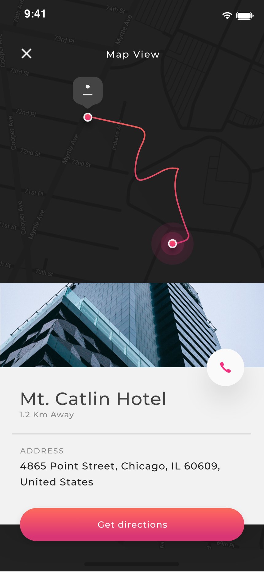
The same hotel, now on a map: pinned, routed from where you stand, the full address written out, and a phone call one tap away. Get directions closes the loop between deciding and going.
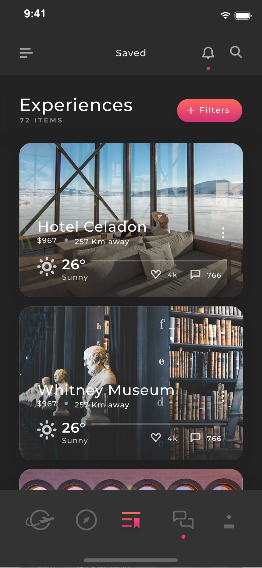
Everything bookmarked collects in one place — 72 experiences at last count — instead of dissolving into a browser history. This is where trips actually start.
Plans, not just bookings
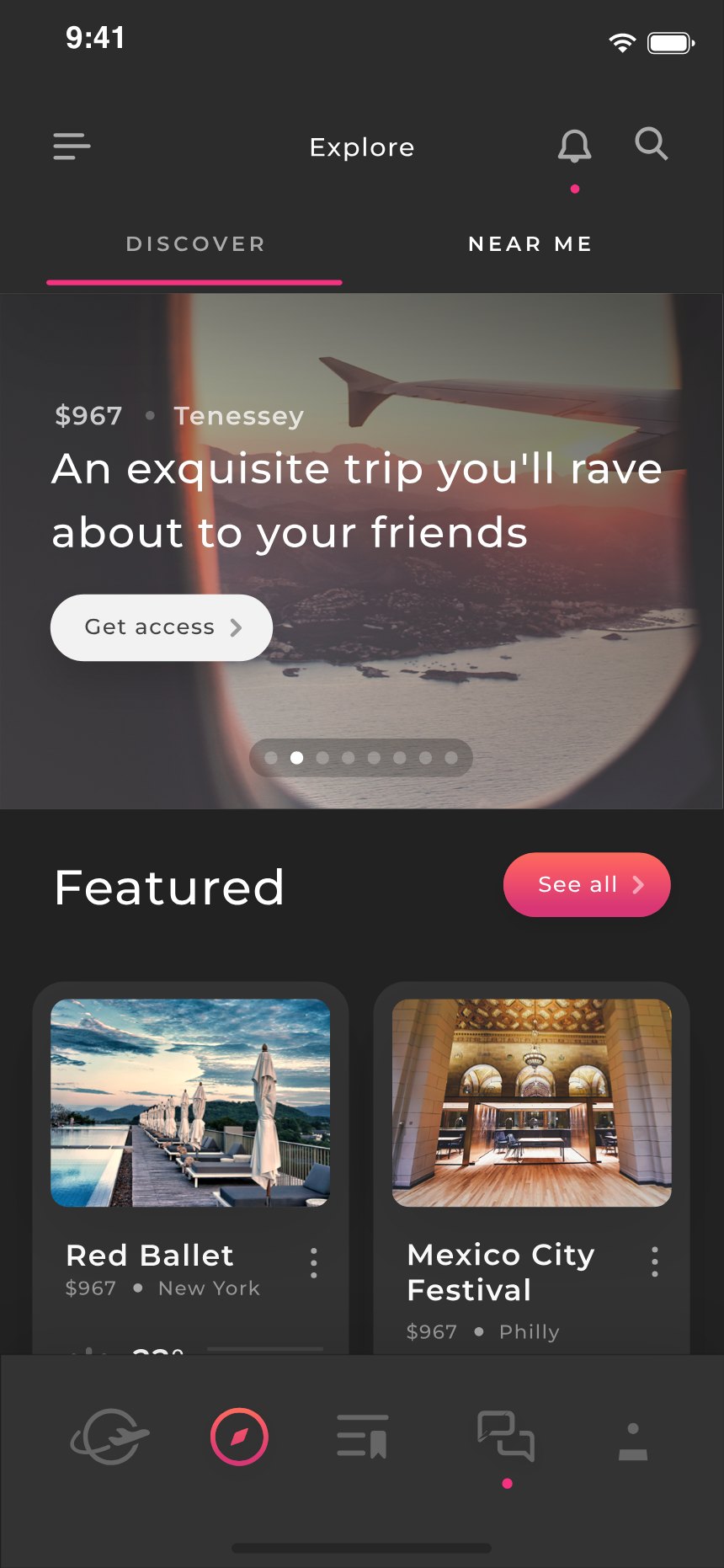
Editorial, not just algorithmic: “an exquisite trip you’ll rave about to your friends” is copy with a point of view, written the way a friend recommends — not the way a database returns.
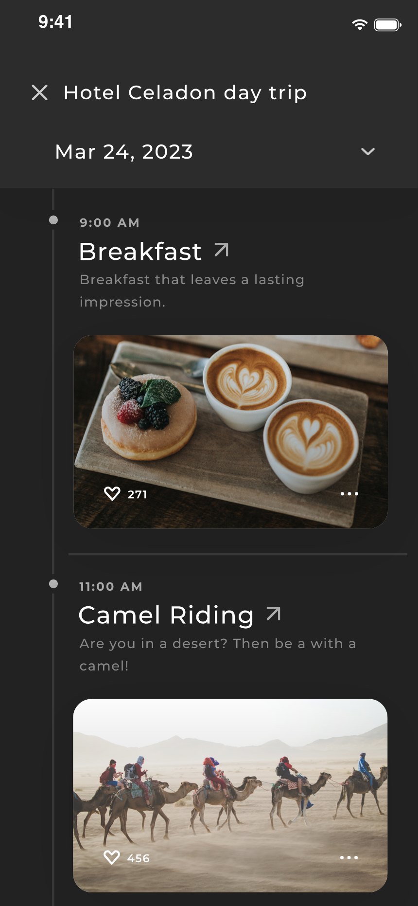
The screen a spreadsheet usually ends up being: breakfast at 9:00, camel riding after, each block with its own photo and note. An itinerary that was designed, not exported.
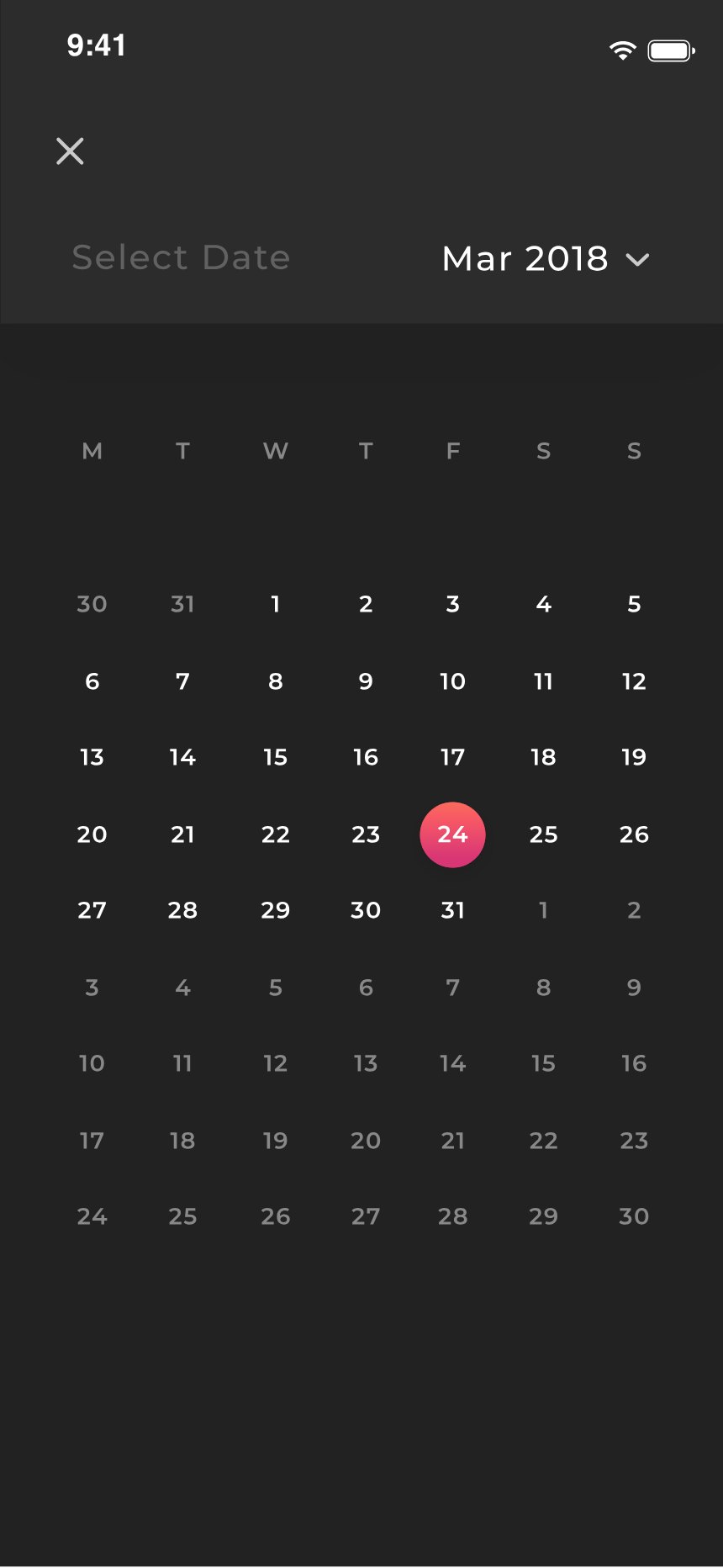
Picking dates happens in two steps — month first, then the day on a proper calendar grid. Coarse before fine, which is how people actually think about when to travel.
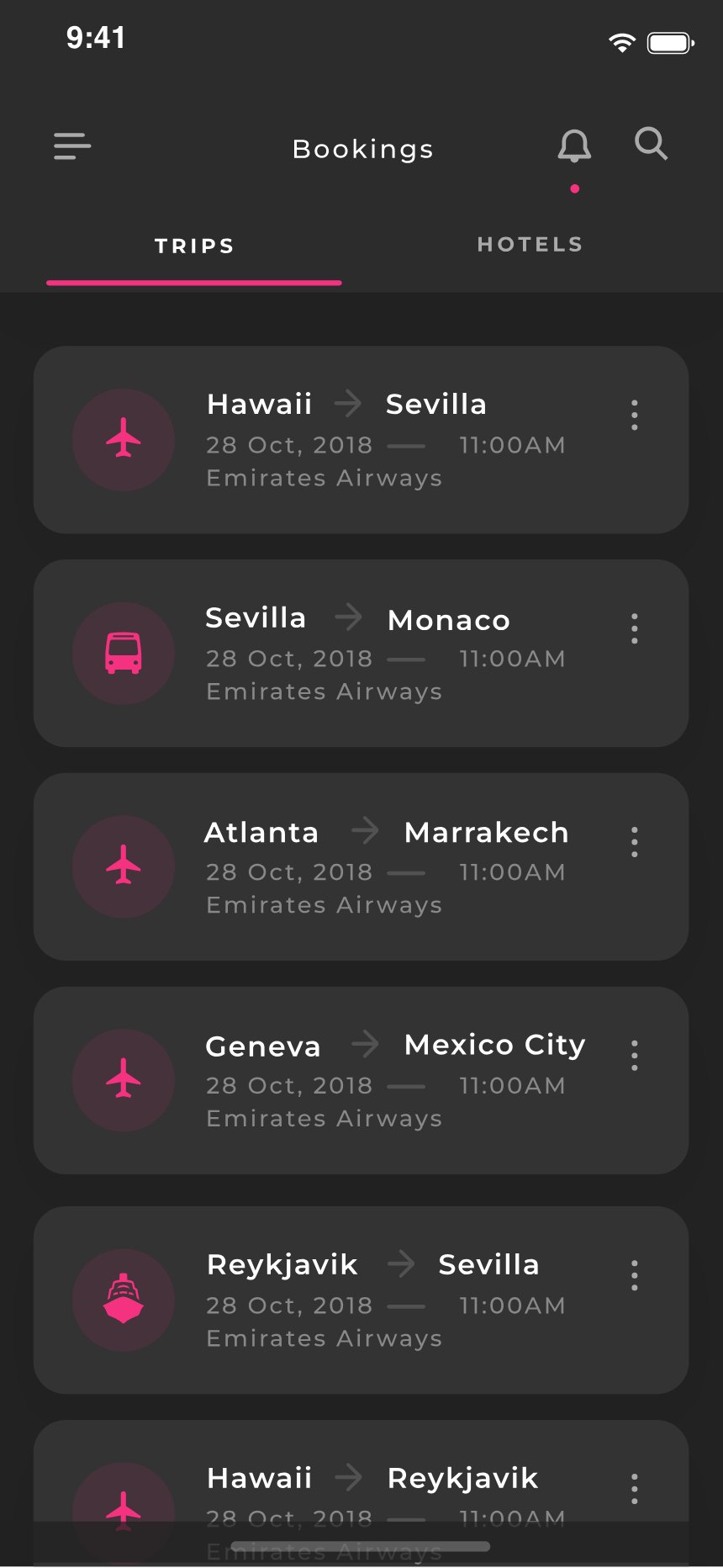
Hawaii to Sevilla, Sevilla to Monaco, Atlanta to Marrakech — flights, trains and ferries as one running itinerary rather than a stack of confirmation emails in four inboxes.
The people you travel with
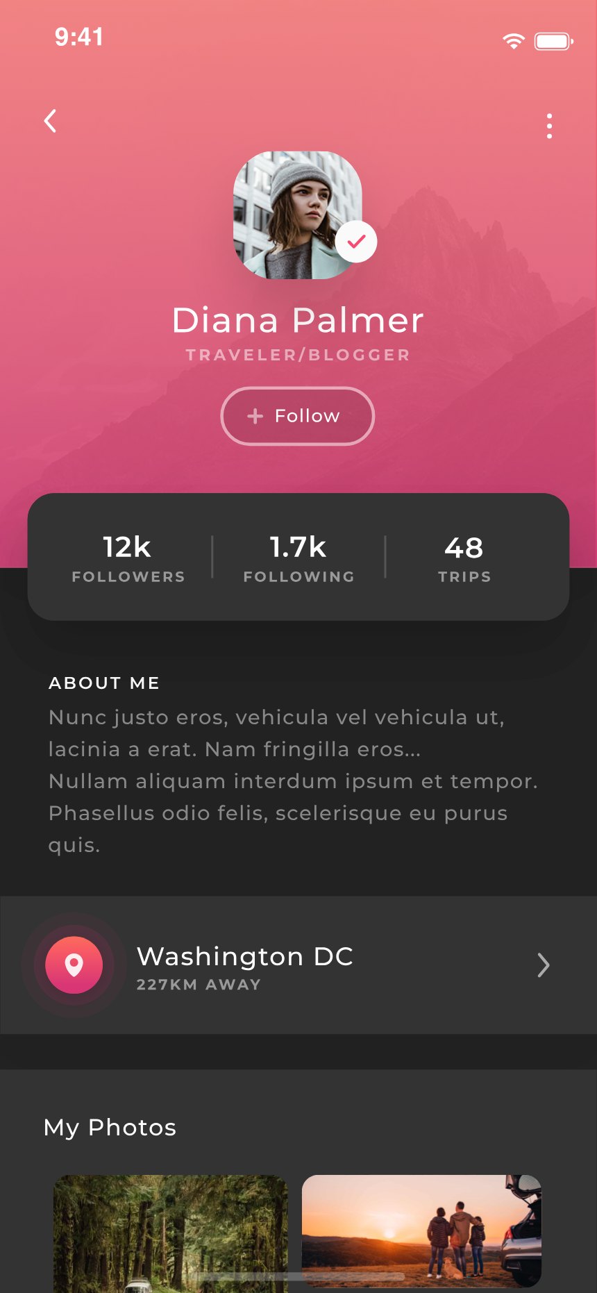
The social layer treats a traveler as someone worth following: twelve thousand followers, forty-eight trips, a bio, a place. Travel apps usually skip this part; here it’s a first-class surface.
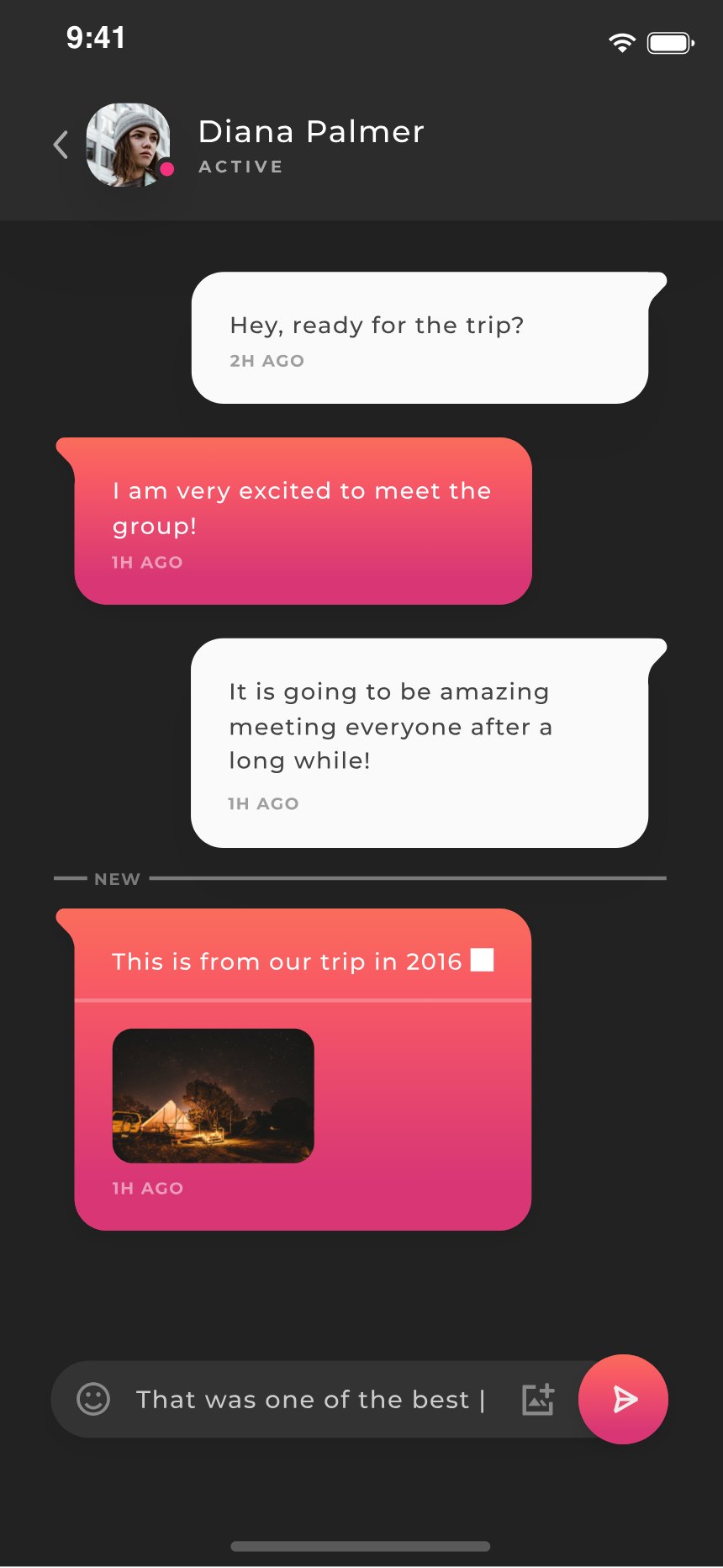
“Hey, ready for the trip?” A real conversation — text, a shared photo from 2016, a NEW divider marking where you left off. Built like messaging, not like a support-ticket log.
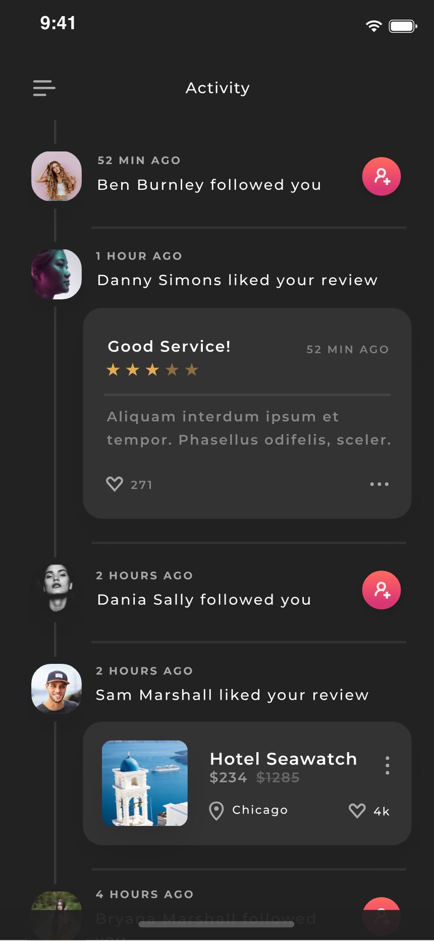
Follows, review likes, and the reviews themselves thread into one timeline instead of four notification types. The feed reads as what happened, not as what the app wants tapped.
Messages split active threads from the archive; settings sit behind three tabs. The unglamorous screens got designed too — that’s most of what makes a concept feel shippable.