Verizon · Straight Talk · Q4 2020–2022

A phone store the size of a vending machine.

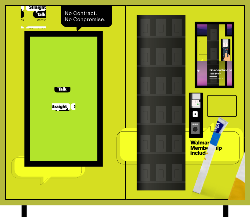
A self-service kiosk that sells phones, upgrades, plan refills and SIM kits inside Walmart and Best Buy — no counter, no queue, no sales rep. Four complete purchase journeys, one 27-inch touchscreen, and a machine that hands you the box.

1,000+
purchases, first month
30%
faster than the counter
26%
of sales self-service
93%
first-time completion
RoleLead Product Designer AgencyMoment ScopeStrategy · UX · Visual · Motion DeployedWalmart & Best Buy, Midwest

The why

Buying a prepaid phone took a counter, a rep, and a wait.

Straight Talk lives inside big-box retail — but its customers were stuck behind the same electronics counter as everyone else. For a prepaid brand whose entire promise is no contract, no compromise, a twenty-minute wait to hand over $45 was the wrong kind of friction.

The bet: a vending machine that does the whole job — browse, decide, pay, activate, collect — standing up, one-handed, in under five minutes. I led product design end to end, from requirement workshops with Verizon stakeholders through post-launch iteration.

Research

What the counter taught us.

We started at the counter the machine would replace: stakeholder workshops with Verizon, intercept interviews next to the electronics desk, and a teardown of every unattended-retail machine we could stand in front of. Four findings did most of the steering.

Heard at the counter

“Twenty minutes in line to spend forty-five dollars.”

So the whole journey was budgeted like a transit map: under 5 minutes, every flow cut to the minimum number of decisions, progress always visible.

Observed in the aisle

There is no one to ask when something goes wrong.

So every dead end got a first-class screen: payment declines, activation failures, out-of-service — each with a printed fallback, never a frozen spinner.
Physical context

Standing, gloved, reading from six feet away.

So the type system starts at 32px body, targets never drop below 56px, and a dedicated 200% Max-Zoom mode re-lays every screen for low-vision customers.
Trust research

Machines that take $400 have to earn it first.
So pricing is itemised line by line — taxes, discounts, the free-phone offer — terms come before the tap, and every purchase prints and emails a receipt.

The how

Four phases, one simulated kiosk.

1

Research & requirements

Stakeholder workshops with Verizon, intercept interviews at retail counters, and a competitive teardown of every unattended-retail machine we could find.

2

Conceptualization

Journey maps for all four purchase paths, then sketches and wireframes pressure-tested against the machine's physical constraints — hopper height, reader position, glare.

3

Design & validation

High-fidelity prototypes A/B tested in a simulated kiosk environment — real distance, real standing posture — before a single unit shipped.

4

Delivery

Full design specifications, QA collaboration through build, and post-launch support feeding observed behaviour back into the roadmap.

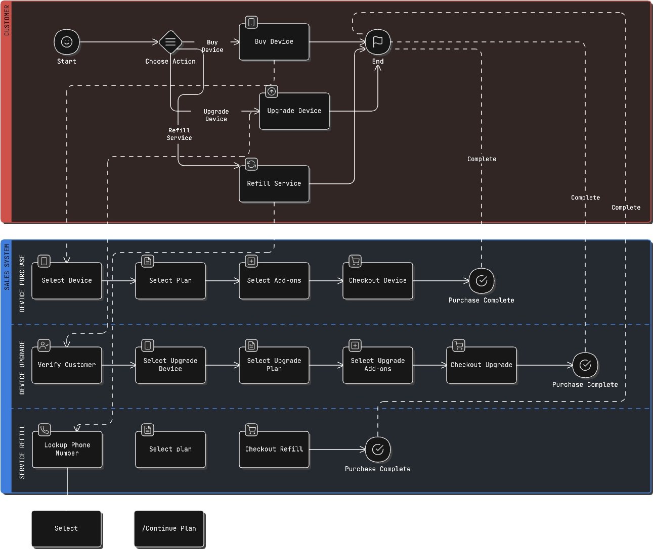
User flows — three journeys, one sales system Swimlane user-flow diagram: a customer lane where Start branches into Buy Device, Upgrade Device or Refill Service, and a sales-system lane where each journey runs the same spine — select, plan, add-ons, checkout, complete

Mapped before a single screen was drawn: whatever the customer chooses — buy, upgrade, refill — the machine runs the same spine underneath: select → plan → add-ons → checkout → complete. Three doors, one corridor. It's why the kiosk could share one design system, one motion language, and one checkout across every journey.

The what

Four journeys that end with a box in your hand.

Buy a phone. Upgrade. Keep your phone. Refill a plan. Each flow was cut to the minimum number of decisions, with progress always visible and every price itemised — taxes, discounts, and the free-phone offer shown line by line before the tap to pay. Each walkthrough below plays itself; the rail alongside holds the stills.

01

Buy a phone

11 screens · box in hand
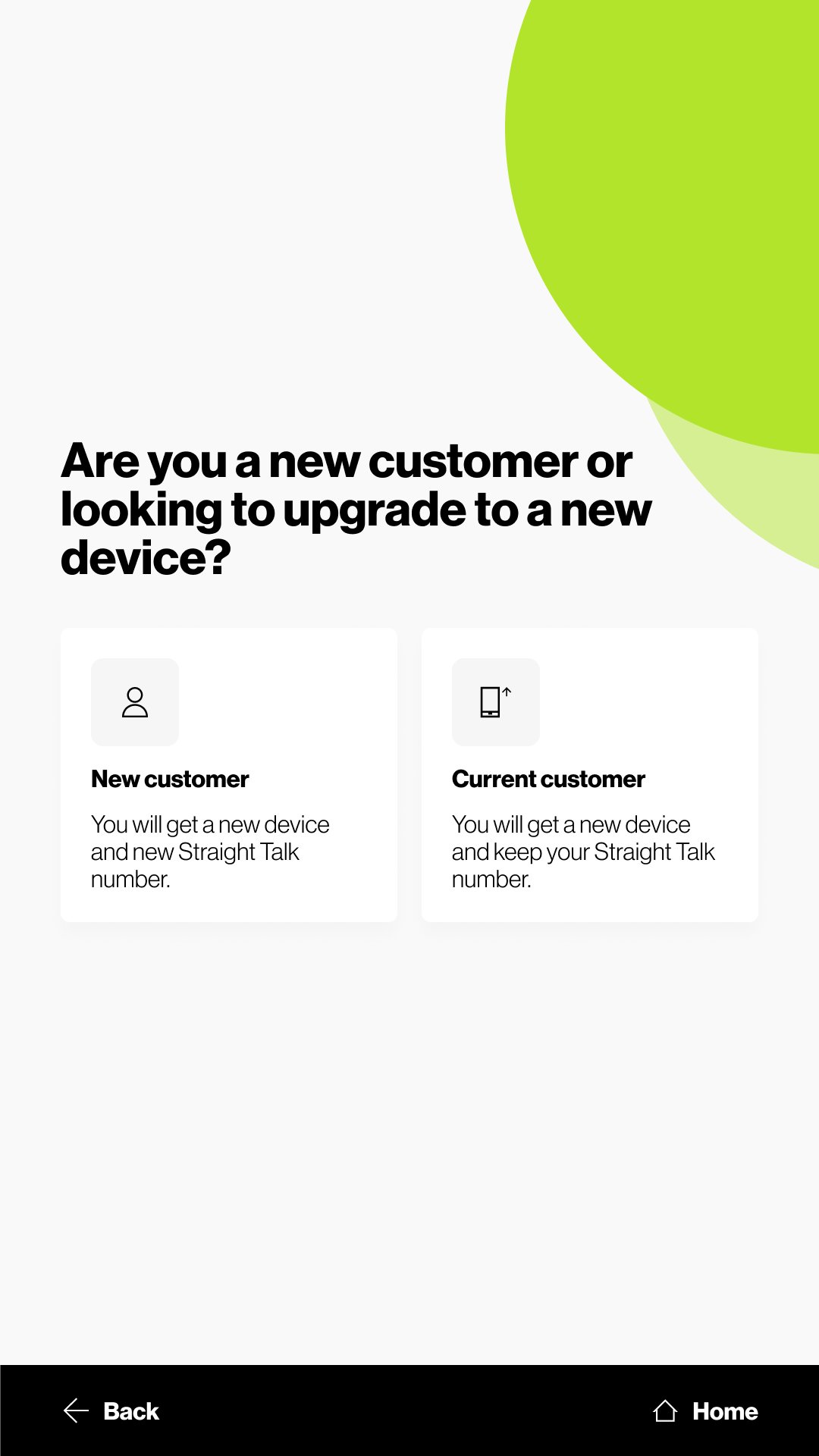
Customer status screenCustomer status

One question splits the store: new line or upgrade.

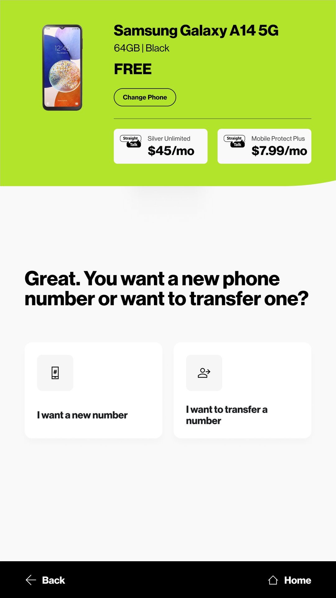
Number preference screenNumber preference

New number from your zip, or bring your own.

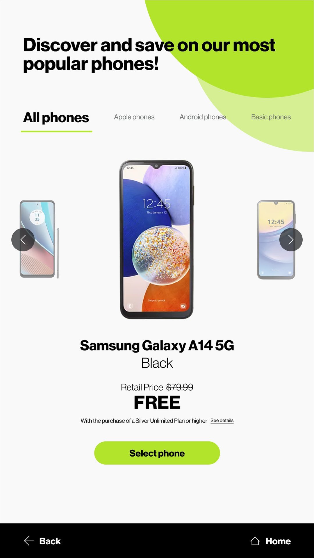
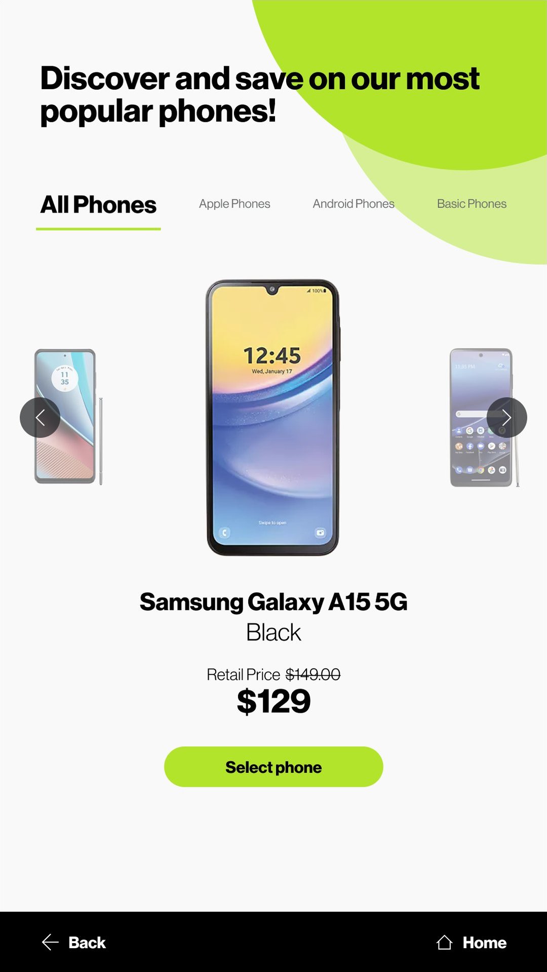
Phone selection screenPhone selection

A carousel sized for a glance, priced for a decision.

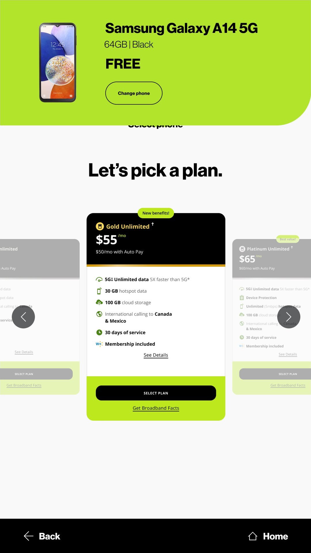
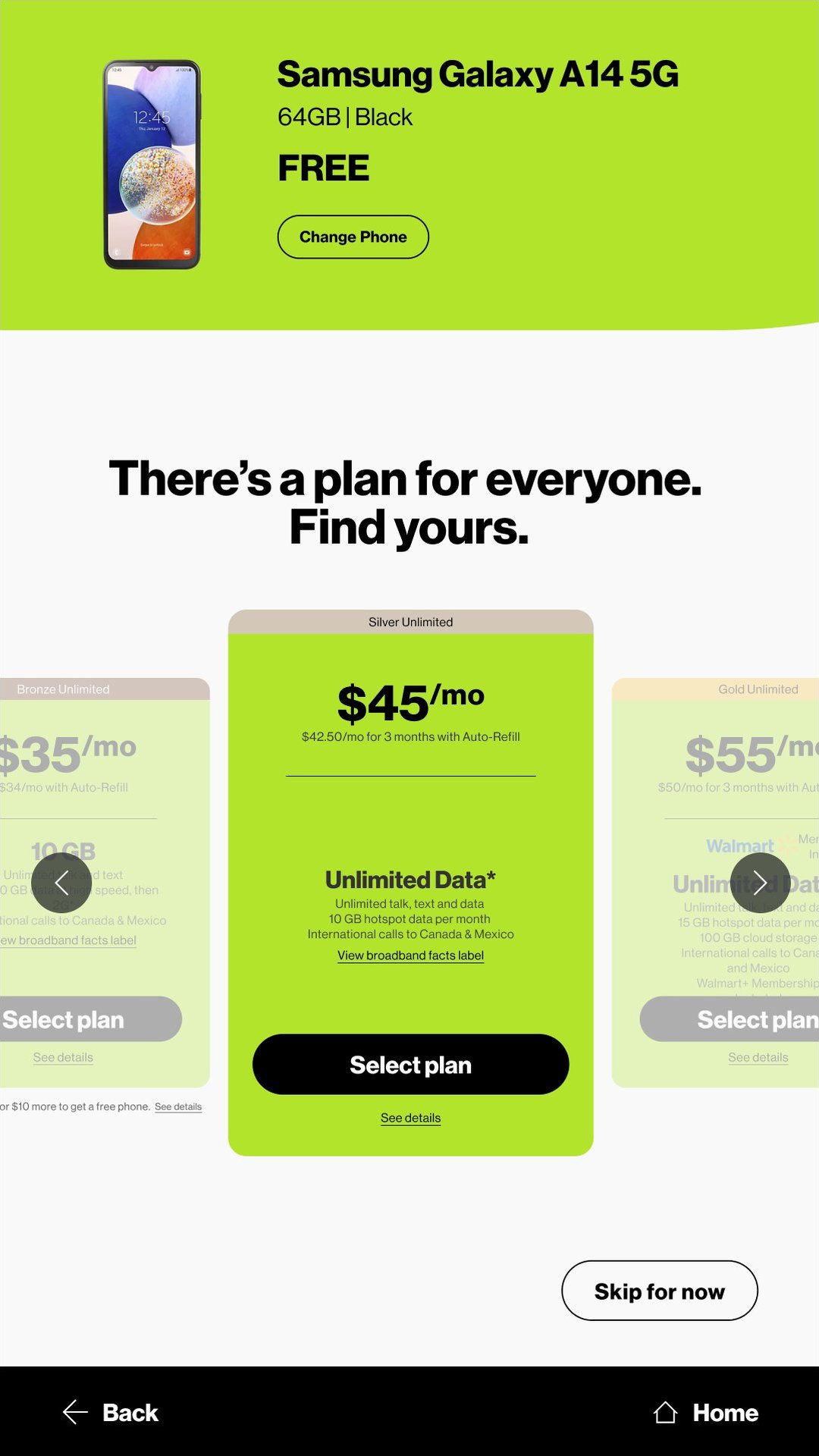
Plan selection screenPlan selection

The middle card sells; the neighbours whisper.

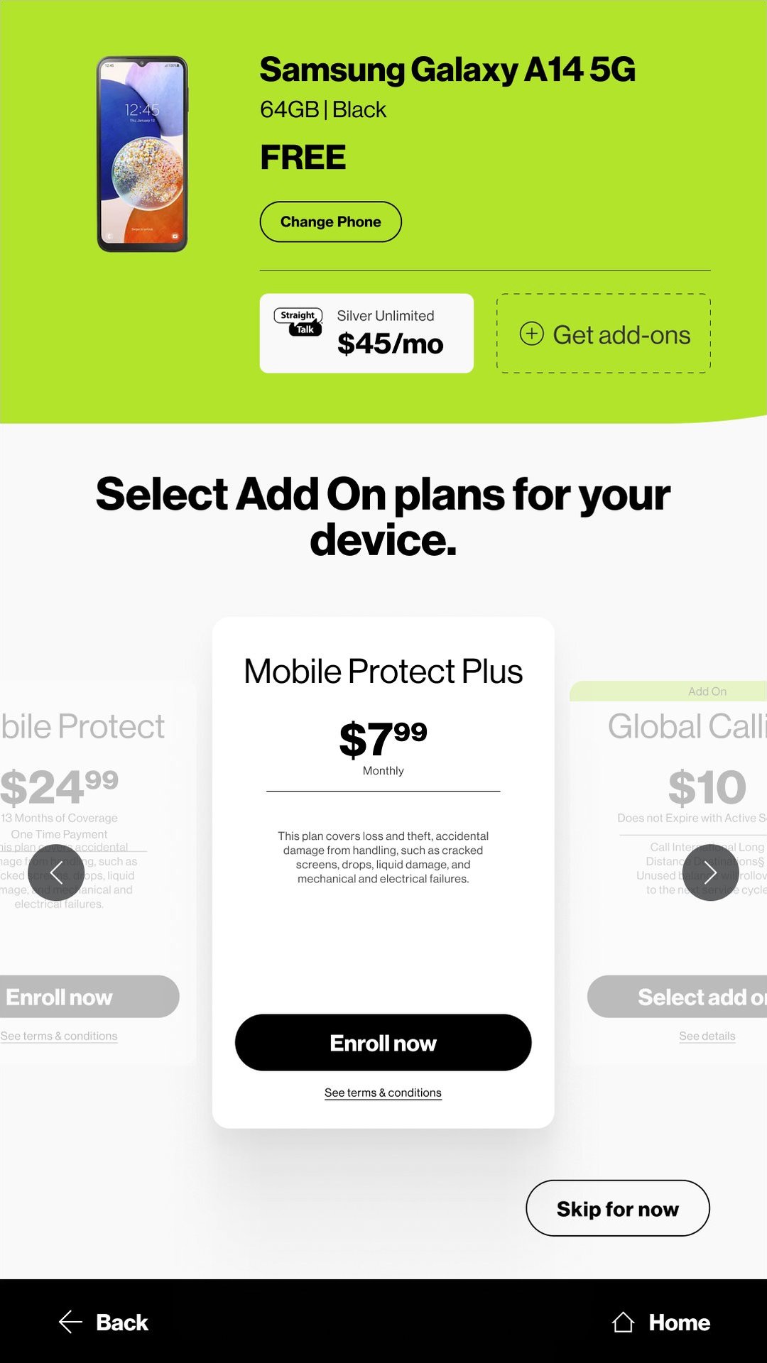
Add-ons screenAdd-ons

Protection and global calling — skippable by design.

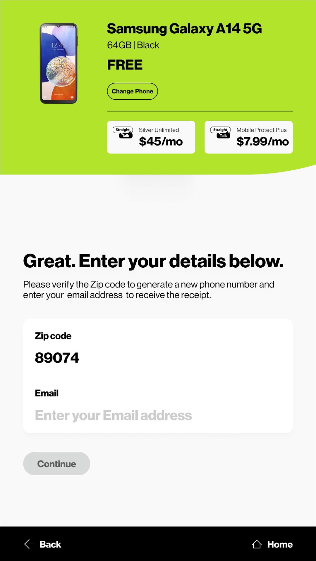
Details screenDetails

Zip seeds the number; email receives the receipt.

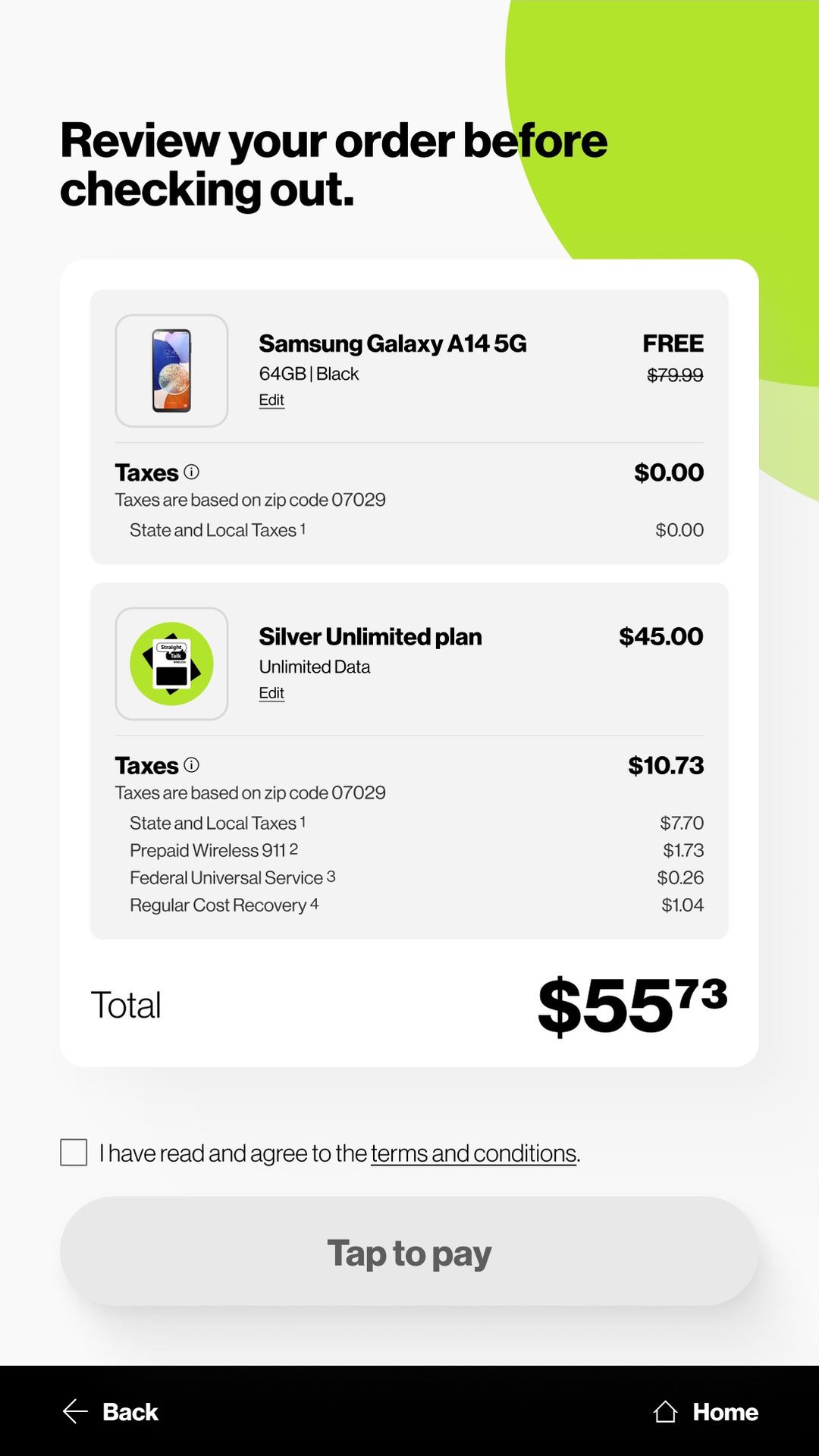
Checkout screenCheckout

Every tax line itemised. Terms before the tap.

Payment screenPayment

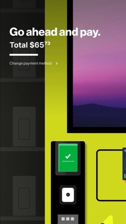
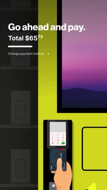
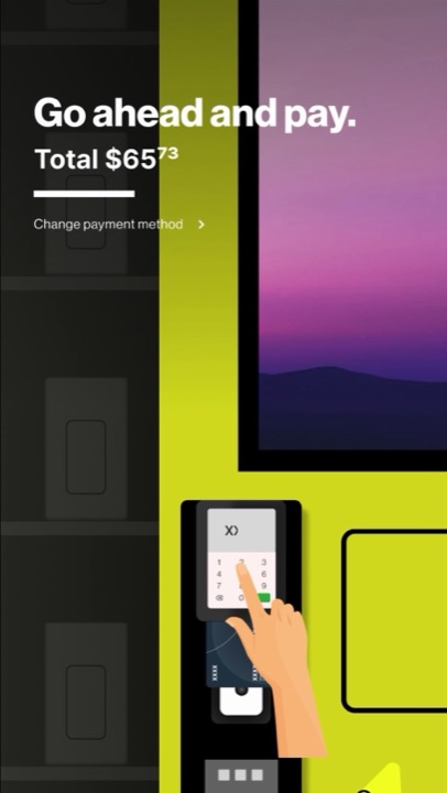
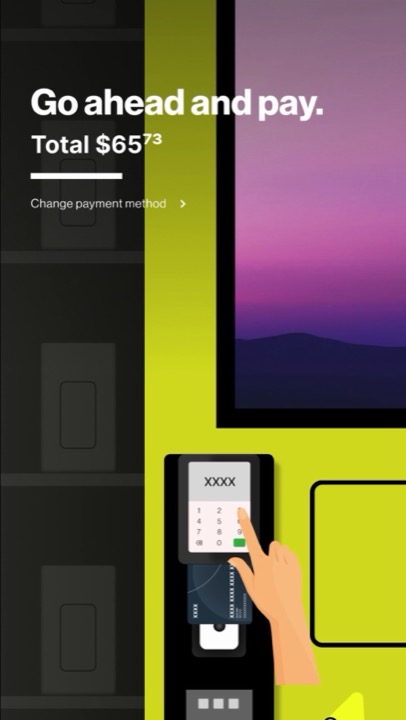
The machine draws itself while the card taps.

Collection screenCollection

The camera dives into the hopper. The door opens.

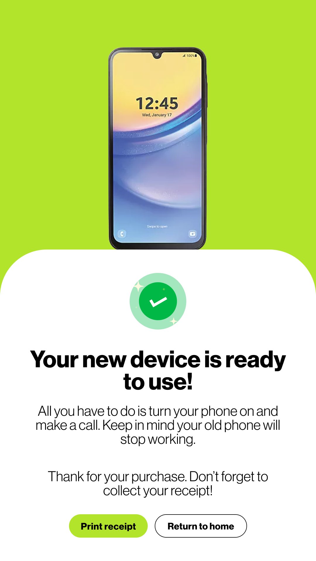
Confirmation screenConfirmation

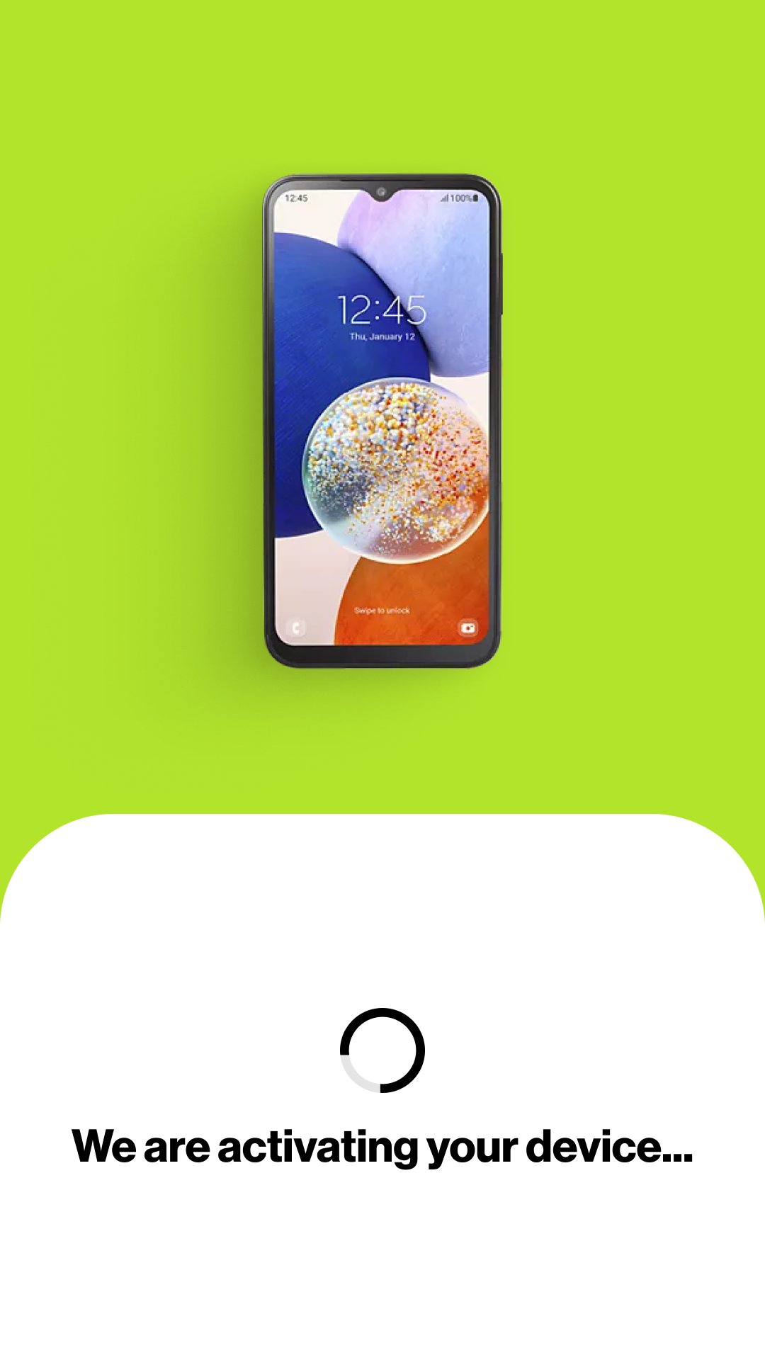
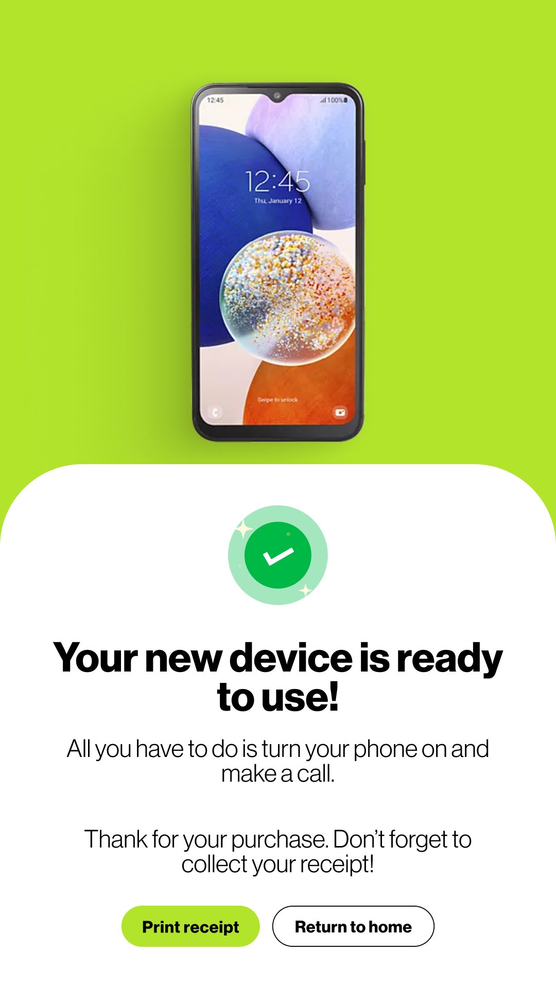
Activated before the box leaves the chute.

Order summary screenOrder summary

Printed and emailed — both, always.

02

Upgrade

4 key screens · keeps your number
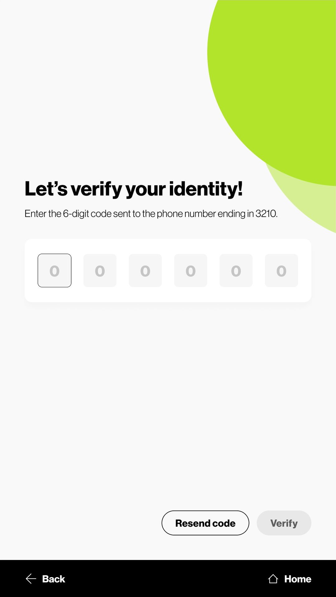
Account lookup screenAccount lookup

Phone number plus a one-time code — no password at a kiosk.

New phone screenNew phone

The same carousel, filtered to upgrade pricing.

Plan check screenPlan check

Keep the current plan or step up in one tap.

Confirmation screenConfirmation

Old phone keeps working until the new one activates.

03

Keep your phone

SIM kit · 4 key screens
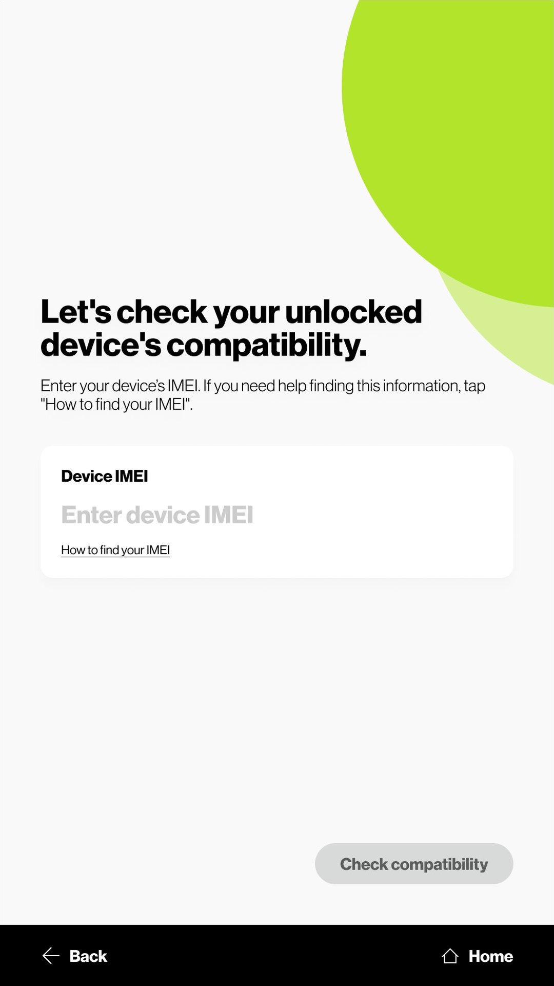
Compatibility screenCompatibility

Dial *#06# — the kiosk checks the IMEI on the spot.

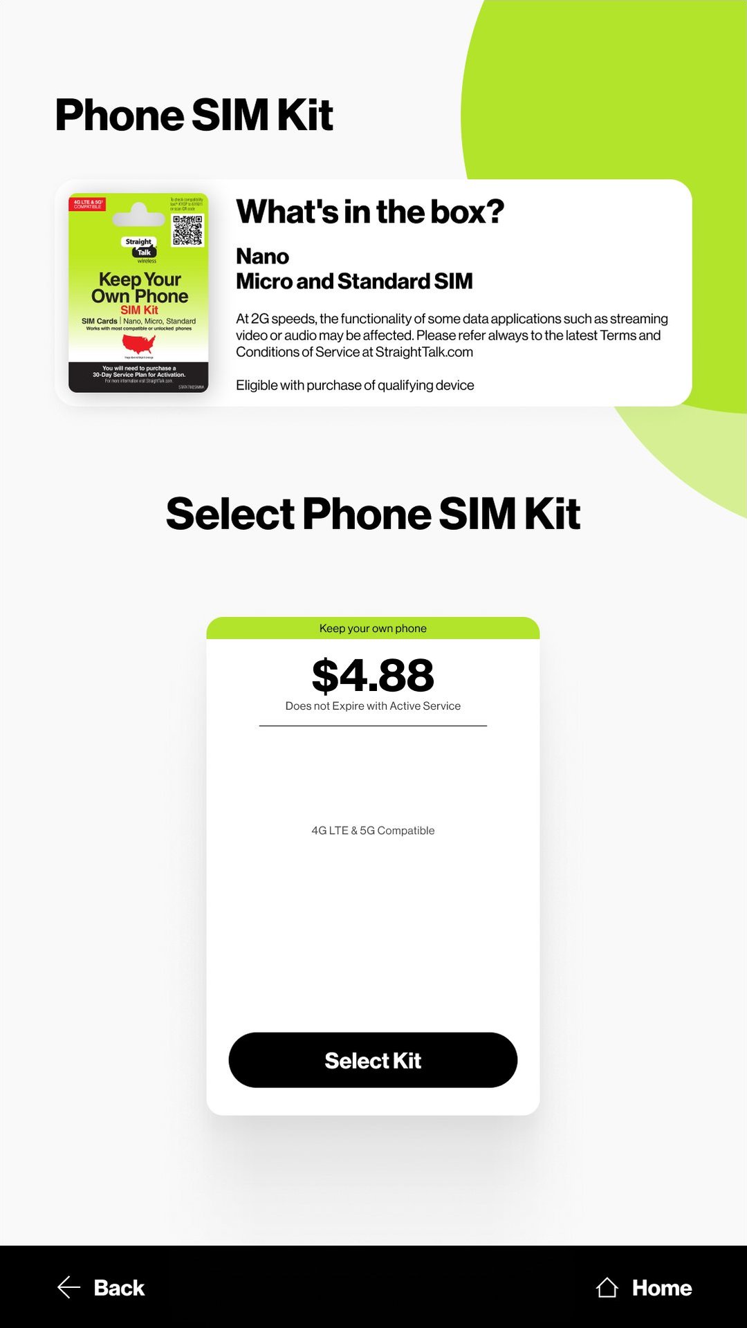
SIM kit screenSIM kit

One product, one price, no wall of SKUs.

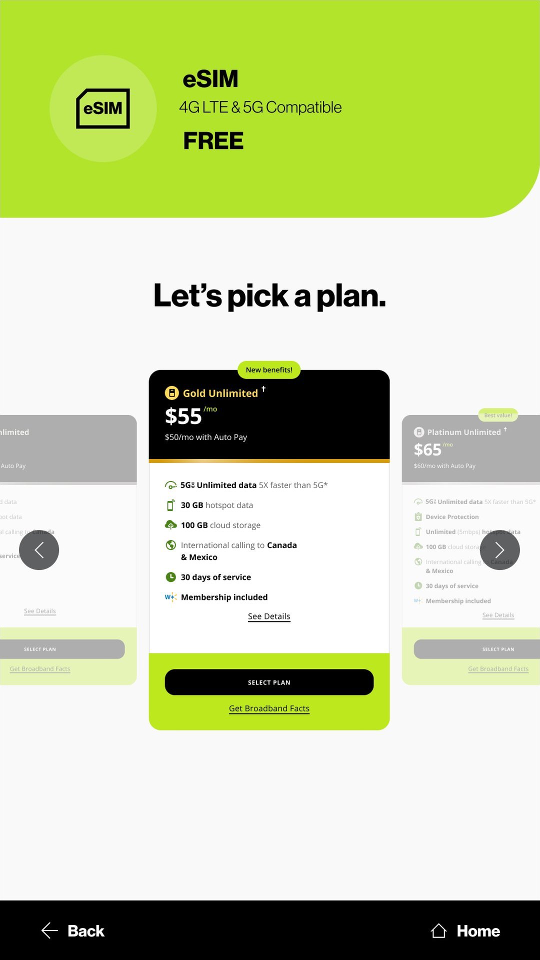
Plan selection screenPlan selection

Same three cards as every other journey.

Confirmation screenConfirmation

Insert the SIM, keep the phone you love.

04

Refill a plan

5 key screens · under a minute
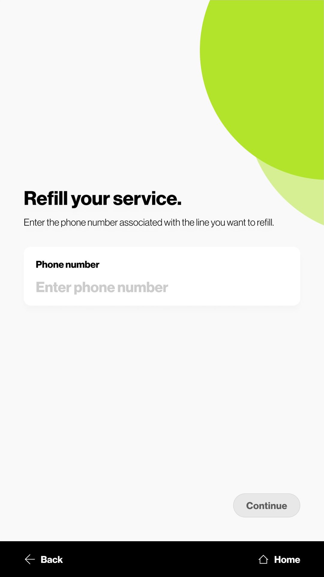
Account lookup screenAccount lookup

Just the phone number — nothing else to remember.

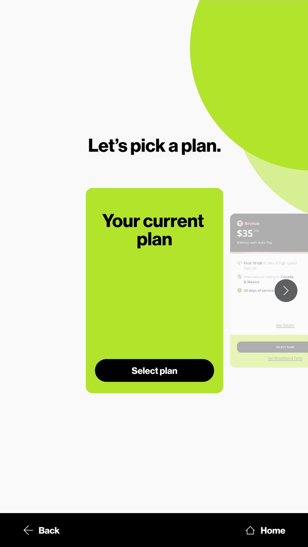
Pick the refill screenPick the refill

Current plan pre-selected; switching is one tap.

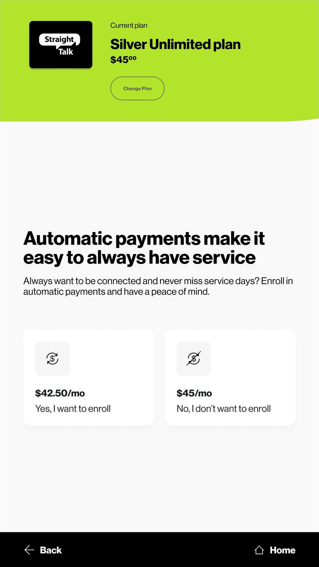
Auto-refill screenAuto-refill

Opt in at the machine, cancel from the phone.

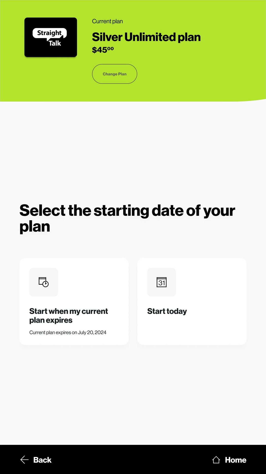
Start date screenStart date

Refill today or when the current cycle ends.

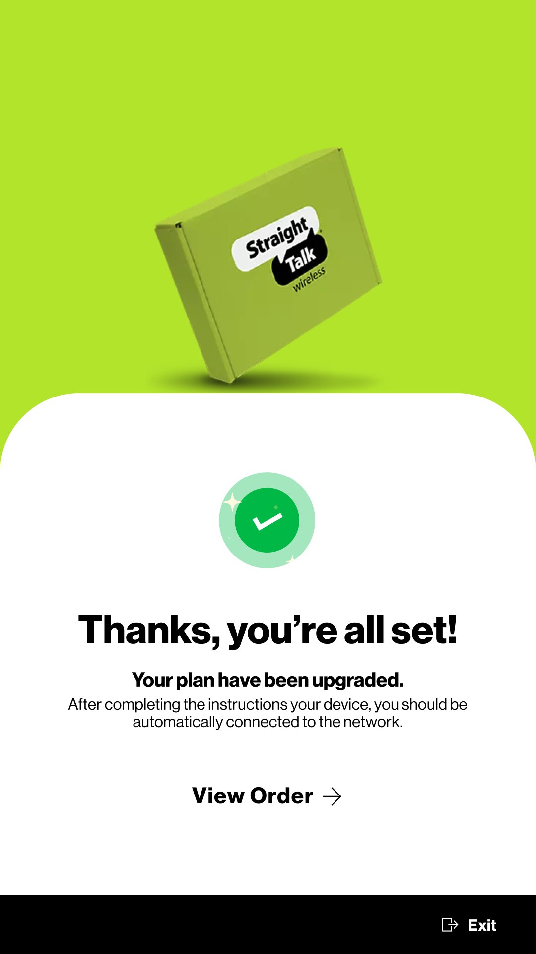
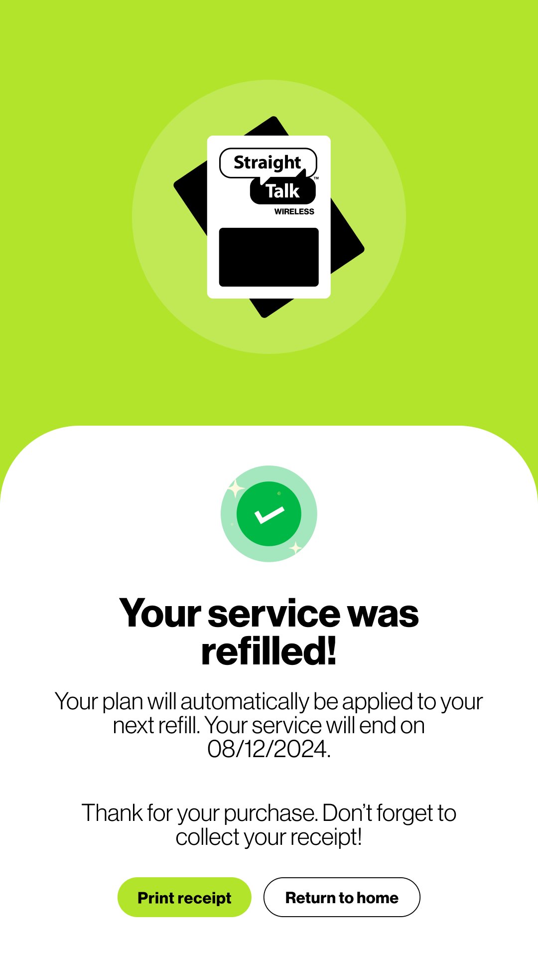
Confirmation screenConfirmation

No box drops — the receipt is the product.

Designed in motion

The machine is a character, not a chrome.

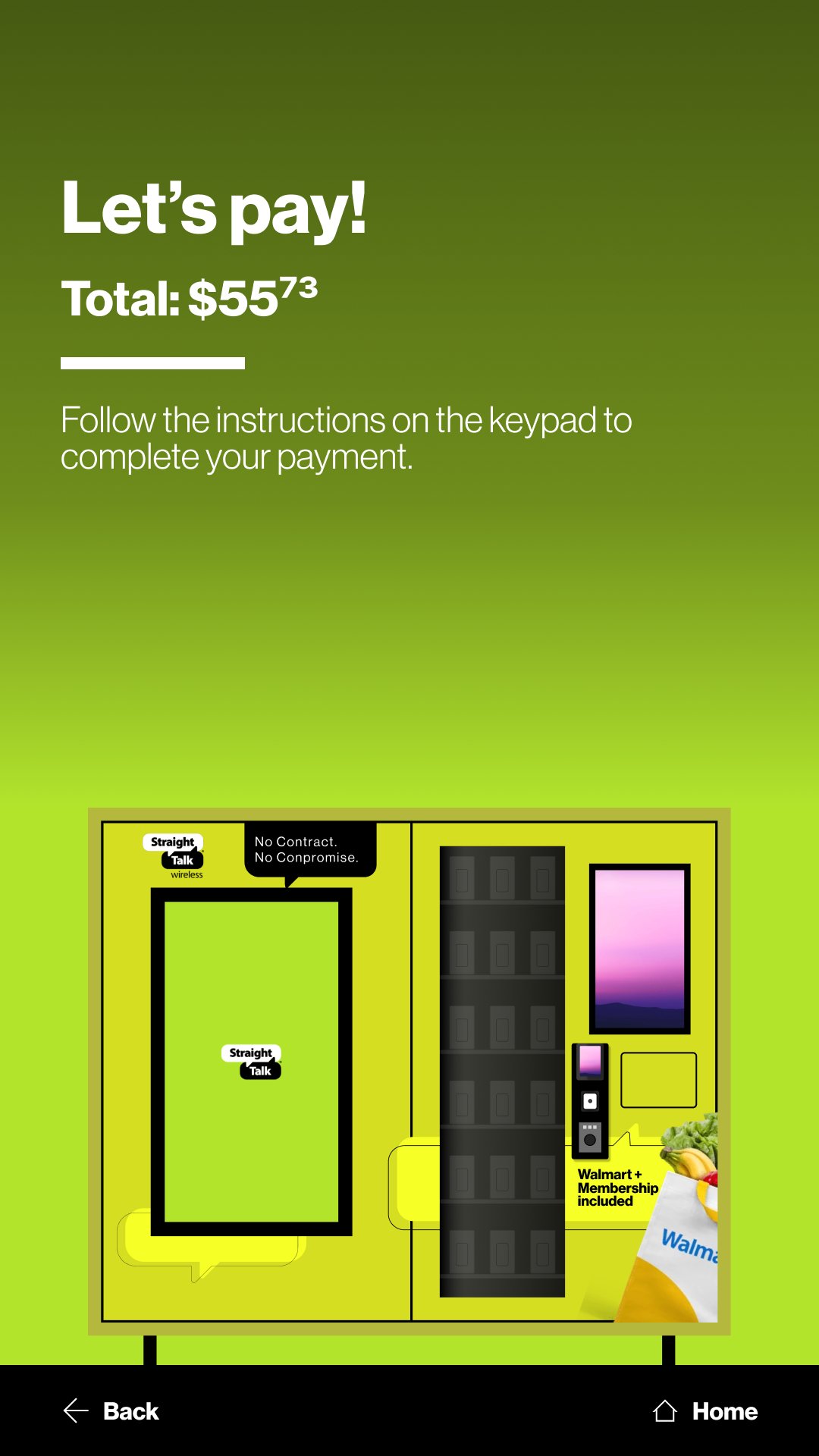
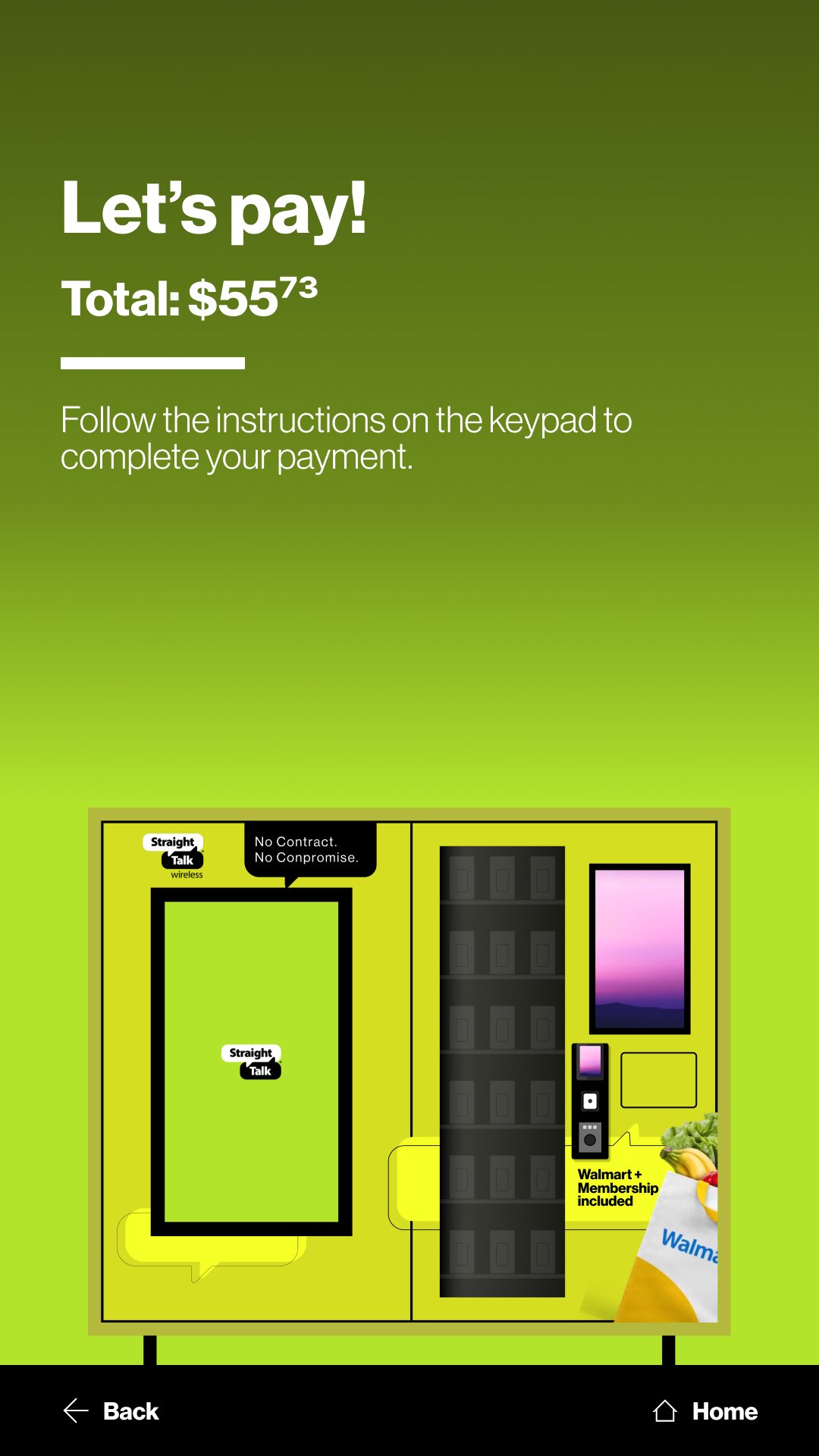
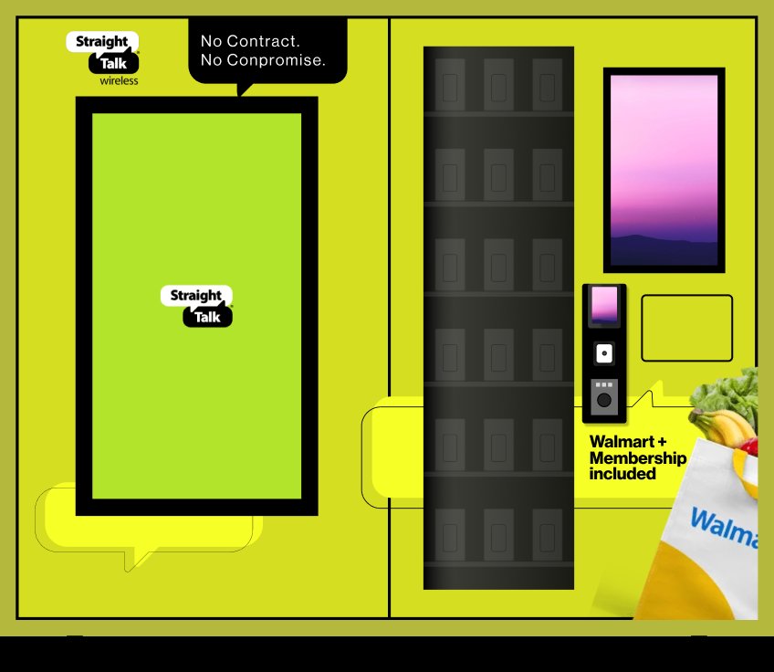
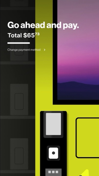
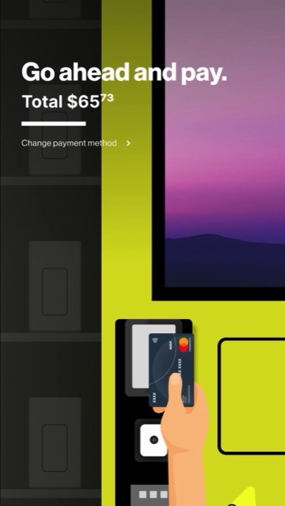
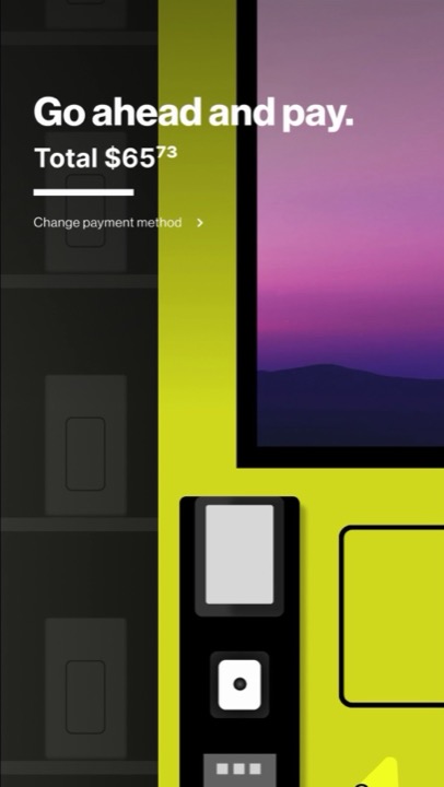
The kiosk's signature isn't a screen — it's the moments between them. While you pay, the interface draws the machine itself: the camera pushes into the card reader, an illustrated hand enters, taps the card, types a PIN, and withdraws. Every demo below runs the authored values from the design file.

Full machine → camera push → 8 keyframes → dispensing · 1250 ms slow spring

The payment sequence

01

"Go ahead and pay." The total sits above an illustration of the machine you're standing at — screen and steel, same object.

02

The camera pushes 6× into the card reader on a 1250 ms spring — the machine group scales to 5086 px and spills across the whole screen, clipping off, while the header rides above it.

03

An illustrated hand plays the part. It enters holding the card, taps, the terminal flips green — then the card goes in, the keypad lights up, and the PIN dots fill one by one. Sixteen hand-keyed frames on the 1250 ms spring, the hand's exit on a quick 300 ms linear.

04

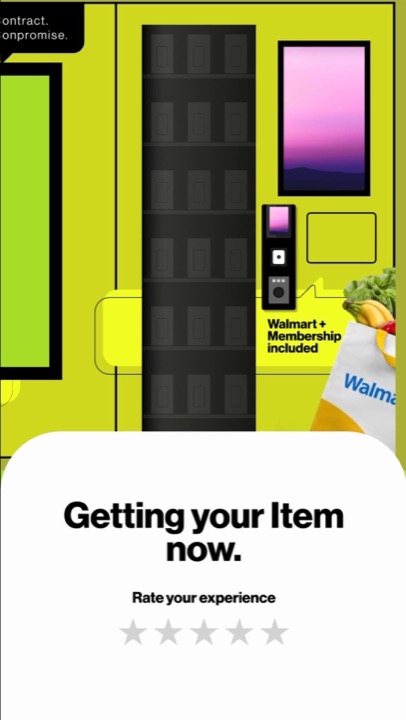
Still zoomed, payment clears — and the screen rolls straight into "Getting your Item now."

Geometry from the document itself: instance at (116, 1065), machine group at (−3508, −1720) scaled to 5086×4413 from keyframe 2 on. The frames you're watching are the prototype's own, playing in the authored order.

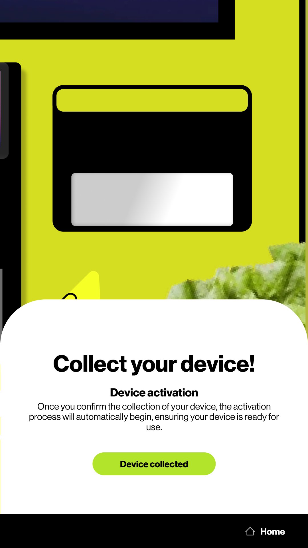
Dispense → collect → 6.929× hopper dive → door slides 613 px

The collection sequence

01

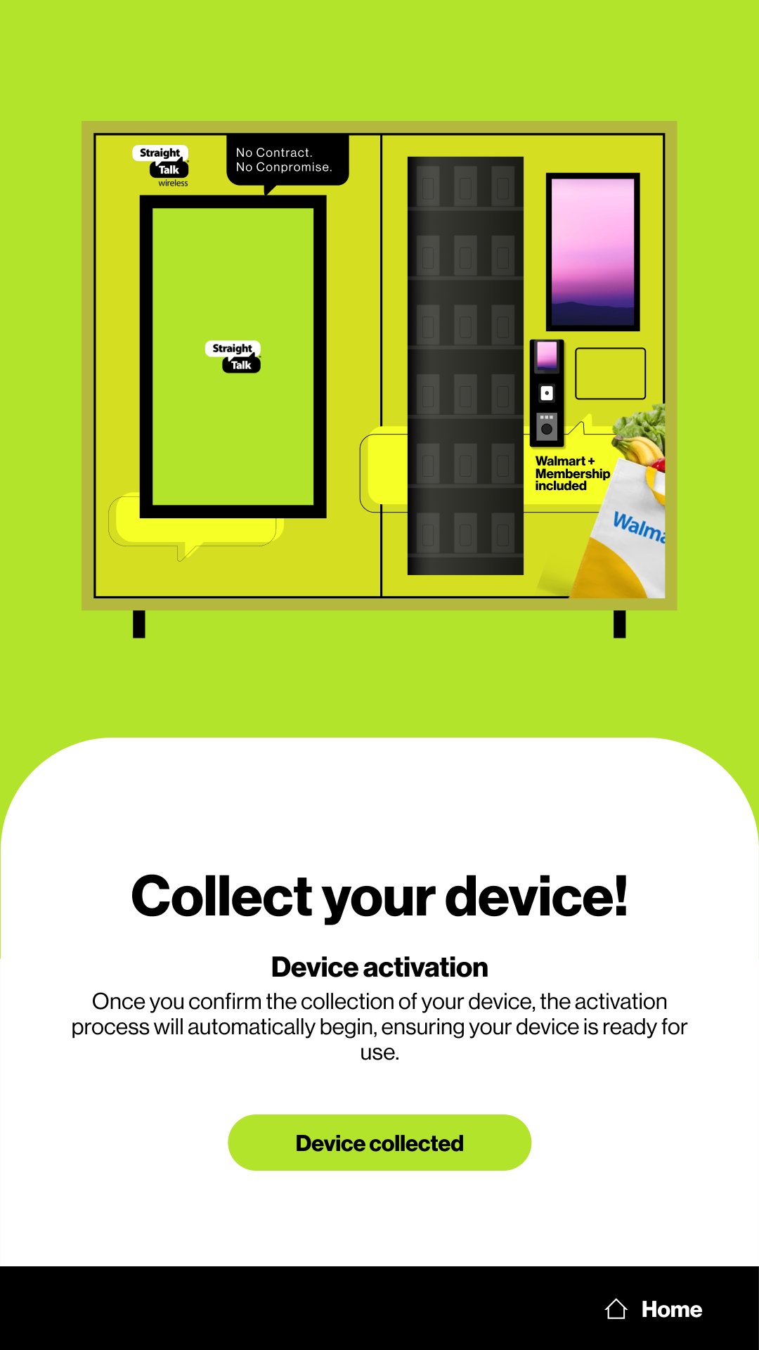
"Your item(s) are being dispensed." The machine drawing works while you wait — an authored 5-second hold before the handoff.

02

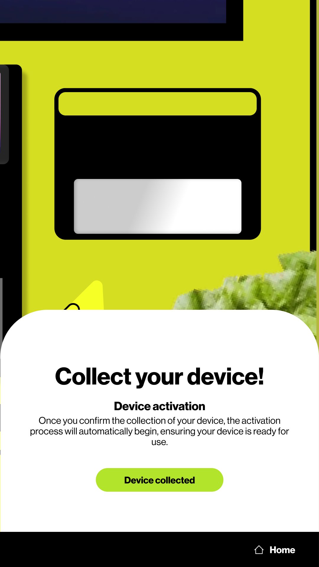
"Collect your device!" The full machine returns, and confirming collection is what starts activation — no orphaned boxes.

03

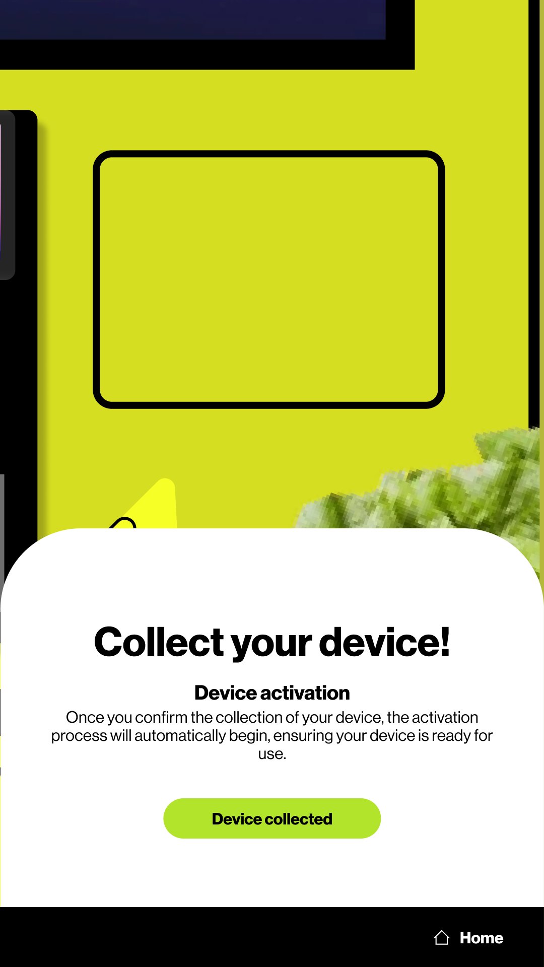
The camera dives 6.929× into the hopper, pivoting about (925, 527) on the 1022 ms Gentle spring — the whole screen commits to one door, telling your hands where to go.

04

The door slides open 613 px on screen a beat before it does in steel, box waiting inside.

Scale, pivot and holds (0.1 s, 0.001 s, 0.8 s) are the diffed values from the four authored frames — the same numbers driving the zoom you're watching.

1022 ms · Gentle spring · used 151×

Screen change

One spring for every navigation — smart animate, 1022 ms, gentle overshoot, used 151 times. Learn it once and the whole kiosk feels familiar.

3000 ms ease-in · 2546 ms spring

Success mark

Draws on the authored 3-second ease-in, then pops on the file's one custom spring — mass 1, stiffness 74.7, damping 5.66 — the real curve, overshoot and all.

300 ms · ease-out · from top

Overlays

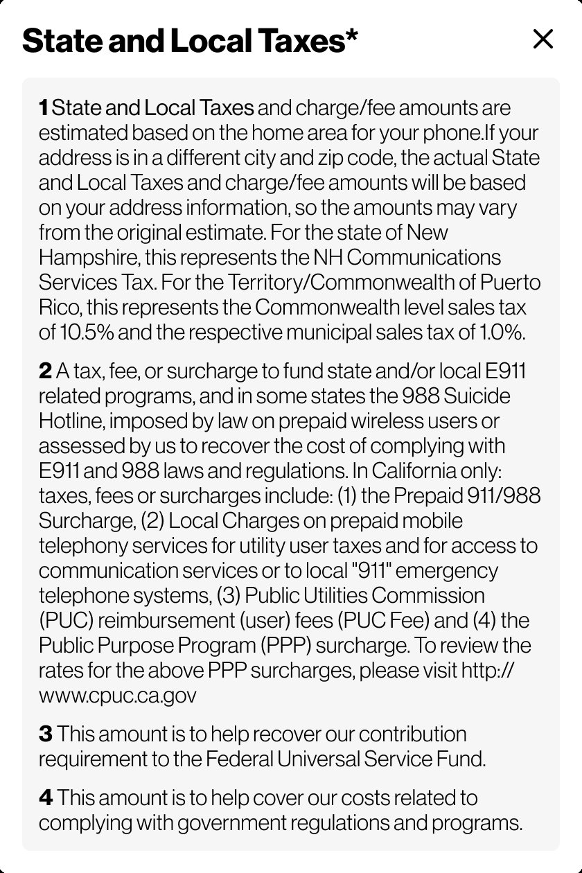
The actual "State and Local Taxes" sheet from the file, dropping over a dimmed checkout exactly as authored — fast in, dismissed from anywhere on the scrim.

The system

Loud lime, quiet everything else.

One accent doing all the work: lime marks whatever is alive — the selected plan, the enabled button, the machine's own body. Everything else stays black, white and grey so the kiosk reads from across an aisle. Prices set their cents as raised superscripts, a detail carried through every total in the system — and through the numbers on this page.

Color · roles, not decoration
#B2E42CAlive / action
#000000Chrome
#FFFFFFSurface
#F9F9F9Canvas
#D8DADABorder / off
#6F7171Muted
#EE0000Error
#00B845Success
Type · Verizon NHG, sized for six feet
Go ahead and pay.
NHG DS display · 96 / 64 / 48
Body 32/36 with 0.25px tracking for standing-distance legibility.
Verizon NHG TX · fine print, links and legal — 20 and 16.
Buttons & price — every state designed
Select plan Tap to pay Continue Skip for now $6573every cent raised, every total honest
Shape · three radii, no more
12
34
999
Motion tokens · three easings run everything

Gentle spring · 1022 ms · every screen change

Slow spring · 1250 ms · payment & set pieces

Ease-out · 300 ms · overlays & keypads

Accessibility · designed for the worst-case shopper
56 pxminimum touch target — winter-glove sized, everywhere
200%dedicated Max-Zoom mode: every screen re-laid, not scaled
32 pxsmallest body type on the kiosk — read standing, at arm's length
receipts: printed at the machine and emailed, always both
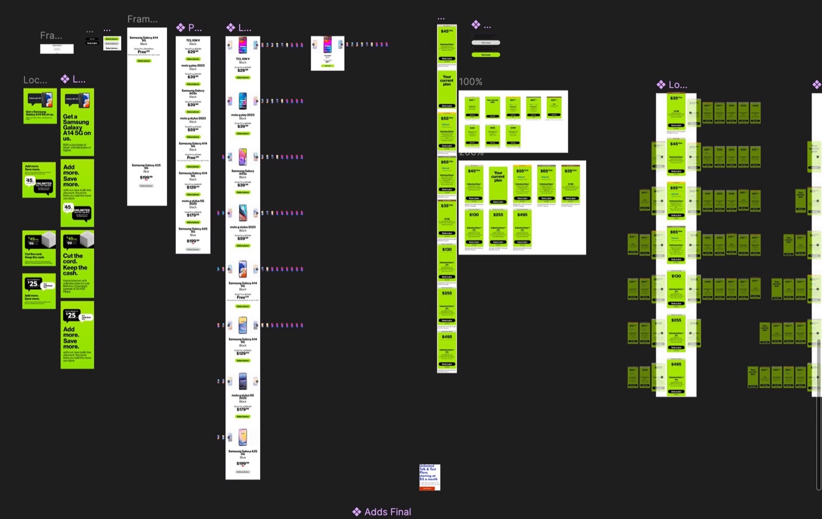
The working file · Local Components The Figma file's Local Components canvas: tilelets, offer cards, phone carousel content, plan cards at every price point, and VDS buttons — many with Max-Zoom variants

One local library drives every screen: tilelets, offer cards, phone content, plan cards at every price point, VDS buttons. Nearly every component carries a [Max Zoom] twin — the 200% accessibility mode is a designed variant of the system, not a browser zoom.

Walk the machine yourself.

The full interactive walkthrough — all four journeys, the payment animation, and the collection sequence — lives in the Figma prototype — all authored transitions included.

Play the prototype →